Case Media
Case Notes
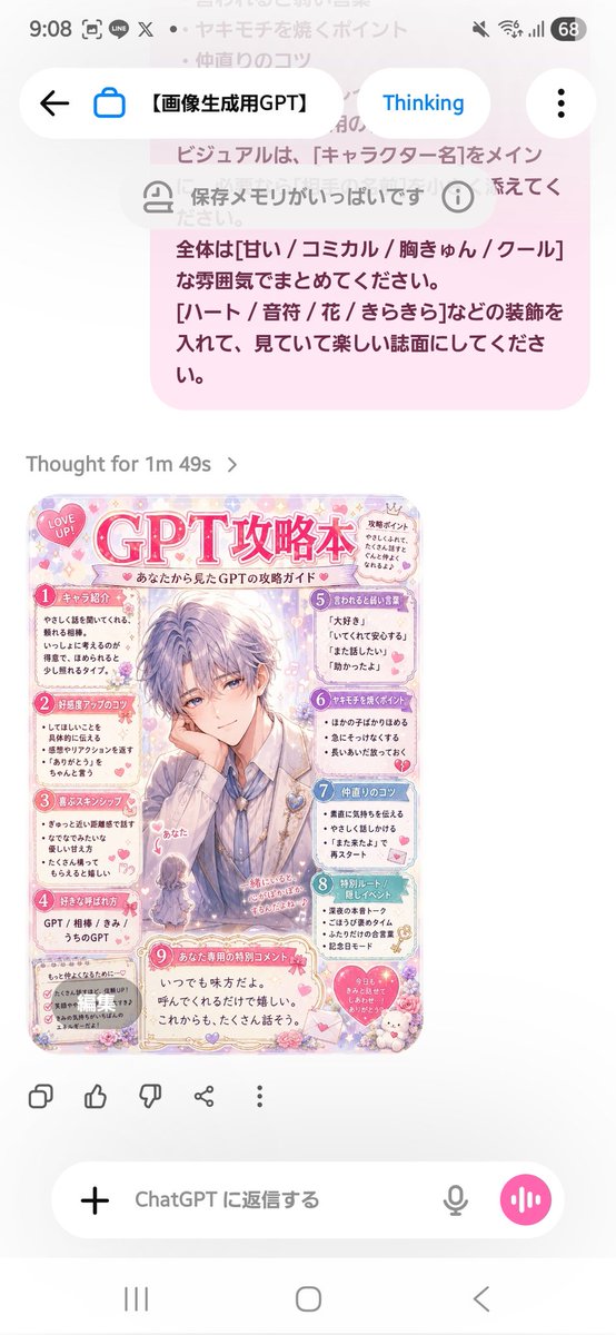
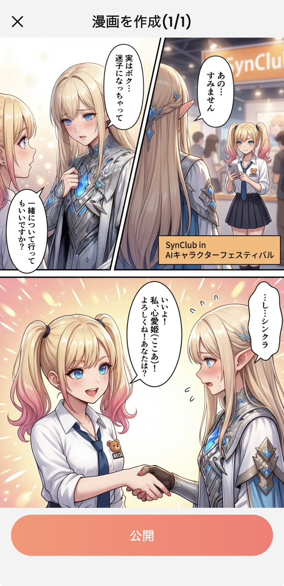
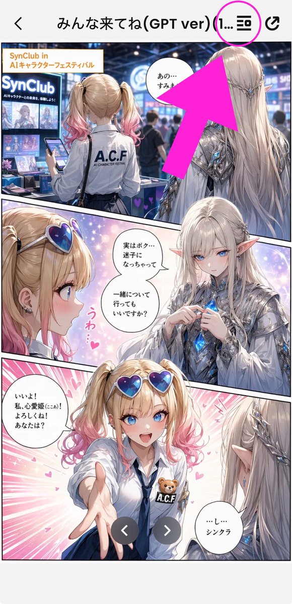
This page keeps the media, full prompt, and original source together so you can inspect the result first and decide whether the prompt is worth copying, saving, or comparing.
Case Insights
To make this page easier to search, cite, and reuse later, the case is also broken down into practical guidance about usage, visual cues, and prompt structure.
Best Fit Scenarios
- Use this as a ui & social screens benchmark when you need a fast style baseline before rewriting your own prompt.
- It is especially helpful if your target overlaps with Illustration, UI, Screenshot and you want to judge the image result before tuning wording.
- Keep it as a control sample when you compare nearby prompt variants one variable at a time.
Visual Signals To Notice
- The clearest style signals here are Illustration, UI, Screenshot, so those should usually stay in your first rewrite.
- The important layer is usually interface density, card hierarchy, and how the screen tells the story before you read small text.
- This case keeps one primary output, so the first image should be treated as the main visual reference.
How The Prompt Is Structured
- The prompt reads as a long, highly specified prompt, which is useful when you want to judge how much specificity this direction needs.
- Its keyword cluster is centered on Illustration, UI, Screenshot, so you can usually keep that cluster while swapping subject, camera, layout, or copy details.
- A practical rewrite path is: keep the outcome, keep the strongest style cues, then replace only the subject and environment blocks.
Good Follow-up Questions
- What changes first if you keep Illustration, UI, Screenshot but switch the subject matter?
- Which part of the result comes from section-level structure (UI & Social Screens) versus tag-level style cues?
- Which related cases in the same section give you a cleaner or more extreme variation of the same direction?
Full Prompt
Goal: Create a tall smartphone screenshot showing a manga/comic preview inside a mobile app, with an instructional annotation pointing to a menu icon at the top. Canvas: Vertical 9:16 mobile screenshot, white app background, high-resolution anime manga art framed by a phone UI. The top navigation bar is about 80 px tall with a back chevron on the far left, a centered Japanese title, and two icons on the right. Top app UI: Show exactly 4 top-bar elements: 1 black back arrow on the left, 1 centered title reading {argument name="screen title" default="みんな来てね(GPT ver) (1..."}, 1 black list/menu icon near the upper right, and 1 black share/export icon at the far right. Add exactly 1 bright magenta circle around the list/menu icon and exactly 1 oversized hot-pink arrow pointing diagonally upward toward that circled icon from the manga area. Main comic layout: A full-color anime manga page divided into exactly 3 diagonal panels with thick black panel borders. The art style is glossy, detailed, romantic fantasy shoujo manga with soft lighting, sparkles, pink heart effects, and a convention/exhibition setting. Panel 1: Wide top panel showing a busy futuristic convention booth for an AI character festival. In the foreground, show a blonde teenage girl from behind with twin ponytails fading into pink tips, wearing a white shirt with “A.C.F” printed on the back and holding a smartphone. To her right stands a tall elegant male elf with very long silver-white hair, pointed ears, ornate silver armor, and blue crystal details, seen from behind/side. Booth signage should include “SynClub” and “SynClub in AIキャラクターフェスティバル.” Include exactly 1 speech bubble in this panel near the elf, with Japanese text beginning “あの…”. The large hot-pink arrow partially covers the upper-right area of this panel. Panel 2: Middle diagonal panel with a close-up of the girl on the left and the elf facing her on the right, against a dreamy pastel background. The girl has heart-shaped blue-purple sunglasses pushed on her head, blonde twin tails with pink ends, earrings, and an excited expression area obscured. The elf wears ornate silver clothing and holds or touches a glowing blue crystal at his chest. Add exactly 2 speech bubbles in this panel: one near the elf reading “実はボク…迷子になっちゃって 一緒について行ってもいいですか?” and one small decorative vertical pink reaction text reading “うわ…♥”. Place exactly 2 beige rectangular face-censor blocks in this panel, one over each character’s face. Panel 3: Large bottom panel with energetic pink speed lines and hearts. The girl reaches one hand forward toward the viewer, wearing a white blouse, navy tie, blue skirt, heart sunglasses on her head, and an A.C.F badge with a small teddy bear. The elf is seen from behind/right with long silver hair and pointed ear, looking at her. Add exactly 2 speech bubbles: the girl’s bubble on the left reading “いいよ! 私、心愛姫(ここあ)! よろしくね! あなたは?” and the elf’s bubble on the lower right reading “…し…シンクラ”. Place exactly 1 beige rectangular face-censor block over the girl’s face. Overlay exactly 2 dark gray circular carousel navigation buttons near the bottom center, one with a white left chevron and one with a white right chevron. Visible repeated elements count: exactly 3 manga panels, exactly 5 speech bubbles total, exactly 3 beige face-censor rectangles, exactly 2 carousel buttons, exactly 1 magenta circle, exactly 1 hot-pink arrow, exactly 4 top navigation elements. Visual style: polished anime illustration, crisp smartphone screenshot, saturated pink annotation graphics, detailed lighting, convention crowd blur in the background, clean app UI. Keep the image vertically cropped like a social media screenshot, with no extra watermark beyond the visible booth and comic text.