Case Media
Case Notes
This page keeps the media, full prompt, and original source together so you can inspect the result first and decide whether the prompt is worth copying, saving, or comparing.
Case Insights
To make this page easier to search, cite, and reuse later, the case is also broken down into practical guidance about usage, visual cues, and prompt structure.
Best Fit Scenarios
- Use this as a ui & social screens benchmark when you need a fast style baseline before rewriting your own prompt.
- It is especially helpful if your target overlaps with Illustration, UI, Screenshot and you want to judge the image result before tuning wording.
- Keep it as a control sample when you compare nearby prompt variants one variable at a time.
Visual Signals To Notice
- The clearest style signals here are Illustration, UI, Screenshot, so those should usually stay in your first rewrite.
- The important layer is usually interface density, card hierarchy, and how the screen tells the story before you read small text.
- This case keeps one primary output, so the first image should be treated as the main visual reference.
How The Prompt Is Structured
- The prompt reads as a long, highly specified prompt, which is useful when you want to judge how much specificity this direction needs.
- Its keyword cluster is centered on Illustration, UI, Screenshot, so you can usually keep that cluster while swapping subject, camera, layout, or copy details.
- A practical rewrite path is: keep the outcome, keep the strongest style cues, then replace only the subject and environment blocks.
Good Follow-up Questions
- What changes first if you keep Illustration, UI, Screenshot but switch the subject matter?
- Which part of the result comes from section-level structure (UI & Social Screens) versus tag-level style cues?
- Which related cases in the same section give you a cleaner or more extreme variation of the same direction?
Full Prompt
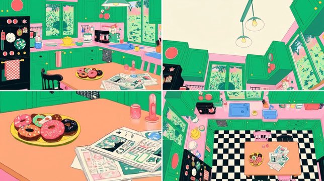
Goal: Create a colorful four-panel scene-design concept sheet for a cozy retro kitchen, in a whimsical flat 2D illustration style inspired by 1980s/1990s animation background art. Canvas: Wide horizontal image, 16:9 aspect ratio, divided into exactly 4 rectangular panels by thin white gutters: two panels across the top row and two panels across the bottom row. Setting: A bright, playful retro kitchen with {argument name="cabinet color" default="emerald green"} cabinets, pink trim, peach countertops, leafy trees visible outside the windows, and a warm pastel palette. Use clean ink lines, slightly imperfect hand-drawn perspective, screen-print-like colors, and cozy lived-in details. Panel layout and contents: - Panel 1, top left: wide eye-level view of the kitchen. Show green upper and lower cabinets, a black refrigerator covered with round magnets and stickers, a pink-and-white checkered towel, two tall windows with greenery outside, a peach counter, small appliances, a sink area, pendant lighting, and a central peach table. On the table are exactly 3 main objects: a plate of donuts, an open newspaper, and a pink bottle or condiment container. Include two mismatched chairs, one black and one pink. - Panel 2, top right: upward-looking corner view emphasizing ceiling, pendant lights, upper cabinets, tall windows, and angled kitchen architecture. Show exactly 2 hanging pendant bulbs and cabinet doors tilted in perspective, with greenery visible through the windows. - Panel 3, bottom left: close-up tabletop still life. Show a large peach tabletop with exactly 3 main object groups: a yellow plate holding assorted donuts, a spread of newspapers/magazines, and two pink table items consisting of one small cup/can and one tall bottle. The donut plate should contain exactly 7 visible donuts or pastries in varied colors, including pink frosted, chocolate, cream, and plain rings. - Panel 4, bottom right: high overhead floor-plan view of the same kitchen. Show a black-and-white checkerboard floor, green cabinetry around the perimeter, pink countertops, windows, refrigerator, sink, stove, and the central table. On the table repeat exactly 3 object groups: donut plate, newspaper pile, and pink bottles/cups. Include exactly 2 chairs, one pink and one black. Visual style: Saturated candy colors, teal-green cabinetry, bubblegum pink accents, peach table surfaces, black-and-white checkerboard floor, cream walls, simplified shapes, charmingly skewed perspective, retro anime background feel, crisp outlines, no photorealism. Text: Newspapers may contain tiny illegible decorative print only; do not include readable headlines, logos, captions, watermarks, or UI elements. Constraints: Keep all 4 panels consistent as views of the same kitchen scene. Preserve the cheerful retro color palette and hand-drawn illustrative look. Do not add people, pets, speech bubbles, or extra panels.