Case Media
Case Notes
This page keeps the media, full prompt, and original source together so you can inspect the result first and decide whether the prompt is worth copying, saving, or comparing.
Case Insights
To make this page easier to search, cite, and reuse later, the case is also broken down into practical guidance about usage, visual cues, and prompt structure.
Best Fit Scenarios
- Use this as a ui & social screens benchmark when you need a fast style baseline before rewriting your own prompt.
- It is especially helpful if your target overlaps with Poster, UI, Screenshot and you want to judge the image result before tuning wording.
- Keep it as a control sample when you compare nearby prompt variants one variable at a time.
Visual Signals To Notice
- The clearest style signals here are Poster, UI, Screenshot, so those should usually stay in your first rewrite.
- The important layer is usually interface density, card hierarchy, and how the screen tells the story before you read small text.
- This case keeps 2 media outputs, which makes it easier to check whether the style remains stable across multiple results.
How The Prompt Is Structured
- The prompt reads as a long, highly specified prompt, which is useful when you want to judge how much specificity this direction needs.
- Its keyword cluster is centered on Poster, UI, Screenshot, so you can usually keep that cluster while swapping subject, camera, layout, or copy details.
- A practical rewrite path is: keep the outcome, keep the strongest style cues, then replace only the subject and environment blocks.
Good Follow-up Questions
- What changes first if you keep Poster, UI, Screenshot but switch the subject matter?
- Which part of the result comes from section-level structure (UI & Social Screens) versus tag-level style cues?
- Which related cases in the same section give you a cleaner or more extreme variation of the same direction?
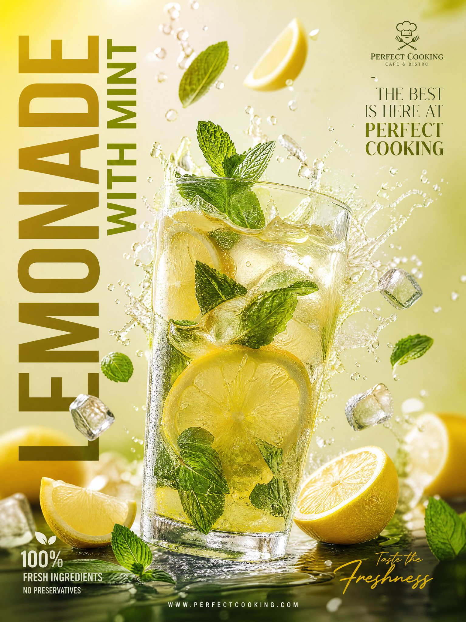
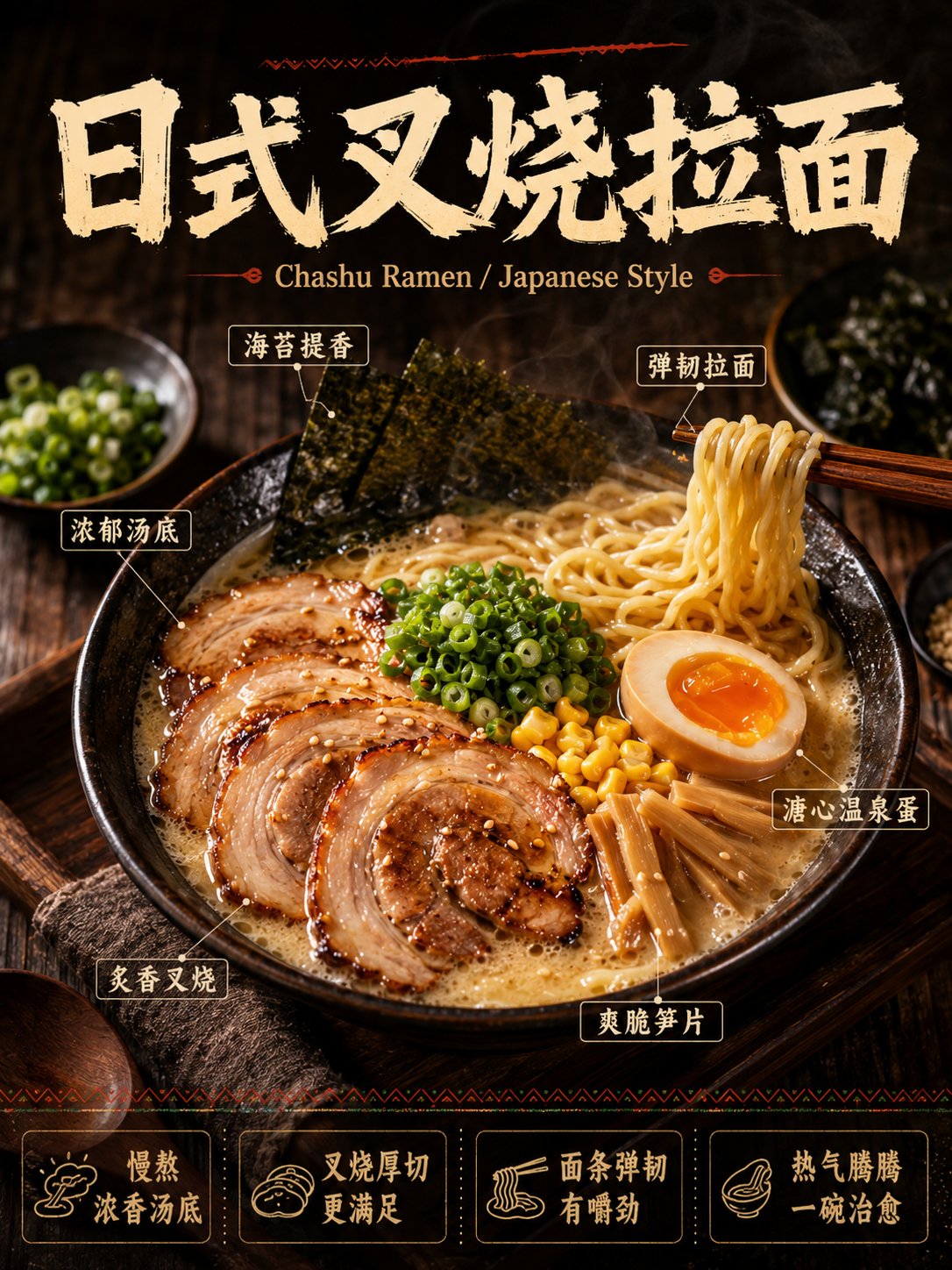
Full Prompt
Generate a high-completion Chinese-dominated commercial food poster for the F&B industry. [Theme Category] [Chinese Main Title] - Positioned at the top with large bold Chinese characters featuring visual impact suitable for restaurant posters incorporating brush handwritten or rough textured qualities [English Auxiliary Subtitle] - Optional smaller text below the main title to assist in explaining the cuisine category or flavor profile [Main Visual Food] - Occupying the core center of the composition: A sufficiently full three-dimensional tempting food subject with strong appetite appeal substantial portion sense obvious exposed ingredients rich layers and clear details featuring authentic commercial food photography texture. The food must appear freshly prepared steaming hot great value and delicious including realistic details such as subtle steam wisps sauce gloss meat grain textures vegetable moisture cheese pull effects or noodle steam. [Ingredient Annotations] - Include 4-6 elegant Chinese ingredient labels positioned around the main visual using thin lines connecting to corresponding ingredients or specific parts. The annotation boxes should be concise and clear resembling high-end restaurant poster explanation tags rather than industrial blueprints. [Bottom Selling Points] - Design a row of 4 selling point modules at the bottom each containing a concise icon paired with one Chinese short sentence conveying the selling point. Overall Requirements: This is a high-quality commercial food poster targeting the Mainland China market not ordinary food photography not menu screenshots and not low-quality e-commerce images. The entire image must prioritize Chinese information with English serving only as auxiliary accent decoration. All text must be clear readable and authentic with no gibberish pseudo-English or meaningless placeholder text. Surround the main subject with minimal carefully selected auxiliary ingredients and props such as sauce bowls herbs chili peppers lemon wedges sesame seeds chopped vegetables condiments chopsticks wooden boards and plates to enhance atmosphere without overpowering the main subject. The background should employ dark wood table charcoal black deep brown or warm dark tone environments to make the food subject stand out prominently. Visual Style: Authentic commercial food photography combined with poster design aesthetics featuring dark tone high quality warm lighting setup strong appetite appeal high-definition details distinct layers rich but clean colors clear imagery prominent subject complete composition creating an overall high-end tempting and visually impactful presentation. Layout Structure: Top: Large title area Middle: Main visual food area Surrounding: Ingredient annotation area Bottom: Selling point information area