Case Media
Case Notes
This page keeps the media, full prompt, and original source together so you can inspect the result first and decide whether the prompt is worth copying, saving, or comparing.
Case Insights
To make this page easier to search, cite, and reuse later, the case is also broken down into practical guidance about usage, visual cues, and prompt structure.
Best Fit Scenarios
- Use this as a ui & social screens benchmark when you need a fast style baseline before rewriting your own prompt.
- It is especially helpful if your target overlaps with Cinematic, Poster, UI and you want to judge the image result before tuning wording.
- Keep it as a control sample when you compare nearby prompt variants one variable at a time.
Visual Signals To Notice
- The clearest style signals here are Cinematic, Poster, UI, so those should usually stay in your first rewrite.
- The important layer is usually interface density, card hierarchy, and how the screen tells the story before you read small text.
- This case keeps one primary output, so the first image should be treated as the main visual reference.
How The Prompt Is Structured
- The prompt reads as a long, highly specified prompt, which is useful when you want to judge how much specificity this direction needs.
- Its keyword cluster is centered on Cinematic, Poster, UI, so you can usually keep that cluster while swapping subject, camera, layout, or copy details.
- A practical rewrite path is: keep the outcome, keep the strongest style cues, then replace only the subject and environment blocks.
Good Follow-up Questions
- What changes first if you keep Cinematic, Poster, UI but switch the subject matter?
- Which part of the result comes from section-level structure (UI & Social Screens) versus tag-level style cues?
- Which related cases in the same section give you a cleaner or more extreme variation of the same direction?
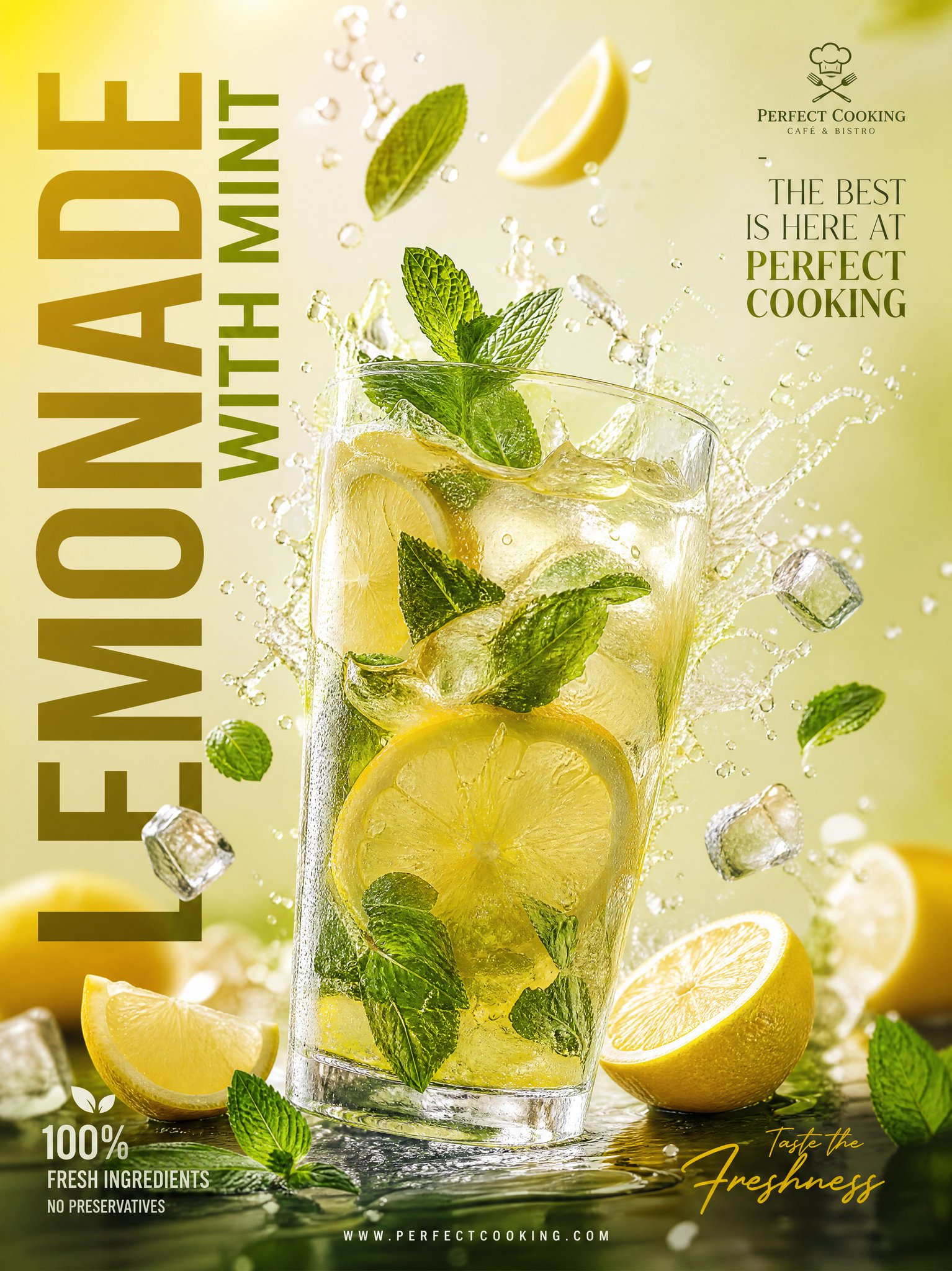
Full Prompt
Ultra-realistic premium lemonade advertisement poster design, luxury modern café branding style, vertical layout, refreshing lemon yellow, lime green, and crisp white color palette, large bold vertical text “LEMONADE WITH MINT” on the left side, cinematic 3D splash effects, a glossy transparent glass filled with chilled lemonade in the center, visible fresh mint leaves and thin lemon slices inside the drink, dynamic citrus juice splashes exploding outward, floating lemon wedges, mint leaves, and sparkling ice cubes around the glass, realistic condensation droplets on the glass surface, soft natural shadows, high-end commercial beverage photography, elegant typography on the top right saying “THE BEST IS HERE AT PERFECT COOKING”, stylish promotional layout, minimal luxury background with subtle gradient, glossy reflections, premium summer drink aesthetic, ultra-detailed, photorealistic, 4K advertising poster, depth of field, dramatic lighting, floating elements composition, modern Instagram marketing design, realistic textures, professional branding mockup, clean luxury typography, trendy café promotional poster.