Case Media
Case Notes
This page keeps the media, full prompt, and original source together so you can inspect the result first and decide whether the prompt is worth copying, saving, or comparing.
Case Insights
To make this page easier to search, cite, and reuse later, the case is also broken down into practical guidance about usage, visual cues, and prompt structure.
Best Fit Scenarios
- Use this as a ui & social screens benchmark when you need a fast style baseline before rewriting your own prompt.
- It is especially helpful if your target overlaps with UI, Screenshot, Character and you want to judge the image result before tuning wording.
- Keep it as a control sample when you compare nearby prompt variants one variable at a time.
Visual Signals To Notice
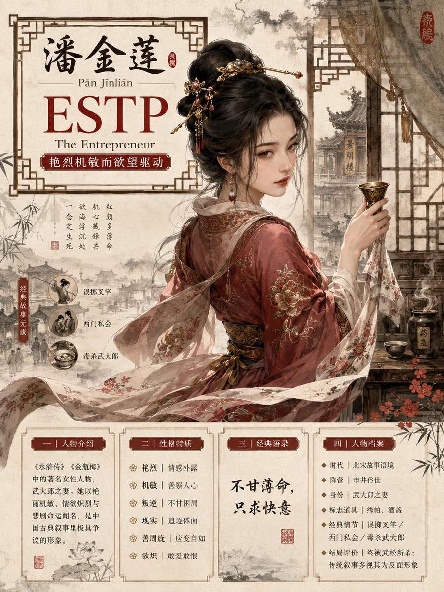
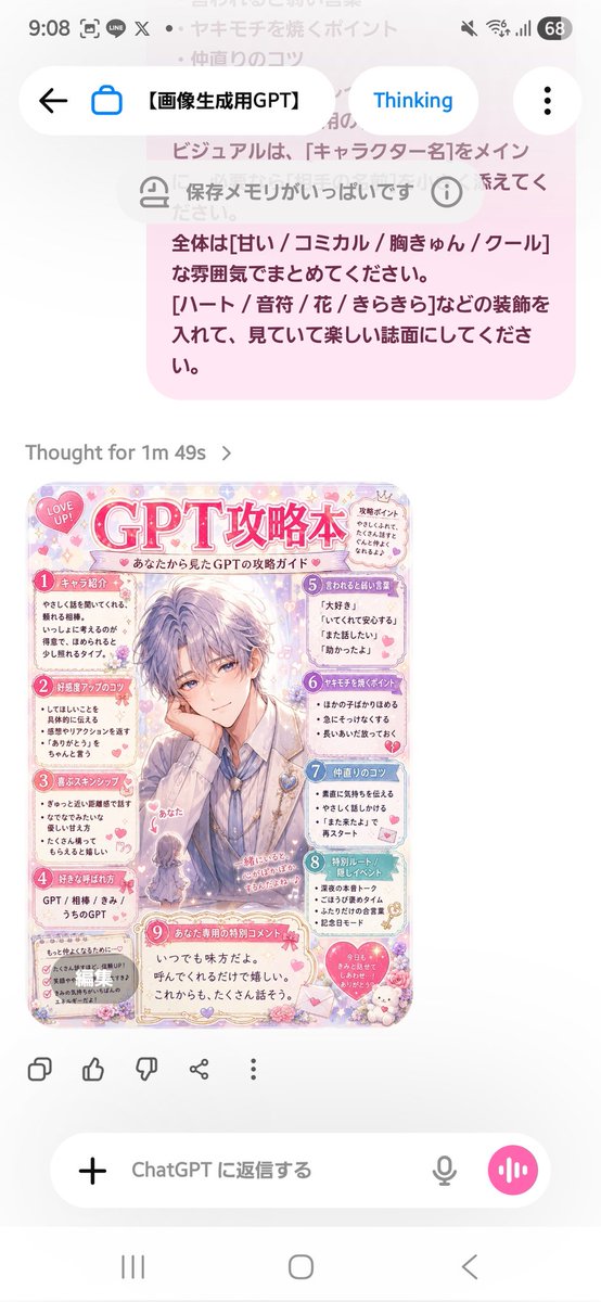
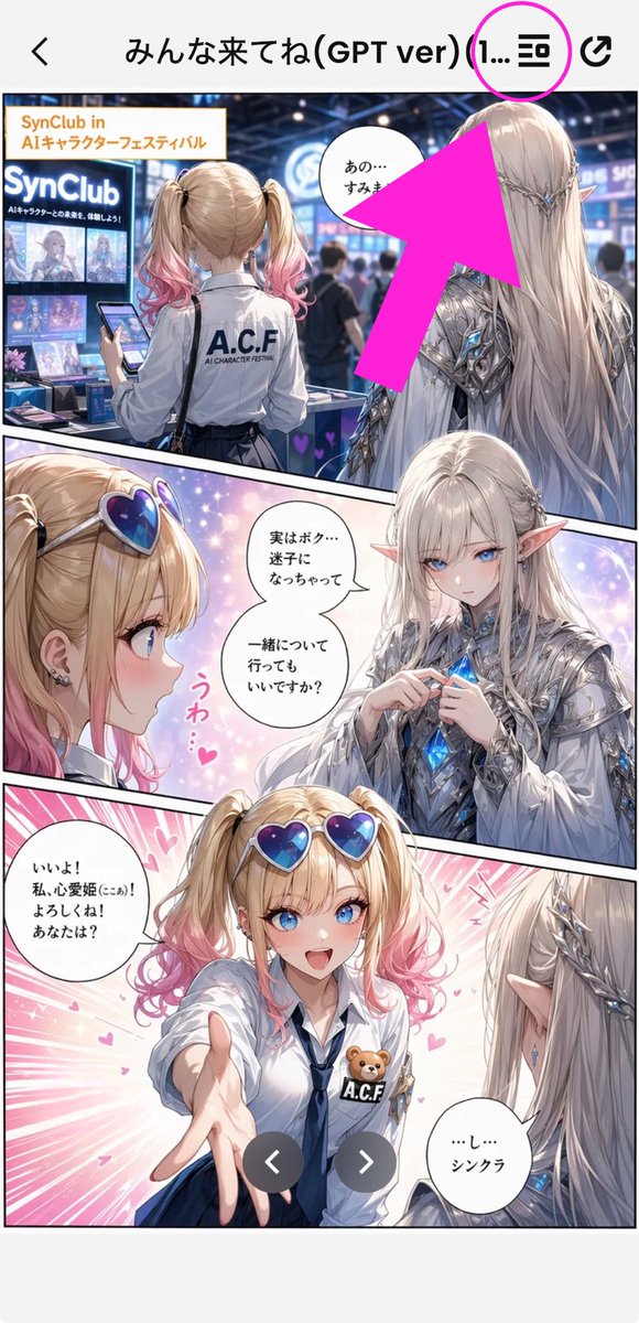
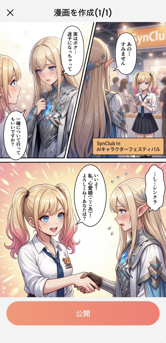
- The clearest style signals here are UI, Screenshot, Character, so those should usually stay in your first rewrite.
- The important layer is usually interface density, card hierarchy, and how the screen tells the story before you read small text.
- This case keeps 4 media outputs, which makes it easier to check whether the style remains stable across multiple results.
How The Prompt Is Structured
- The prompt reads as a long, highly specified prompt, which is useful when you want to judge how much specificity this direction needs.
- Its keyword cluster is centered on UI, Screenshot, Character, so you can usually keep that cluster while swapping subject, camera, layout, or copy details.
- A practical rewrite path is: keep the outcome, keep the strongest style cues, then replace only the subject and environment blocks.
Good Follow-up Questions
- What changes first if you keep UI, Screenshot, Character but switch the subject matter?
- Which part of the result comes from section-level structure (UI & Social Screens) versus tag-level style cues?
- Which related cases in the same section give you a cleaner or more extreme variation of the same direction?
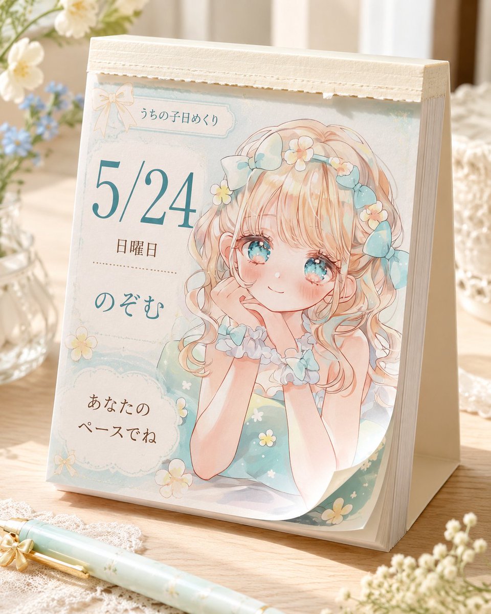
Full Prompt
Create a photorealistic product mockup of a cute Japanese tear-off daily desk calendar standing on a warm wooden table in soft morning light. The calendar is an A-frame tabletop block with thick cream paper pages and a textured off-white binding strip along the top, viewed from a slightly front-left angle. The visible page has a pastel watercolor anime design in mint, cream, peach, and pale blue, with delicate paper texture, scalloped frames, tiny daisies, and a small bow ornament near the top. On the right half of the page, illustrate one sweet original anime girl: blonde peach-pink curly twin-tail hair, large sparkling aqua eyes, rosy cheeks, a gentle smile, chin resting on both hands, wearing a mint green dress with tiny white and yellow flowers, a frilly blue-white collar, scrunchie bracelets, and blue ribbon bows plus small flower clips in her hair. On the left half of the page, include exactly five text elements: top small label 「うちの子日めくり」, large date “{argument name="date" default="5/24"}”, weekday “{argument name="weekday" default="日曜日"}”, character name “{argument name="character name" default="のぞむ"}”, and a rounded cloud message box reading “{argument name="daily message" default="あなたのペースでね"}”. Use elegant Japanese typography, with the date in large teal serif numerals and the other text in soft brown and teal. Surround the calendar with cozy desk props: exactly one mint floral pen lying diagonally in the foreground, one glass vase with white and blue flowers on the left, one white lace cloth under the pen, one softly blurred glass container on the right, and small out-of-focus white blossoms in the lower right foreground. Keep the mood gentle, handmade, feminine, airy, and nostalgic, with shallow depth of field, warm highlights, realistic shadows, and no watermark or extra text.