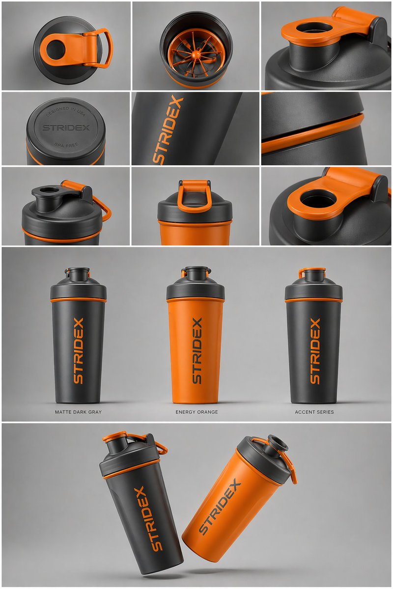
Case Media
Case Notes
This page keeps the media, full prompt, and original source together so you can inspect the result first and decide whether the prompt is worth copying, saving, or comparing.
Case Insights
To make this page easier to search, cite, and reuse later, the case is also broken down into practical guidance about usage, visual cues, and prompt structure.
Best Fit Scenarios
- Use this as a ui & social screens benchmark when you need a fast style baseline before rewriting your own prompt.
- It is especially helpful if your target overlaps with UI, Screenshot, Product and you want to judge the image result before tuning wording.
- Keep it as a control sample when you compare nearby prompt variants one variable at a time.
Visual Signals To Notice
- The clearest style signals here are UI, Screenshot, Product, so those should usually stay in your first rewrite.
- The important layer is usually interface density, card hierarchy, and how the screen tells the story before you read small text.
- This case keeps one primary output, so the first image should be treated as the main visual reference.
How The Prompt Is Structured
- The prompt reads as a long, highly specified prompt, which is useful when you want to judge how much specificity this direction needs.
- Its keyword cluster is centered on UI, Screenshot, Product, so you can usually keep that cluster while swapping subject, camera, layout, or copy details.
- A practical rewrite path is: keep the outcome, keep the strongest style cues, then replace only the subject and environment blocks.
Good Follow-up Questions
- What changes first if you keep UI, Screenshot, Product but switch the subject matter?
- Which part of the result comes from section-level structure (UI & Social Screens) versus tag-level style cues?
- Which related cases in the same section give you a cleaner or more extreme variation of the same direction?
Full Prompt
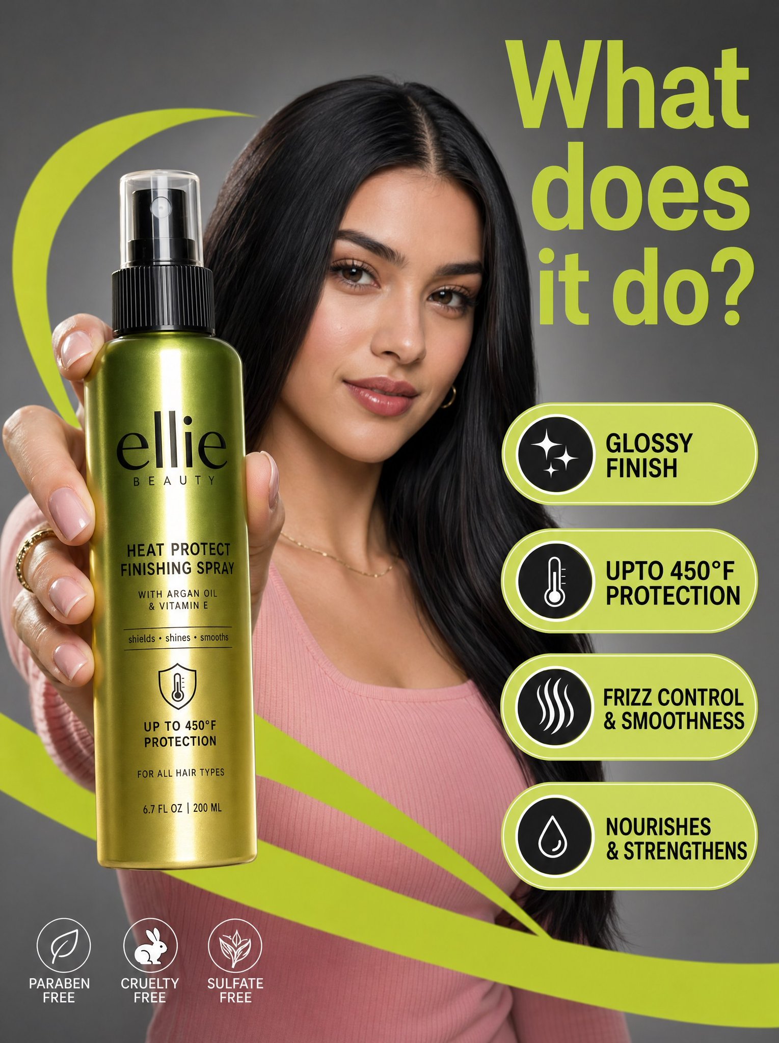
A high-resolution commercial marketing photograph features a young woman with sleek dark hair and a pink ribbed top in a neutral grey studio setting, centered behind a glossy Ellie Beauty spray bottle held prominently in the foreground. The composition is energized by vibrant, lime-green graphic "swooshes" and floating pill-shaped callouts that highlight product features like "glossy finish" and "upto 450°F protection" in bold black sans-serif text. The lighting is professionally diffused, casting soft highlights on the model’s face while creating a sharp, vertical reflection on the metallic green-to-gold gradient bottle label. Topping the scene is a large, lime-green headline in the upper right asking, "What does it do?", altogether creating a clean, modern, and high-contrast aesthetic with a shallow depth of field that keeps the product and the model's focused expression in sharp relief.