Case Media
Case Notes
This page keeps the media, full prompt, and original source together so you can inspect the result first and decide whether the prompt is worth copying, saving, or comparing.
Case Insights
To make this page easier to search, cite, and reuse later, the case is also broken down into practical guidance about usage, visual cues, and prompt structure.
Best Fit Scenarios
- Use this as a ui & social screens benchmark when you need a fast style baseline before rewriting your own prompt.
- It is especially helpful if your target overlaps with Poster, UI, Screenshot and you want to judge the image result before tuning wording.
- Keep it as a control sample when you compare nearby prompt variants one variable at a time.
Visual Signals To Notice
- The clearest style signals here are Poster, UI, Screenshot, so those should usually stay in your first rewrite.
- The important layer is usually interface density, card hierarchy, and how the screen tells the story before you read small text.
- This case keeps one primary output, so the first image should be treated as the main visual reference.
How The Prompt Is Structured
- The prompt reads as a long, highly specified prompt, which is useful when you want to judge how much specificity this direction needs.
- Its keyword cluster is centered on Poster, UI, Screenshot, so you can usually keep that cluster while swapping subject, camera, layout, or copy details.
- A practical rewrite path is: keep the outcome, keep the strongest style cues, then replace only the subject and environment blocks.
Good Follow-up Questions
- What changes first if you keep Poster, UI, Screenshot but switch the subject matter?
- Which part of the result comes from section-level structure (UI & Social Screens) versus tag-level style cues?
- Which related cases in the same section give you a cleaner or more extreme variation of the same direction?
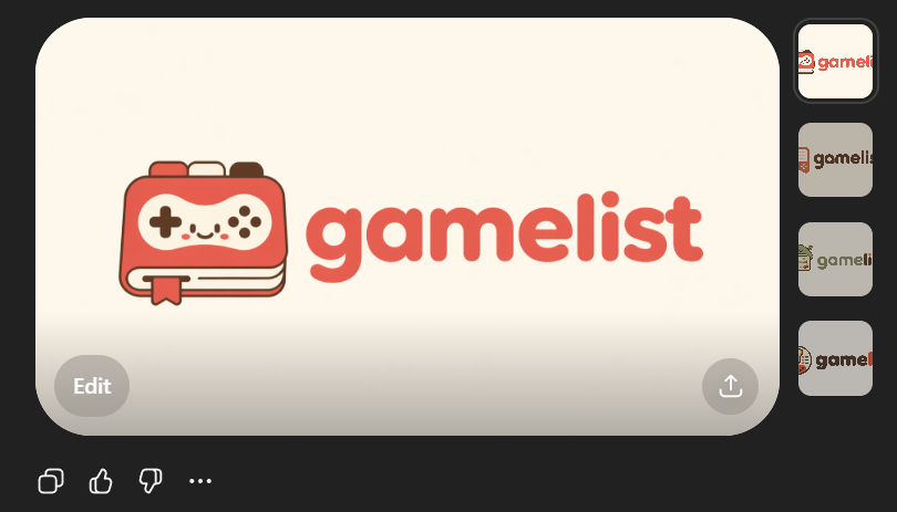
Full Prompt
Create a clean flat vector app logo presentation on a dark UI background. Center a large rounded-rectangle preview card in warm light beige. Inside the card, place a cute minimalist gaming logo: on the left, a stylized handheld game console icon drawn as a rounded rectangular device stacked over 2 visible offset layers like pages or cards, with a small ribbon bookmark hanging from the bottom edge. The console body is coral red with cream screen details, thin dark brown outlines, and tiny dark brown controller symbols: 1 cross-shaped D-pad on the left, 4 small circular buttons on the right, plus 4 tiny decorative dots in the center forming a smiling playful face impression. To the right of the icon, place the lowercase brand wordmark {argument name="brand name" default="gamelist"} in thick rounded geometric sans-serif letters, colored coral red to match the icon. Keep the spacing balanced so the icon and text read as one cohesive modern startup logo. Use a soft, friendly, vector-only aesthetic with no gradients, no photorealism, no texture, and high SVG-friendly simplicity. The palette should be limited to 4 colors: {argument name="primary color" default="coral red"}, cream, dark brown, and warm light beige. Show 4 small vertical thumbnail variations aligned along the right side of the dark interface, each showing the same logo on slightly different light neutral backgrounds. Add subtle UI framing only: a circular gray Edit button at bottom left of the large preview card, a circular gray share/upload button at bottom right of the card, and small monochrome action icons below the card on the dark background. Overall composition should look like a screenshot of an AI image generation result showcasing an app logo concept.