Case Media
Case Notes
This page keeps the media, full prompt, and original source together so you can inspect the result first and decide whether the prompt is worth copying, saving, or comparing.
Case Insights
To make this page easier to search, cite, and reuse later, the case is also broken down into practical guidance about usage, visual cues, and prompt structure.
Best Fit Scenarios
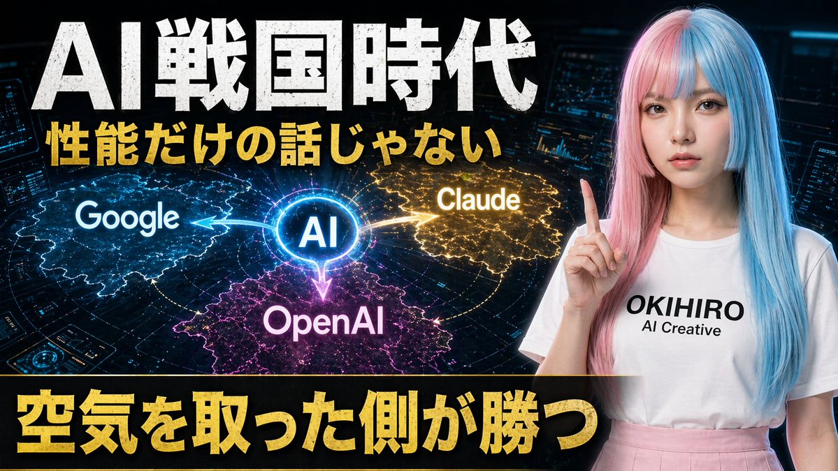
- Use this as a ui & social screens benchmark when you need a fast style baseline before rewriting your own prompt.
- It is especially helpful if your target overlaps with Neon, Poster, UI and you want to judge the image result before tuning wording.
- Keep it as a control sample when you compare nearby prompt variants one variable at a time.
Visual Signals To Notice
- The clearest style signals here are Neon, Poster, UI, so those should usually stay in your first rewrite.
- The important layer is usually interface density, card hierarchy, and how the screen tells the story before you read small text.
- This case keeps one primary output, so the first image should be treated as the main visual reference.
How The Prompt Is Structured
- The prompt reads as a long, highly specified prompt, which is useful when you want to judge how much specificity this direction needs.
- Its keyword cluster is centered on Neon, Poster, UI, so you can usually keep that cluster while swapping subject, camera, layout, or copy details.
- A practical rewrite path is: keep the outcome, keep the strongest style cues, then replace only the subject and environment blocks.
Good Follow-up Questions
- What changes first if you keep Neon, Poster, UI but switch the subject matter?
- Which part of the result comes from section-level structure (UI & Social Screens) versus tag-level style cues?
- Which related cases in the same section give you a cleaner or more extreme variation of the same direction?
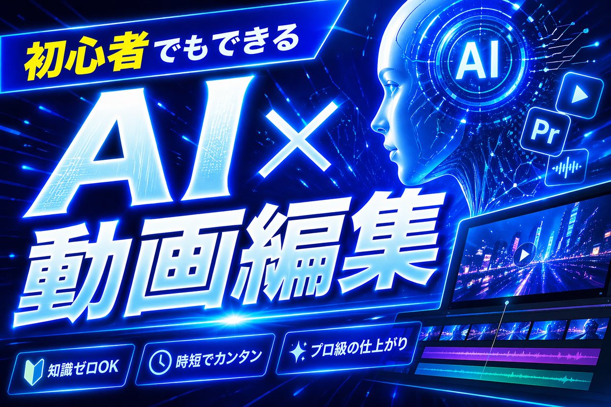
Full Prompt
Create a bold Japanese YouTube thumbnail for the theme {argument name="headline text" default="初心者でもできる AI×動画編集"}, in a futuristic neon-blue cyberpunk style. Use a wide 16:9 composition with a dark electric-blue background filled with glowing circuit lines, digital streaks, lens flares, and high-energy motion. Place a slanted glowing banner in the upper left containing the Japanese text {argument name="top banner text" default="初心者でもできる"}, with the first part in bright yellow and the rest in white. Make the main headline dominate the left and center: gigantic white glowing text “AI×” above even larger white glowing text “動画編集”, with thick blue neon outer glow, slight italic forward motion, beveled 3D shading, and dramatic perspective. In the upper right, add a circular holographic interface with the letters {argument name="ai badge text" default="AI"} in the center, surrounded by concentric rings and tiny HUD marks. Near it, include exactly 3 floating app-style icons: a play button icon, a square “Pr” icon, and an audio waveform icon, all glowing blue. Across the lower right, show a sleek angled video editing monitor displaying a neon city night road scene with a play symbol overlay; beneath the preview, include a timeline with exactly 4 visible tracks: 2 rows of video thumbnails and 2 colored audio bars, one magenta and one cyan-green. Along the bottom, add exactly 3 glowing rounded feature badges with icons and Japanese text: a book icon with “知識ゼロOK”, a clock icon with “時短でカンタン”, and a sparkle icon with “プロ級の仕上がり”. Add a tall solid blue vertical rectangle near the top center-right as a placeholder block. Overall design should feel dynamic, high-contrast, polished, techy, and optimized for maximum click-through as a modern AI and video-editing tutorial thumbnail.