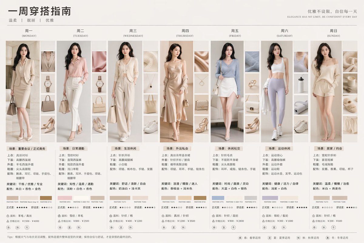
Case Media
Case Notes
This page keeps the media, full prompt, and original source together so you can inspect the result first and decide whether the prompt is worth copying, saving, or comparing.
Case Insights
To make this page easier to search, cite, and reuse later, the case is also broken down into practical guidance about usage, visual cues, and prompt structure.
Best Fit Scenarios
- Use this as a ui & social screens benchmark when you need a fast style baseline before rewriting your own prompt.
- It is especially helpful if your target overlaps with UI, Screenshot, Minimal and you want to judge the image result before tuning wording.
- Keep it as a control sample when you compare nearby prompt variants one variable at a time.
Visual Signals To Notice
- The clearest style signals here are UI, Screenshot, Minimal, so those should usually stay in your first rewrite.
- The important layer is usually interface density, card hierarchy, and how the screen tells the story before you read small text.
- This case keeps 2 media outputs, which makes it easier to check whether the style remains stable across multiple results.
How The Prompt Is Structured
- The prompt reads as a long, highly specified prompt, which is useful when you want to judge how much specificity this direction needs.
- Its keyword cluster is centered on UI, Screenshot, Minimal, so you can usually keep that cluster while swapping subject, camera, layout, or copy details.
- A practical rewrite path is: keep the outcome, keep the strongest style cues, then replace only the subject and environment blocks.
Good Follow-up Questions
- What changes first if you keep UI, Screenshot, Minimal but switch the subject matter?
- Which part of the result comes from section-level structure (UI & Social Screens) versus tag-level style cues?
- Which related cases in the same section give you a cleaner or more extreme variation of the same direction?
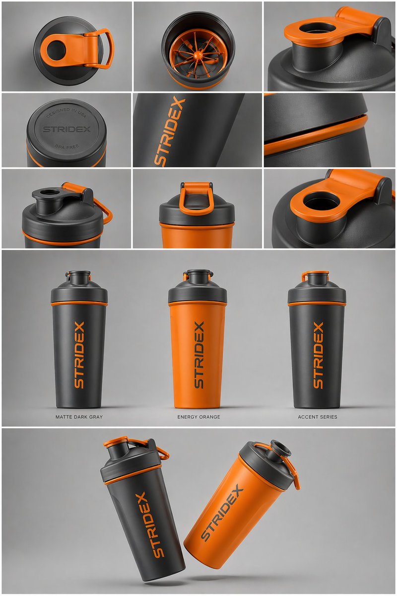
Full Prompt
Core Subject: [{argument name="reference" default="use the uploaded image"}, keep the details, typography and structure locked 100%] Layout & Composition: A {argument name="presentation type" default="professional industrial design presentation sheet"}. The image should be organized into a clean grid system. Top Row: A 3x3 layout showing top-down flat lay views and close-up macro details of materials. Middle Section: Three hero shots of the product standing upright in different color ways (Matte Black, Arctic White, and accented variants). The products should be slightly tilted to show depth and form. Bottom Section: A dynamic "floating" composition featuring two products overlapping at opposing angles to showcase the front and side profiles simultaneously. Environment & Lighting: Set against a minimalist, neutral studio gray background. Soft top-down lighting with realistic contact shadows. High-end product photography aesthetic. Style & Finish: Matte textures, clean silhouettes, and sharp edges. Leave designated blank areas on the product surfaces for "Placeholder Branding" and "Graphic Mockups." 4k resolution, Unreal Engine 5 render style, hyper-realistic, clean aesthetic.