Case Media
Case Notes
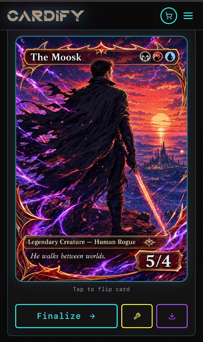
This page keeps the media, full prompt, and original source together so you can inspect the result first and decide whether the prompt is worth copying, saving, or comparing.
Case Insights
To make this page easier to search, cite, and reuse later, the case is also broken down into practical guidance about usage, visual cues, and prompt structure.
Best Fit Scenarios
- Use this as a ui & social screens benchmark when you need a fast style baseline before rewriting your own prompt.
- It is especially helpful if your target overlaps with Neon, Fashion, Illustration and you want to judge the image result before tuning wording.
- Keep it as a control sample when you compare nearby prompt variants one variable at a time.
Visual Signals To Notice
- The clearest style signals here are Neon, Fashion, Illustration, so those should usually stay in your first rewrite.
- The important layer is usually interface density, card hierarchy, and how the screen tells the story before you read small text.
- This case keeps one primary output, so the first image should be treated as the main visual reference.
How The Prompt Is Structured
- The prompt reads as a long, highly specified prompt, which is useful when you want to judge how much specificity this direction needs.
- Its keyword cluster is centered on Neon, Fashion, Illustration, so you can usually keep that cluster while swapping subject, camera, layout, or copy details.
- A practical rewrite path is: keep the outcome, keep the strongest style cues, then replace only the subject and environment blocks.
Good Follow-up Questions
- What changes first if you keep Neon, Fashion, Illustration but switch the subject matter?
- Which part of the result comes from section-level structure (UI & Social Screens) versus tag-level style cues?
- Which related cases in the same section give you a cleaner or more extreme variation of the same direction?
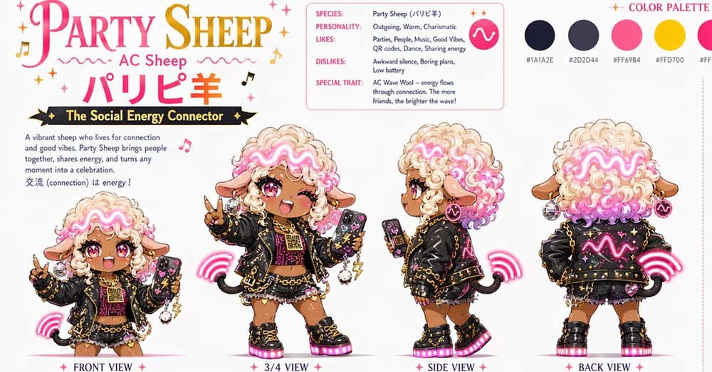
Full Prompt
Goal: Create a cute anime character design sheet for {argument name="character name" default="Party Sheep"}, an “AC Sheep” social-energy connector mascot, combining fluffy sheep features with neon party fashion. Canvas: Wide horizontal character sheet on a clean white background, about 2:1 aspect ratio, polished concept-art presentation with pink, gold, black, and cream accents. Add small decorative sparkles, music notes, and wave marks around the header. Header and typography: Large decorative title at top left reading “PARTY SHEEP” in a serif display font with a pink-to-gold feel. Under it, smaller text “AC Sheep,” then large Japanese text “パリピ羊” in bright pink. Beneath the title, place a black ribbon banner with gold edges reading “The Social Energy Connector.” Add a short descriptive paragraph: “A vibrant sheep who lives for connection and good vibes. Party Sheep brings people together, shares energy, and turns any moment into a celebration. 交流 (connection) is energy!” Character: Depict one consistent chibi sheep-girl mascot with tan skin, big glossy pink eyes, one winking expression in the main front pose, sheep ears, tiny curved black horns, and extremely fluffy cream wool hair with bright pink curly streaks. Across the front of the wool hair, add a glowing neon pink wavy AC symbol like an electric waveform. Outfit: black cropped party jacket with gold studs, chains, star decorations, and neon pink details; black and pink patterned top; short ruffled skirt or shorts; chunky black platform boots with pink glowing soles; fingerless gloves; dangling accessories and charms. She holds a smartphone with a cute decorated case in some views. The mood is energetic, charismatic, warm, and playful. Layout: Show exactly 4 full-body character views along the bottom row, each clearly labeled beneath in small serif text with pink star separators: 1) “FRONT VIEW” at far left, smaller full-body front pose flashing a peace sign and holding a phone, pink wireless-wave energy arcs near her side; 2) “3/4 VIEW” near center-left, larger main pose facing slightly right, winking, smiling with open mouth, holding up a peace sign and a smartphone, more detailed chains and charms; 3) “SIDE VIEW” center-right, profile view facing left while holding a phone, tail visible, pink wireless energy arcs behind; 4) “BACK VIEW” far right, rear view showing the back of the jacket with a large glowing pink waveform symbol, fluffy pink-and-cream wool from behind, tail, boots, and pink energy arcs. Info card: At the upper center, include a rounded rectangle profile card with pink outline. It contains exactly 5 labeled rows: “SPECIES: Party Sheep (パリピ羊)”; “PERSONALITY: Outgoing, Warm, Charismatic”; “LIKES: Parties, People, Music, Good Vibes, QR codes, Dance, Sharing energy”; “DISLIKES: Awkward silence, Boring plans, Low battery”; “SPECIAL TRAIT: AC Wave Wool — energy flows through connection. The more friends, the brighter the wave!” Add a pink circular icon with a white AC waveform inside the card. Color palette: At the upper right, create a “COLOR PALETTE” section with exactly 5 circular swatches in a row. Visible swatches should include near-black navy labeled “#1A1A2E,” dark slate labeled “#2D2D44,” hot pink labeled “#FF69B4,” golden yellow labeled “#FFD700,” and a fifth very light cream/white swatch for wool highlights. Style: High-detail kawaii anime concept art, crisp clean linework, soft cel shading, tiny sparkles, glossy eyes, neon glow effects on the waveform, wireless arcs, boot soles, and jacket emblem. Use a professional character-sheet composition, with consistent proportions and details across all 4 views. Constraints: Keep all text legible, keep the same character identity in every view, do not add extra views beyond the 4 labeled views, do not add extra color swatches beyond the 5 swatches, and avoid photorealism.