Case Media
Case Notes
This page keeps the media, full prompt, and original source together so you can inspect the result first and decide whether the prompt is worth copying, saving, or comparing.
Case Insights
To make this page easier to search, cite, and reuse later, the case is also broken down into practical guidance about usage, visual cues, and prompt structure.
Best Fit Scenarios
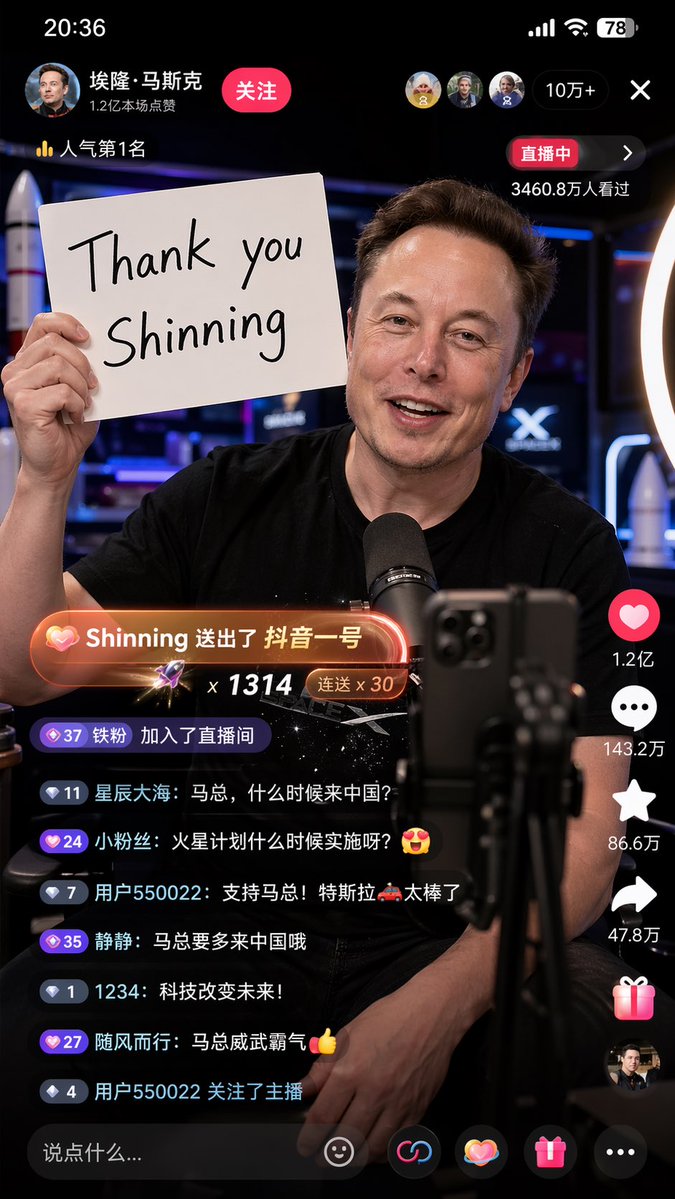
- Use this as a ui & social screens benchmark when you need a fast style baseline before rewriting your own prompt.
- It is especially helpful if your target overlaps with Neon, Cinematic, Illustration and you want to judge the image result before tuning wording.
- Keep it as a control sample when you compare nearby prompt variants one variable at a time.
Visual Signals To Notice
- The clearest style signals here are Neon, Cinematic, Illustration, so those should usually stay in your first rewrite.
- The important layer is usually interface density, card hierarchy, and how the screen tells the story before you read small text.
- This case keeps one primary output, so the first image should be treated as the main visual reference.
How The Prompt Is Structured
- The prompt reads as a long, highly specified prompt, which is useful when you want to judge how much specificity this direction needs.
- Its keyword cluster is centered on Neon, Cinematic, Illustration, so you can usually keep that cluster while swapping subject, camera, layout, or copy details.
- A practical rewrite path is: keep the outcome, keep the strongest style cues, then replace only the subject and environment blocks.
Good Follow-up Questions
- What changes first if you keep Neon, Cinematic, Illustration but switch the subject matter?
- Which part of the result comes from section-level structure (UI & Social Screens) versus tag-level style cues?
- Which related cases in the same section give you a cleaner or more extreme variation of the same direction?
Full Prompt
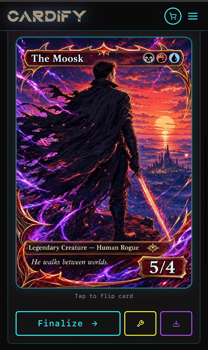
Goal: Create a dark futuristic mobile web app screen for a custom trading card generator called {argument name="app name" default="CARDIFY"}, showing one completed fantasy TCG card ready to finalize. Canvas: Vertical smartphone screenshot, 720×1200 style aspect ratio, black and charcoal background with thin neon cyan divider lines and rounded borders. Overall look is premium cyberpunk UI mixed with high-detail fantasy card art. Layout: Top navigation bar contains exactly 3 visible elements: a large stylized CARDIFY logo on the left, a circular neon cyan shopping cart icon near the upper right, and a neon cyan three-line hamburger menu icon at the far right. Below it is a centered card preview inside a thin cyan rounded rectangle panel. Under the card preview, show small gray monospace text reading “Tap to flip card”. At the bottom, place exactly 3 action buttons: a large cyan-outlined rectangular button labeled “Finalize →”, a smaller yellow-outlined square button with a wrench icon, and a smaller purple-outlined square button with a download icon. Trading card design: The card is a vertical fantasy collectible card with rounded corners, ornate red-gold metallic frame, glowing crimson highlights, and electric purple energy curling around the border. The card title bar at the top reads {argument name="card title" default="The Moosk"} in large white serif type. On the right side of the title bar are exactly 3 circular mana/type icons: a skull icon, a red dragon/swirl icon, and a blue water droplet icon. The lower type bar reads {argument name="type line" default="Legendary Creature — Human Rogue"} in gold serif text, with a small star-like rarity emblem to its right. The flavor text box below reads {argument name="flavor text" default="He walks between worlds."} in italic white serif type. The bottom-right power/toughness badge reads {argument name="power toughness" default="5/4"} in large bold white numerals. Main card artwork: A dramatic anime-fantasy illustration of a lone male rogue viewed from behind, standing on a rocky cliff at sunset. He has short dark hair, dark armor, and a huge tattered black cloak streaming leftward in the wind. He holds a glowing orange-red sword pointed downward in his right hand. In the distance is a luminous ocean horizon with a large setting sun, red and purple clouds, and a dark spired fantasy city near the water. Purple lightning arcs and magical energy ribbons surround the character and frame, with red sparks scattered through the cloak and foreground. Use extremely detailed painterly digital art, high contrast, cinematic lighting, saturated magenta, violet, crimson, orange, and gold. Constraints: Keep the screen as a mobile app mockup, not a standalone card. Use exactly 1 trading card preview, exactly 3 top navigation elements, exactly 3 mana/type icons, and exactly 3 bottom action buttons. Preserve all visible UI text clearly. Do not add extra cards, popups, watermarks, or unrelated interface panels.