Case Media
Case Notes
This page keeps the media, full prompt, and original source together so you can inspect the result first and decide whether the prompt is worth copying, saving, or comparing.
Case Insights
To make this page easier to search, cite, and reuse later, the case is also broken down into practical guidance about usage, visual cues, and prompt structure.
Best Fit Scenarios
- Use this as a ui & social screens benchmark when you need a fast style baseline before rewriting your own prompt.
- It is especially helpful if your target overlaps with Illustration, UI, Screenshot and you want to judge the image result before tuning wording.
- Keep it as a control sample when you compare nearby prompt variants one variable at a time.
Visual Signals To Notice
- The clearest style signals here are Illustration, UI, Screenshot, so those should usually stay in your first rewrite.
- The important layer is usually interface density, card hierarchy, and how the screen tells the story before you read small text.
- This case keeps 2 media outputs, which makes it easier to check whether the style remains stable across multiple results.
How The Prompt Is Structured
- The prompt reads as a long, highly specified prompt, which is useful when you want to judge how much specificity this direction needs.
- Its keyword cluster is centered on Illustration, UI, Screenshot, so you can usually keep that cluster while swapping subject, camera, layout, or copy details.
- A practical rewrite path is: keep the outcome, keep the strongest style cues, then replace only the subject and environment blocks.
Good Follow-up Questions
- What changes first if you keep Illustration, UI, Screenshot but switch the subject matter?
- Which part of the result comes from section-level structure (UI & Social Screens) versus tag-level style cues?
- Which related cases in the same section give you a cleaner or more extreme variation of the same direction?
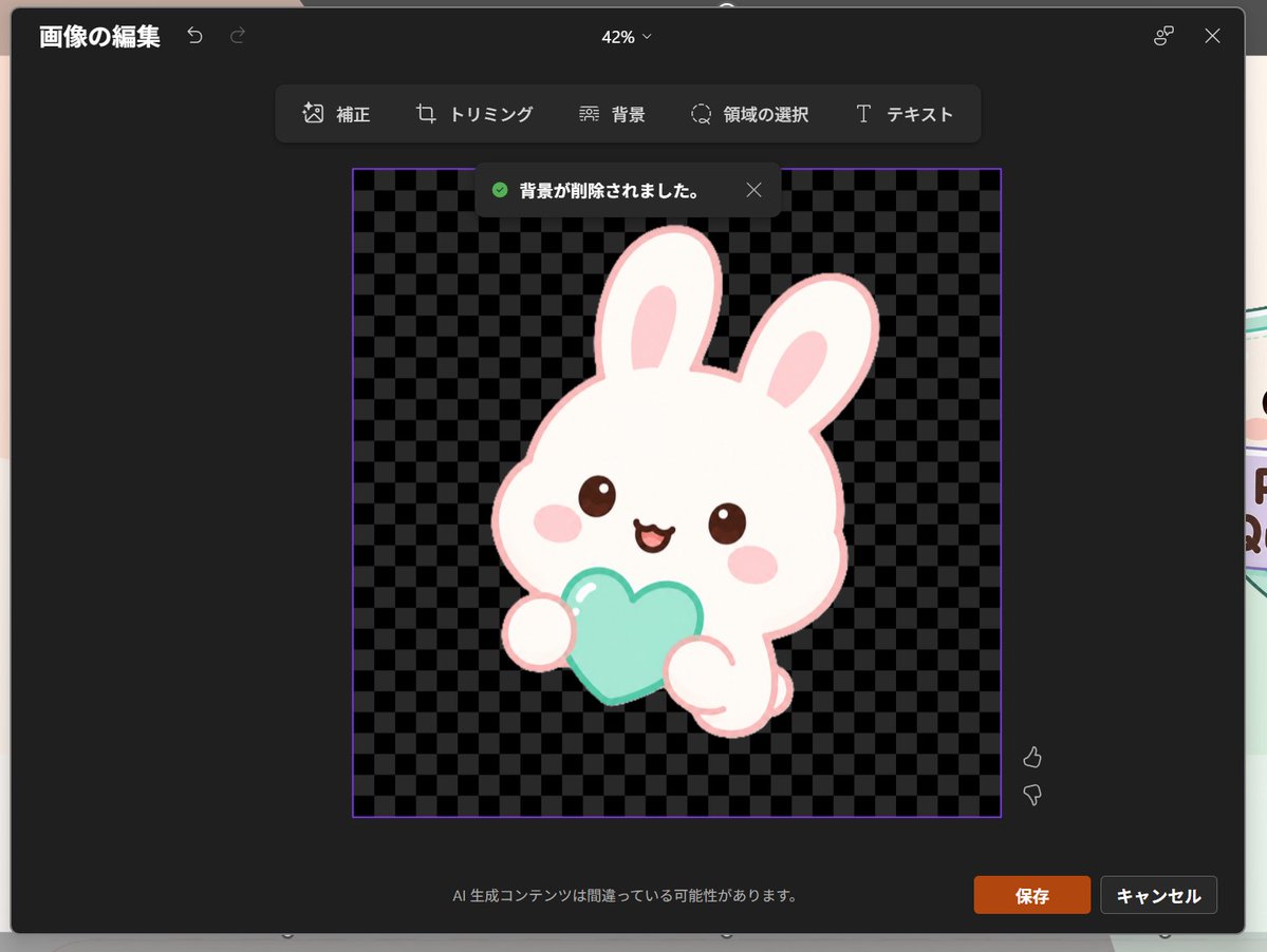
Full Prompt
Goal: Create a realistic screenshot of a dark-themed PowerPoint-style image editing window in Japanese, showing a cute dreamy kawaii icon after background removal. Canvas: 1024×768 landscape screenshot with a dark charcoal modal editor centered on screen, rounded corners, subtle shadow, and a faint glimpse of the underlying slide behind the modal edges. The interface zoom indicator at the top center reads “42%”. Layout: At the top left, show the Japanese title “画像の編集” with two small undo/redo arrow icons. At the top right, show a small connected-dots icon and an X close icon. Below the top bar, center a floating toolbar with exactly 6 tools labeled: “補正”, “トリミング”, “背景”, “領域の選択”, “テキスト”, plus their small simple line icons, arranged horizontally in dark rounded rectangles. Main editing area: In the center, place a square image area outlined with a thin purple border. Inside it, use a black and dark-gray checkerboard transparency pattern. Near the top of this square, show a dark notification toast with a green check icon and the Japanese text “背景が削除されました。” plus a small X close icon. Subject details: Center the icon inside the checkerboard square: one pastel yume-kawaii white rabbit mascot with a thick pale pink outline, oversized rounded head, two long upright ears with pink inner ears, small brown glossy eyes, pink oval blush cheeks, and a happy open mouth. The bunny holds exactly 1 mint-aqua heart-shaped object in front of its body with two rounded paws visible. Add soft highlights on the heart and a clean sticker-like vector style with no harsh shadows. The character should feel like a cute app icon or sticker. Use {argument name="character" default="a white kawaii rabbit"}, {argument name="held object" default="a mint-aqua heart"}, and {argument name="accent color" default="pale pink"}. Footer and controls: At the bottom center of the modal, show the small Japanese warning text “AI 生成コンテンツは間違っている可能性があります。” At the bottom right, show exactly 2 buttons: an orange “保存” button and a dark gray “キャンセル” button. Near the right side of the image area, include exactly 2 small vertical feedback icons: thumbs up above thumbs down. Visual style: Realistic software screenshot, crisp UI text, dark Microsoft-style interface, clean Japanese typography, transparent-background checkerboard, cute pastel sticker art. Keep the composition faithful to a PowerPoint built-in image editor after background removal, not a standalone illustration.