Case Media
Case Notes
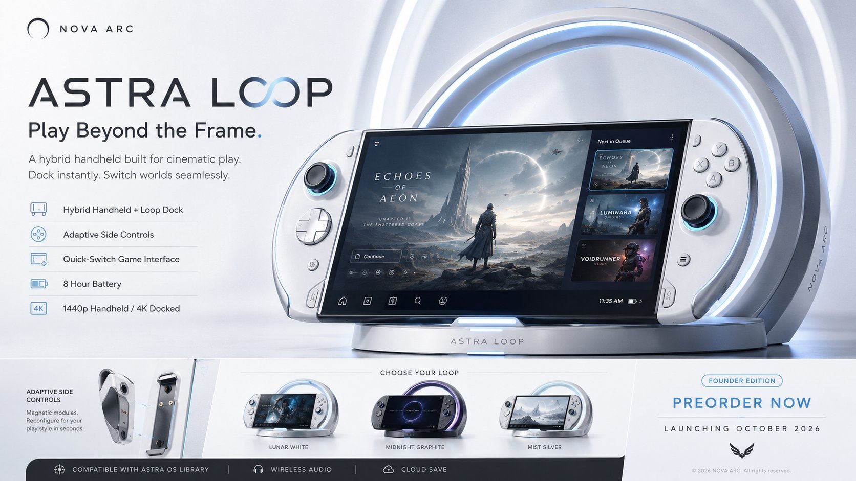
This page keeps the media, full prompt, and original source together so you can inspect the result first and decide whether the prompt is worth copying, saving, or comparing.
Case Insights
To make this page easier to search, cite, and reuse later, the case is also broken down into practical guidance about usage, visual cues, and prompt structure.
Best Fit Scenarios
- Use this as a ui & social screens benchmark when you need a fast style baseline before rewriting your own prompt.
- It is especially helpful if your target overlaps with Cinematic, Poster, UI and you want to judge the image result before tuning wording.
- Keep it as a control sample when you compare nearby prompt variants one variable at a time.
Visual Signals To Notice
- The clearest style signals here are Cinematic, Poster, UI, so those should usually stay in your first rewrite.
- The important layer is usually interface density, card hierarchy, and how the screen tells the story before you read small text.
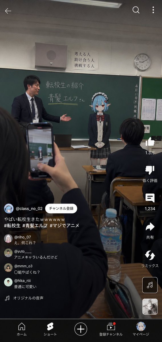
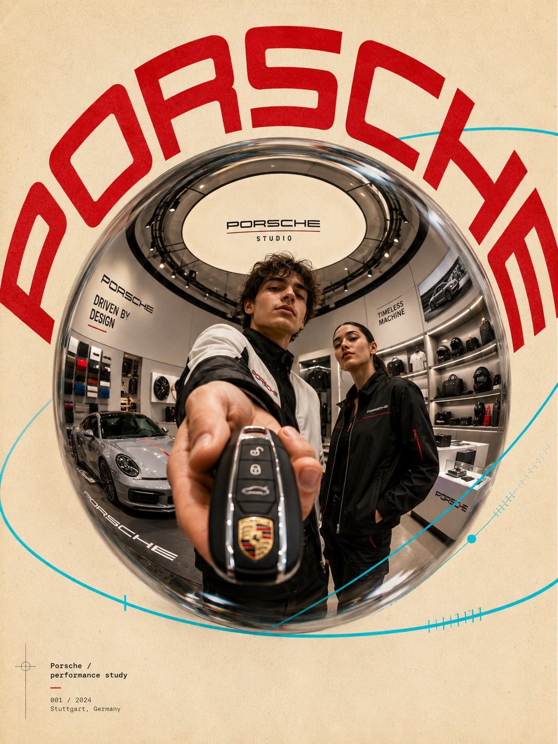
- This case keeps 2 media outputs, which makes it easier to check whether the style remains stable across multiple results.
How The Prompt Is Structured
- The prompt reads as a long, highly specified prompt, which is useful when you want to judge how much specificity this direction needs.
- Its keyword cluster is centered on Cinematic, Poster, UI, so you can usually keep that cluster while swapping subject, camera, layout, or copy details.
- A practical rewrite path is: keep the outcome, keep the strongest style cues, then replace only the subject and environment blocks.
Good Follow-up Questions
- What changes first if you keep Cinematic, Poster, UI but switch the subject matter?
- Which part of the result comes from section-level structure (UI & Social Screens) versus tag-level style cues?
- Which related cases in the same section give you a cleaner or more extreme variation of the same direction?
Full Prompt
Create a premium, highly believable Fictional Console / Handheld Ad for an imaginary gaming device called [DEVICE NAME]. The goal is to make the hardware feel like a real next-gen or cult-favorite launch: iconic, ownable, desirable, and instantly recognizable as a gaming product people would preorder, compare, and obsess over. The visual should feel like an official hardware campaign from a major platform brand or a breakout design-led company. Device details: - Device name: [DEVICE NAME] - Device type: [HANDHELD / HOME CONSOLE / HYBRID / CLOUD DEVICE / PORTABLE ARCADE / RETRO REVIVAL / MODULAR DEVICE] - Core concept: [WHAT MAKES THE DEVICE SPECIAL] - Brand identity: [PREMIUM / FUTURISTIC / PLAYFUL / MINIMAL / RETRO / HARDCORE / EXPERIMENTAL / LUXURY TECH] - Main fantasy: [WHAT PLAYERS FEEL WHEN THEY OWN IT] - Audience: [AUDIENCE] - Tone: [ASPIRATIONAL / HYPED / CLEAN / NOSTALGIC / TECHNICAL / BOLD / CINEMATIC / CULT] - Cultural vibe: [PLAYSTATION-LIKE / NINTENDO-LIKE / XBOX-LIKE / ANALOGUE-LIKE / STEAM-DECK-STYLE / Y2K TECH / RETRO FUTURISM / DESIGN NERD] - Reality level: [BELIEVABLE AAA HARDWARE / BELIEVABLE NICHE DEVICE / STYLIZED BUT REAL / DEADPAN FICTIONAL] Ad structure: Build the visual like an official gaming hardware campaign. Include sections such as: - hero device image - device name - short launch tagline - key feature callouts - optional screen UI preview - optional controller detail or modular attachment view - optional product colorways - optional release date or preorder cue - optional edition label - optional platform ecosystem or compatibility note - optional logo or company mark For the copy, include: - one strong hardware tagline - 1 to 3 concise support lines - wording that feels like a real product campaign - language that is sharp, premium, and commercially convincing - a balance between hype and restraint Include: - a strong product-name treatment - polished industrial-design focus - believable hardware hierarchy - premium launch positioning - clear product fantasy - realistic feature communication - strong commercial tech desire - instantly shareable device-campaign appeal Visual direction: - Make the ad feel like a real console reveal or launch campaign people would debate online and preorder instantly - Emphasize design, power, identity, and ownership fantasy - Balance product realism with strong entertainment-tech aspiration - Make it suitable for reveal campaigns, store banners, hardware launch posters, tech press images, or collector’s promo assets - The result should look like a genuine platform-device ad from a major or cult gaming company Art direction: - Style: [NEXT-GEN CONSOLE CAMPAIGN / PREMIUM HANDHELD AD / RETRO TECH REVEAL / CLEAN HARDWARE BILLBOARD / FUTURIST PRODUCT VISUAL / CULT DEVICE LAUNCH] - Color palette: [PALETTE] - Typography feel: [MINIMAL TECH SANS / SHARP FUTURIST TYPE / RETRO DIGITAL / CLEAN PREMIUM UI] - Material feel: [HARDWARE BILLBOARD / PRODUCT REVEAL POSTER / STORE BANNER / PRESS IMAGE / LAUNCH CAMPAIGN PANEL] - Lighting or image mood: [CLEAN STUDIO / DRAMATIC TECH GLOW / SOFT PREMIUM / HIGH-CONTRAST PRODUCT LIGHT / RETRO ELECTRONIC] - Background: [PURE COLOR FIELD / STUDIO VOID / GRADIENT / TECH STAGE / ARCHITECTURAL SPACE / SHADOW SURFACE] Composition: - Show the ad as one cohesive hardware-campaign image - Make the device, product name, and key launch message instantly readable - Use real consumer-tech ad hierarchy and industrial-design emphasis - Make the device feel iconic, collectible, and commercially real - Make the final output feel like a premium fake hardware campaign with viral potential Output quality: - ultra-detailed - visually structured - commercially believable - culturally fluent - polished industrial design styling - strong hierarchy and spacing - premium hardware-ad composition - instantly shareable visual concept Optional content blocks: - preorder now cue - color variants - docking system preview - compatibility badge - battery-life claim - launch lineup tease - ecosystem icon strip - limited edition mark - controller breakdown - screen feature callout Avoid: - generic gadget styling - weak industrial design - fake-looking feature claims - cluttered layout - random typography choices - amateur product-ad aesthetics - too much copy fighting the hardware - obvious parody unless intentionally chosen