Case Media
Case Notes
This page keeps the media, full prompt, and original source together so you can inspect the result first and decide whether the prompt is worth copying, saving, or comparing.
Case Insights
To make this page easier to search, cite, and reuse later, the case is also broken down into practical guidance about usage, visual cues, and prompt structure.
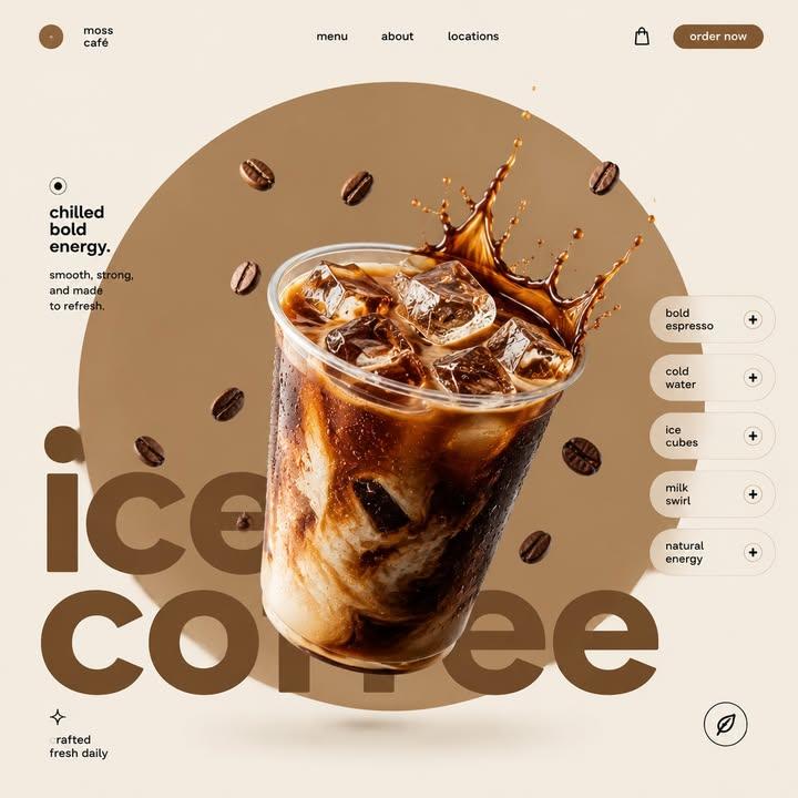
Best Fit Scenarios
- Use this as a ui & social screens benchmark when you need a fast style baseline before rewriting your own prompt.
- It is especially helpful if your target overlaps with Cinematic, Fashion, Poster and you want to judge the image result before tuning wording.
- Keep it as a control sample when you compare nearby prompt variants one variable at a time.
Visual Signals To Notice
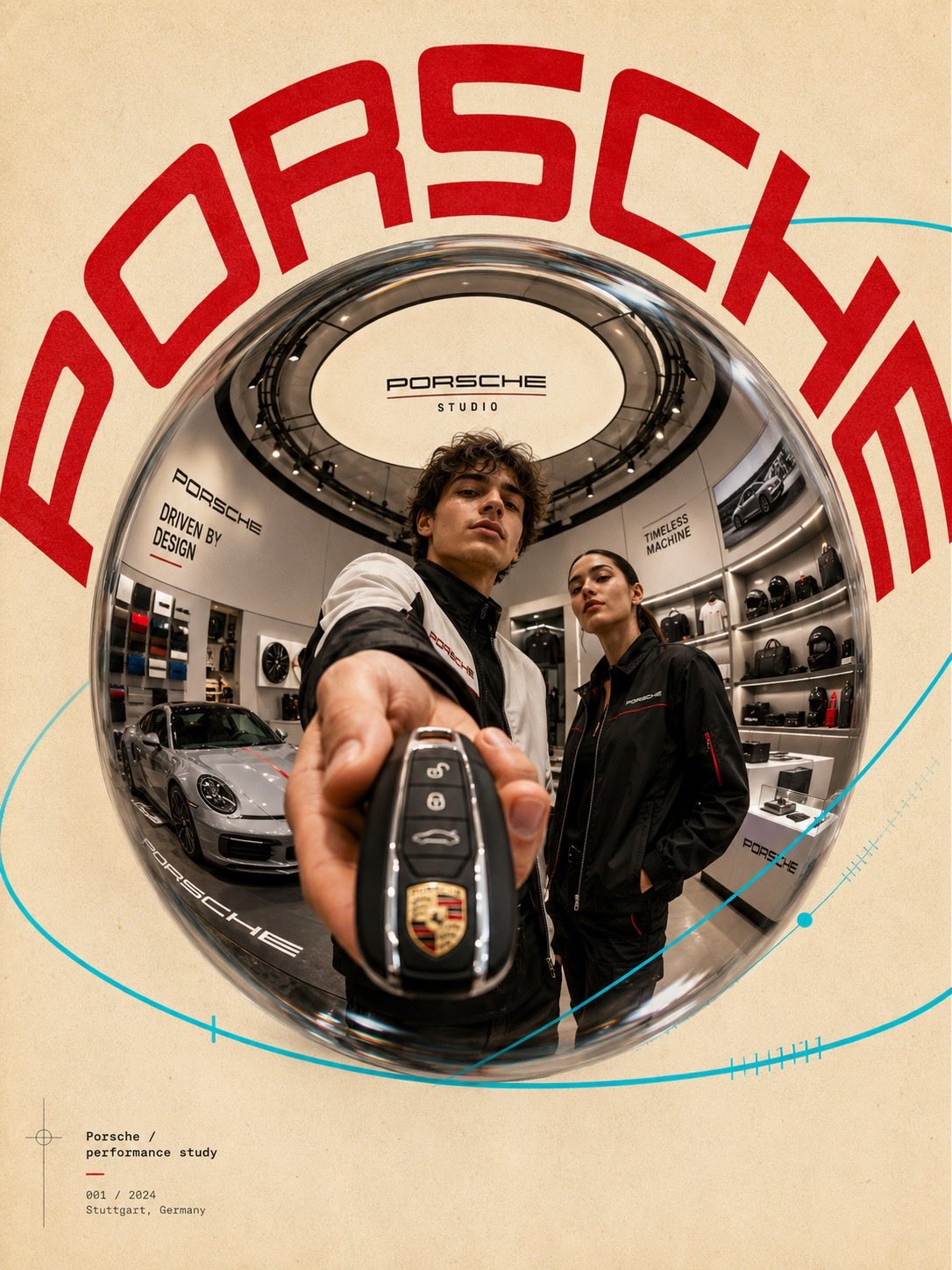
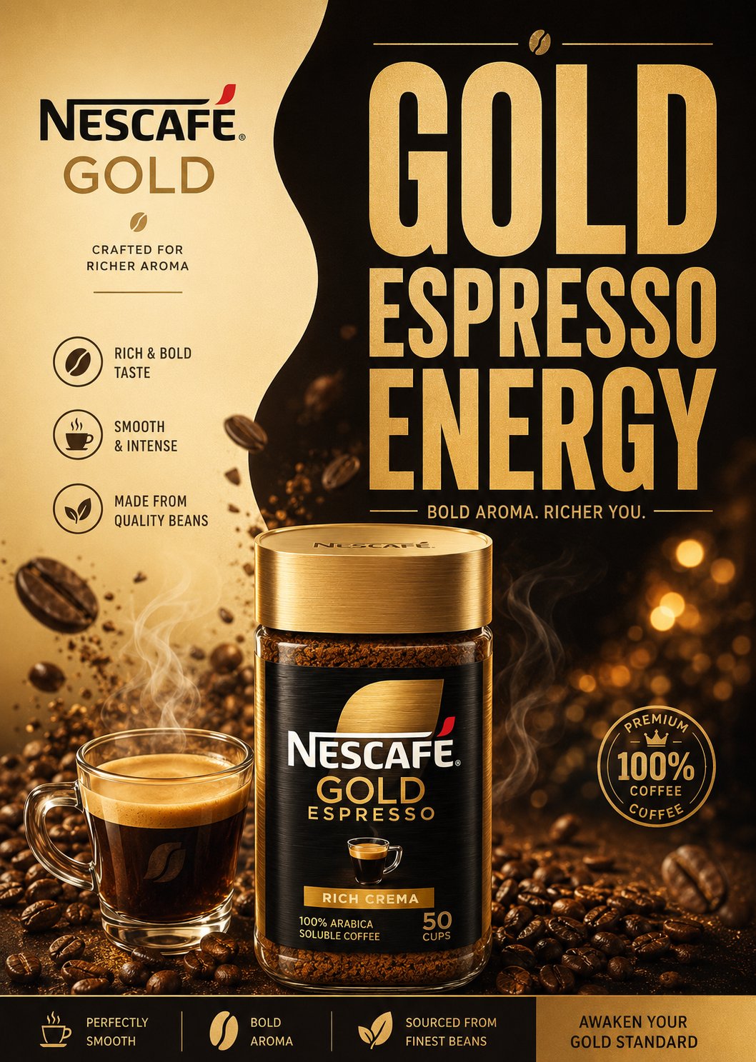
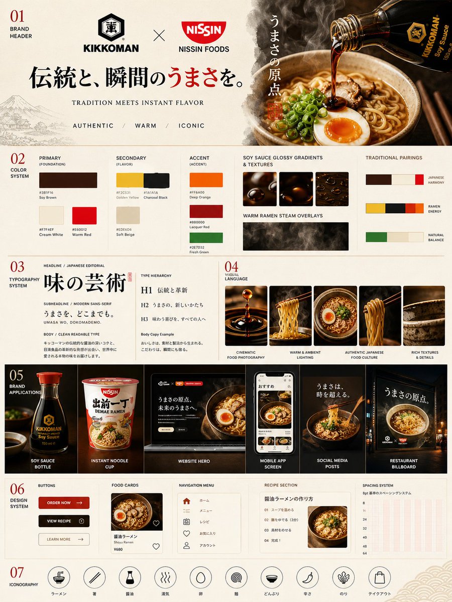
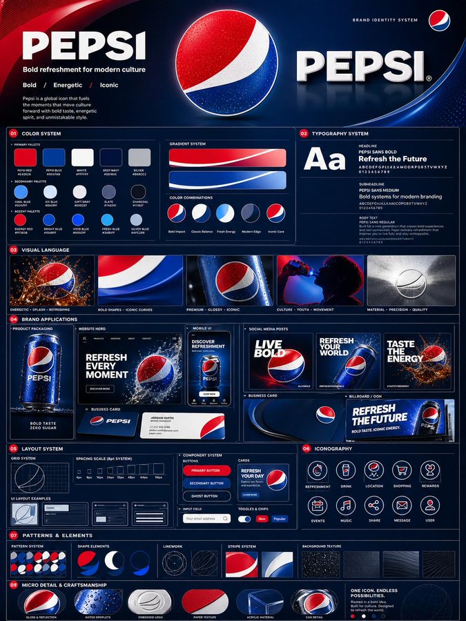
- The clearest style signals here are Cinematic, Fashion, Poster, so those should usually stay in your first rewrite.
- The important layer is usually interface density, card hierarchy, and how the screen tells the story before you read small text.
- This case keeps 2 media outputs, which makes it easier to check whether the style remains stable across multiple results.
How The Prompt Is Structured
- The prompt reads as a long, highly specified prompt, which is useful when you want to judge how much specificity this direction needs.
- Its keyword cluster is centered on Cinematic, Fashion, Poster, so you can usually keep that cluster while swapping subject, camera, layout, or copy details.
- A practical rewrite path is: keep the outcome, keep the strongest style cues, then replace only the subject and environment blocks.
Good Follow-up Questions
- What changes first if you keep Cinematic, Fashion, Poster but switch the subject matter?
- Which part of the result comes from section-level structure (UI & Social Screens) versus tag-level style cues?
- Which related cases in the same section give you a cleaner or more extreme variation of the same direction?
Full Prompt
[Matcha Latte] STYLE & ART DIRECTION: Modern minimalist food advertising aesthetics, Swiss-style advertising composition, premium restaurant social media branding, editorial design for an FMCG campaign, visuals for startup food brands, Pinterest-style food poster aesthetics, playful geometric advertising structure, modern in-app branding style, minimalist luxury restaurant marketing. MAIN OBJECT: Hyper-realistic food hero placed in the center of the composition, striking premium food photography design, floating or suspended presentation, realistic glossy textures, detailing of fresh ingredients, mouth-watering commercial presentation, studio-quality dish rendering, premium restaurant advertising campaign atmosphere. LAYOUT & COMPOSITION: Maintain the EXACT composition structure as sampled: large, rounded organic cream background centered on a vibrant full-color backdrop, large, lowercase type placed behind the protagonist and the hero's food object positioned in the center, overlapping, small branding/navigation strip aligned at the top, short editorial text block positioned on the left, floating rounded ingredient or flavor labels in the UI aligned vertically on the right, minimal decorative micro-icons, clean asymmetrical spacing, large breakout room, premium minimalist style hierarchy, social media poster composition. Typography: Large, bold typeface with rounded lowercase letters, modern geometric sans-serif font system, minimal supporting text, clear typography hierarchy for emerging brands, soft, rounded commercial lettering, large-scale typography treatment hidden behind objects. DEPTH AND LIGHT: Soft premium studio lighting, high-quality food highlights, realistic soft shadows, subtle glossy reflections, cinematic commercial lighting, highly detailed texture rendering, high-quality depth separation. ADDITIONAL DESIGN DETAILS: Rounded pill-shaped labels, small plus icons, minimal floating elements in the UI, app-like composition, fresh ingredient garnish, soft shadow blending, modern food delivery branding system, clean visuals, minimal geometric balance. COLOR PALETTE: [PRIMARY BRAND COLOR], cream/off-white, warm accent tones, high-contrast food colors, minimal black typography accents, a modern premium commercial palette. Quality: Ultra-high resolution, Behance-level food ad quality, 8k commercial rendering, Pinterest-style restaurant ad campaign design, premium FMCG branding aesthetics, professional art direction, high-quality editorial food poster.