Case Media
Case Notes
This page keeps the media, full prompt, and original source together so you can inspect the result first and decide whether the prompt is worth copying, saving, or comparing.
Case Insights
To make this page easier to search, cite, and reuse later, the case is also broken down into practical guidance about usage, visual cues, and prompt structure.
Best Fit Scenarios
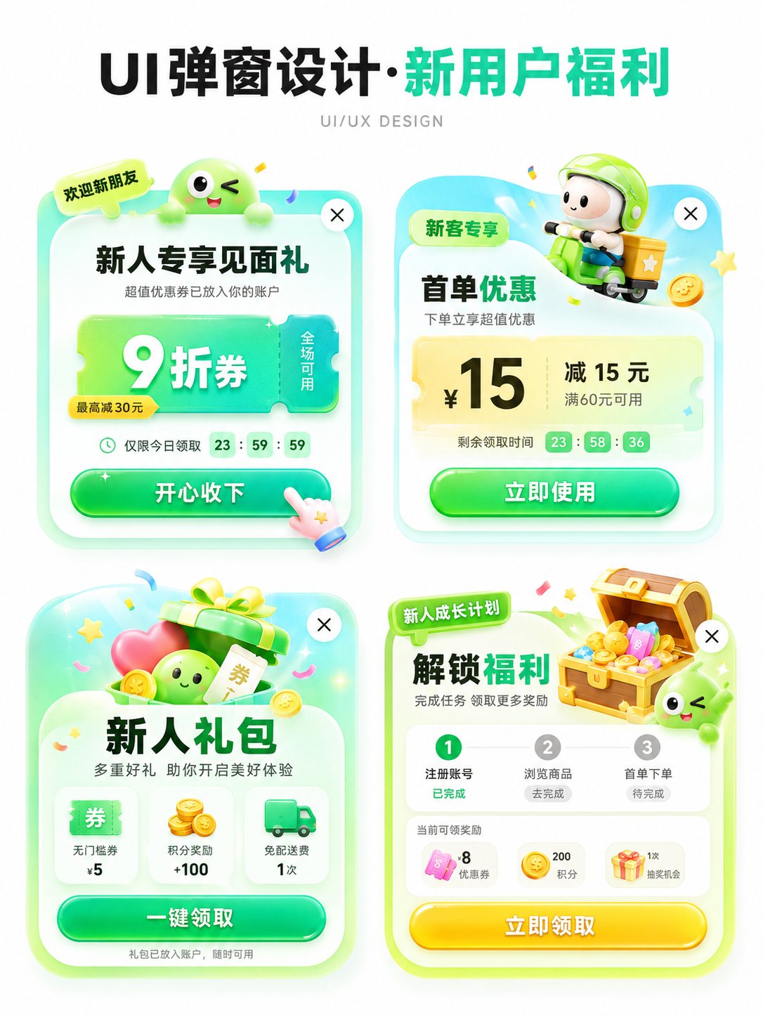
- Use this as a ui & social screens benchmark when you need a fast style baseline before rewriting your own prompt.
- It is especially helpful if your target overlaps with Poster, Illustration, UI and you want to judge the image result before tuning wording.
- Keep it as a control sample when you compare nearby prompt variants one variable at a time.
Visual Signals To Notice
- The clearest style signals here are Poster, Illustration, UI, so those should usually stay in your first rewrite.
- The important layer is usually interface density, card hierarchy, and how the screen tells the story before you read small text.
- This case keeps 2 media outputs, which makes it easier to check whether the style remains stable across multiple results.
How The Prompt Is Structured
- The prompt reads as a long, highly specified prompt, which is useful when you want to judge how much specificity this direction needs.
- Its keyword cluster is centered on Poster, Illustration, UI, so you can usually keep that cluster while swapping subject, camera, layout, or copy details.
- A practical rewrite path is: keep the outcome, keep the strongest style cues, then replace only the subject and environment blocks.
Good Follow-up Questions
- What changes first if you keep Poster, Illustration, UI but switch the subject matter?
- Which part of the result comes from section-level structure (UI & Social Screens) versus tag-level style cues?
- Which related cases in the same section give you a cleaner or more extreme variation of the same direction?
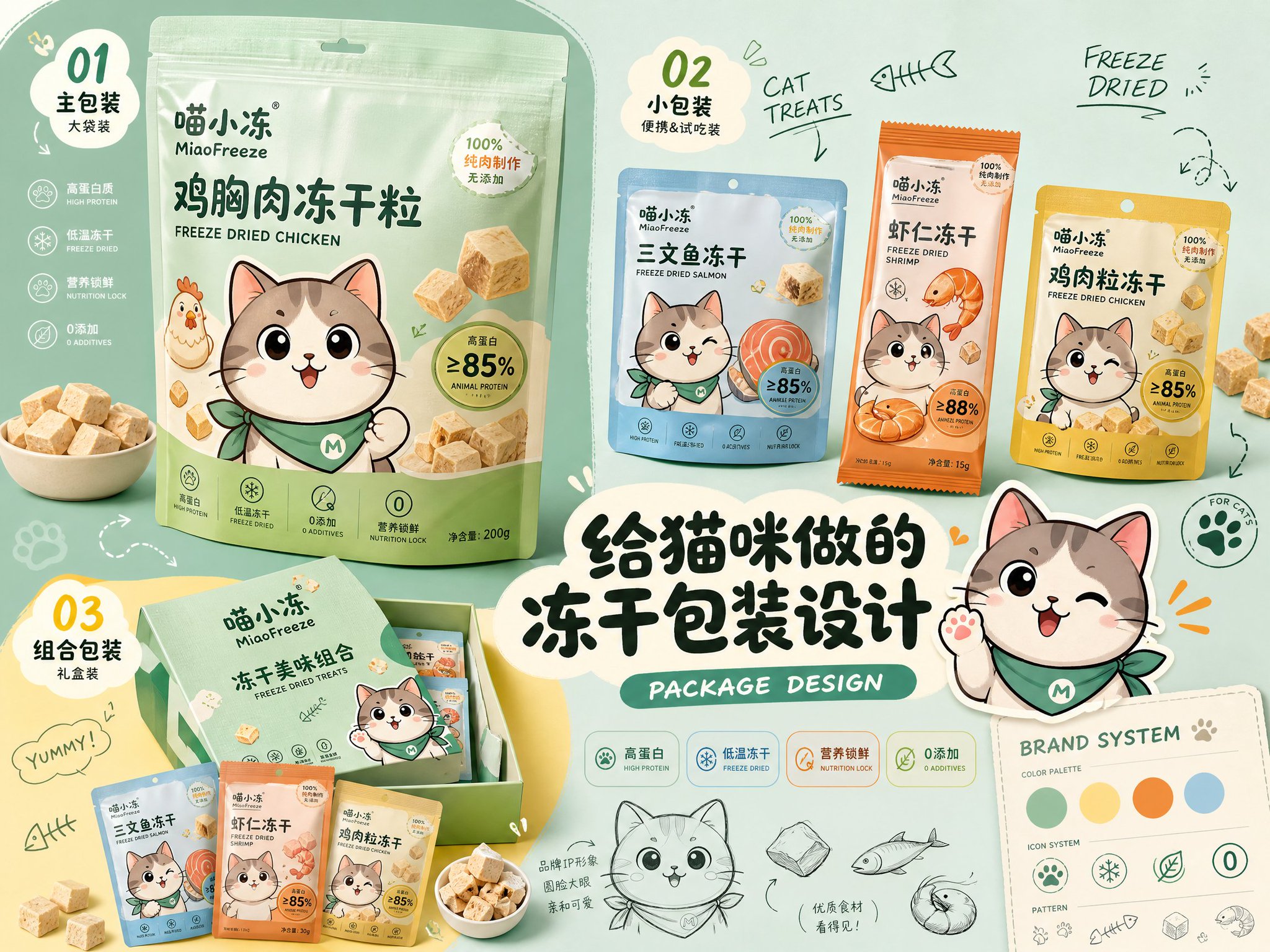
Full Prompt
Please generate a horizontal 4:3 high-definition 'Brand Packaging Design Proposal Quick View'. 【Theme】: 【Fill in product theme】 【Brand Name】: 【Fill in brand name】 【Series Name】: 【Fill in series name】 【Product Content】: 【Fill in main product + 3 sub-products / SKU】 【Style Direction】: 【Cute and Childlike / Youthful and Energetic / Light Lifestyle / Trendy and Sweet / Healthy and Natural / Pet-friendly / Retro Food Style / Premium Light Brand Feel】 【Main Color Tone】: 【Fill in main color】 【Auxiliary Color】: 【Fill in auxiliary color】 【IP / Illustration Elements】: 【Fill in character, mascot, ingredients or graphic elements】 【Main Headline Copy】: 【Fill in title】 The image adopts a structure of 'large area main color background + irregular color block base + multiple packaging mockup collage + proposal board layout'. Needs to include: 1. One largest main packaging, as the primary visual center 2. 2–3 sub-packaging / SKUs, showing series extension 3. A group of auxiliary packaging, sets, gift boxes, or tasting packs 4. Product-related ingredients, props, or symbolic elements 5. Original IP / mascot, which can appear on packaging or as screen stickers 6. A striking Chinese main title in the center 7. 01 / 02 / 03 numbered tags 8. A small amount of English handwriting, such as PACKAGE DESIGN, BRAND SYSTEM, NEW FLAVOR 9. A small amount of hand-drawn sketches, arrows, annotations, line drawings, cloud text boxes The overall effect should look like a quick preview of a real packaging design proposal: With a sense of branding, series, portfolio, and social media shareability. Packaging needs to have real printing texture, cardboard / plastic bag / cup / can materials, clear edges, natural perspective, and unified lighting. Avoid: Do not use real brand trademarks, do not use garbled text, do not deform packaging, do not use low resolution, do not use cheap e-commerce promotion style, do not pile all packaging together, do not make it into an ordinary product poster.