Case Media
Case Notes
This page keeps the media, full prompt, and original source together so you can inspect the result first and decide whether the prompt is worth copying, saving, or comparing.
Case Insights
To make this page easier to search, cite, and reuse later, the case is also broken down into practical guidance about usage, visual cues, and prompt structure.
Best Fit Scenarios
- Use this as a ui & social screens benchmark when you need a fast style baseline before rewriting your own prompt.
- It is especially helpful if your target overlaps with Poster, UI, Screenshot and you want to judge the image result before tuning wording.
- Keep it as a control sample when you compare nearby prompt variants one variable at a time.
Visual Signals To Notice
- The clearest style signals here are Poster, UI, Screenshot, so those should usually stay in your first rewrite.
- The important layer is usually interface density, card hierarchy, and how the screen tells the story before you read small text.
- This case keeps 2 media outputs, which makes it easier to check whether the style remains stable across multiple results.
How The Prompt Is Structured
- The prompt reads as a long, highly specified prompt, which is useful when you want to judge how much specificity this direction needs.
- Its keyword cluster is centered on Poster, UI, Screenshot, so you can usually keep that cluster while swapping subject, camera, layout, or copy details.
- A practical rewrite path is: keep the outcome, keep the strongest style cues, then replace only the subject and environment blocks.
Good Follow-up Questions
- What changes first if you keep Poster, UI, Screenshot but switch the subject matter?
- Which part of the result comes from section-level structure (UI & Social Screens) versus tag-level style cues?
- Which related cases in the same section give you a cleaner or more extreme variation of the same direction?
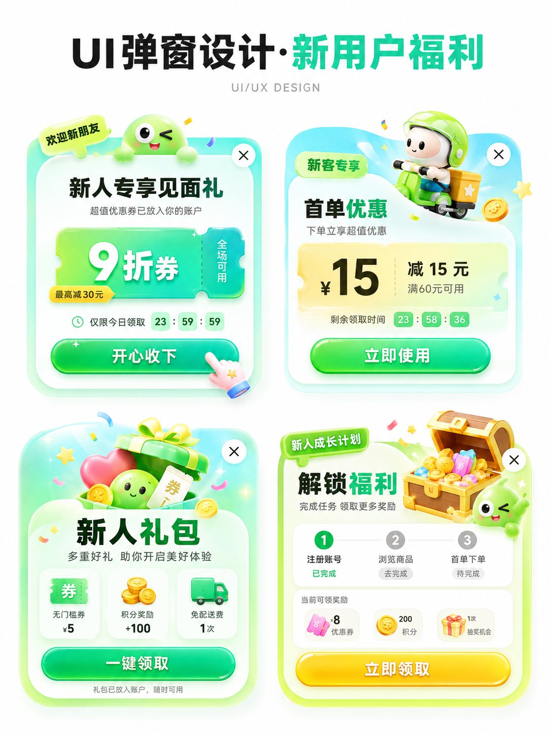
Full Prompt
Please generate an APP operation pop-up design display image in [Aspect Ratio], with the theme [Theme]. The background should be pure white, with an overall clean and concise design proposal presentation style. The layout is a 2x2 grid, showing 4 different pop-up schemes in one image. All four pop-ups revolve around the same theme, but their entry points, benefit points, icon elements, and information structures are slightly different. Add a clear and eye-catching main title [Main Title] at the top, and the subtitle can be 'UI/UX DESIGN' or similar design display text. [Theme] can be replaced with: New User Benefits / Version Upgrade / 618 Promotion / Membership Opening / Sign-in Reward / Festival Event / Invitation Gift / Limited Time Offer / Growth Task / Points Exchange. [Main Color Tone] can be replaced with: Green series / Blue-purple series / Red-orange-gold series / Black-gold series / Pink-purple series / Fresh candy color. [Style Keywords] can be replaced with: High click desire, Light skeuomorphism, 3D cartoon, Gummy texture, Operational activity pop-up, APP benefit pop-up, Gamified operation visual, Rounded corner card, Soft shadow, Gradient button. [Four sub-scheme directions] can be replaced with: 1. [Scheme 1] 2. [Scheme 2] 3. [Scheme 3] 4. [Scheme 4] Each pop-up card must have the structural sense of a real APP pop-up, including: 1. Top label or scene identifier (such as 'Limited Time Offer', 'Exclusive for New Customers', 'Version Benefits', 'Upgrade Experience', etc.) 2. Core title area, highlighting the activity theme or benefit points. 3. Main equity area, expressed with large numbers, large discounts, and large selling points, such as coupon amounts, discounts, membership prices, upgrade rights, red envelope amounts, task rewards, etc. 4. Auxiliary description information, such as usage conditions, limited-time countdown, scope of application, growth steps, reward content, etc. 5. Obvious CTA button, such as 'Receive Now', 'Accept with Joy', 'Open Now', 'Update Now', 'Go Experience', 'Buy Now', etc. 6. Keep the close button in the top right corner to enhance the sense of a real UI pop-up. The four pop-ups need a unified visual system, but each small card should have its own variations: - Copy structure can be different - Decorative graphics can be different - Icons can be different - Benefit points can be different - Component layout can be slightly different But overall they still belong to 4 design schemes under the same theme. Visually, please strengthen the following characteristics: - White background display, clean page, no complex background - Vertical design display image, suitable for social media publishing - 2x2 layout is clear, with sufficient white space between the four cards - Pop-ups use rounded corner cards, soft shadows, and slight glowing edges - Large buttons should have a strong sense of clickability - Overall colors are bright but not messy - Use an appropriate amount of 3D small elements to enhance vitality, such as gift boxes, gold coins, red envelopes, shopping bags, rockets, crowns, membership cards, treasure chests, bells, megaphones, medals, cards and coupons, small mascots, etc. - Elements should serve the pop-up theme and not overshadow it. Layout requirements: - The top main title is eye-catching, suitable for a 'series cover' - The four pop-ups are centered to form a neat design display board - Information hierarchy is clear: see the title first, then the four pop-ups - Each pop-up should look like a real, implementable APP operational interface reference rather than a common poster - Chinese text should be as concise and clear as possible, reducing excessively small characters and avoiding confusion caused by too much information - Maintain the texture of an 'AI visual proposal map', suitable for UI/UX inspiration reference, operational activity display, and product proposal sharing.