Case Media
Case Notes
This page keeps the media, full prompt, and original source together so you can inspect the result first and decide whether the prompt is worth copying, saving, or comparing.
Case Insights
To make this page easier to search, cite, and reuse later, the case is also broken down into practical guidance about usage, visual cues, and prompt structure.
Best Fit Scenarios
- Use this as a ui & social screens benchmark when you need a fast style baseline before rewriting your own prompt.
- It is especially helpful if your target overlaps with Poster, UI, Screenshot and you want to judge the image result before tuning wording.
- Keep it as a control sample when you compare nearby prompt variants one variable at a time.
Visual Signals To Notice
- The clearest style signals here are Poster, UI, Screenshot, so those should usually stay in your first rewrite.
- The important layer is usually interface density, card hierarchy, and how the screen tells the story before you read small text.
- This case keeps 2 media outputs, which makes it easier to check whether the style remains stable across multiple results.
How The Prompt Is Structured
- The prompt reads as a long, highly specified prompt, which is useful when you want to judge how much specificity this direction needs.
- Its keyword cluster is centered on Poster, UI, Screenshot, so you can usually keep that cluster while swapping subject, camera, layout, or copy details.
- A practical rewrite path is: keep the outcome, keep the strongest style cues, then replace only the subject and environment blocks.
Good Follow-up Questions
- What changes first if you keep Poster, UI, Screenshot but switch the subject matter?
- Which part of the result comes from section-level structure (UI & Social Screens) versus tag-level style cues?
- Which related cases in the same section give you a cleaner or more extreme variation of the same direction?
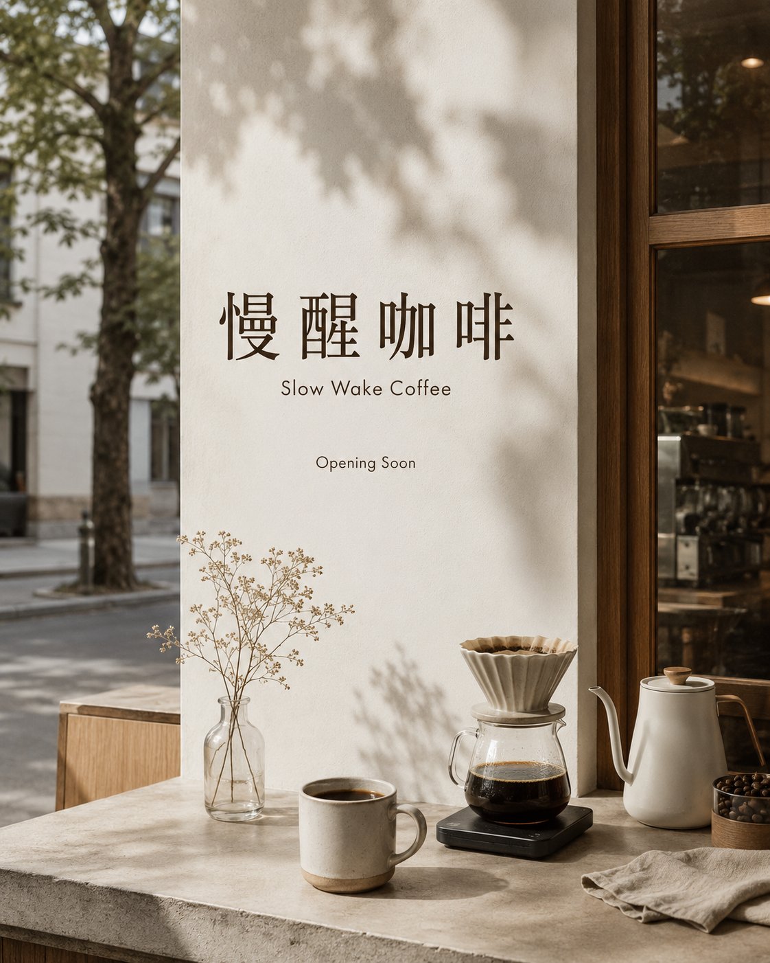
Full Prompt
Generate 4 pre-opening brand visual proposal images for a virtual boutique coffee shop. Brand Name: "慢醒咖啡" English Auxiliary Name: Slow Wake Coffee Brand Temperament: Early morning, slow life, city corner, handcrafted coffee, quiet but memorable, warm but restrained. Unified Visual Requirements: Use the same set of brand colors: cream, light coffee, dark brown, mist gray. The images should look like brand proposals, design mockups, or visual schemes before a real coffee shop opens. The overall style should be clean, with white space, a realistic sense of photography, and a boutique coffee shop quality. The Chinese brand name "慢醒咖啡" must be clearly readable. English is only for auxiliary information and must not overpower the main Chinese title. Please generate 4 independent images: 1. Opening Main Visual Poster Vertical poster composition, early morning city street corner coffee shop atmosphere, soft natural light. The image features a coffee cup, morning light, the outline of the shop door, a tabletop by the window, or handcrafted coffee tools. The main visual position clearly presents "慢醒咖啡". Auxiliary text: Slow Wake Coffee, Opening Soon. Do not look like a discount promotion poster. 2. Takeaway Cup and Coffee Bean Packaging Display a set of takeaway coffee cup and coffee bean packaging mockups. The cup body is cream or light coffee color, printed with "慢醒咖啡". The coffee bean packaging has a matte paper texture, using a combination of light coffee, dark brown, and cream. The scene is a wooden tabletop, mist gray background, early morning soft light. Text only appears as: 慢醒咖啡, Slow Wake Coffee, Handcrafted Coffee. 3. Store Menu Lightbox Real coffee shop interior scene, menu lightbox above the counter or on the wall. The lightbox has a cream background, dark brown text, and a mist gray frame. The top clearly displays "慢醒咖啡". The menu layout is concise, without full-screen text. Menu text only uses: Espresso Americano Latte Hand Brew Slow Wake Coffee 4. Social Media Promotion Image Square social media image, suitable for Xiaohongshu, Instagram, and WeChat Moments. The image includes a coffee cup, city early morning street corner, window light and shadows, brand color blocks, and concise layout. The Chinese brand name "慢醒咖啡" must clearly appear in the main visual position. Auxiliary text: Slow Wake Coffee, Opening Soon. Avoid: Do not use real brand logos. Do not use real-world brand elements like Starbucks, Blue Bottle, % Arabica, etc. Do not have full-screen text. Do not have garbled code. Do not have incorrect Chinese. Do not have meaningless English. Do not have a promotional poster feel. Do not have discounts, offers, or buy one get one free. Do not use random collages. Do not let the style of the four images be disjointed. Do not let the brand name be deformed, missing characters, or written incorrectly.