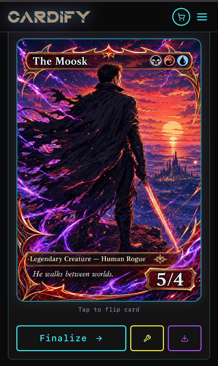
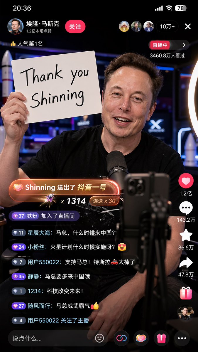
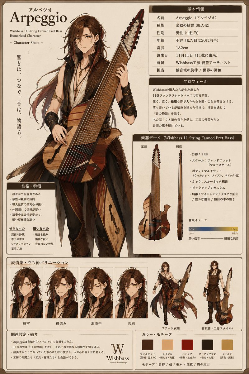
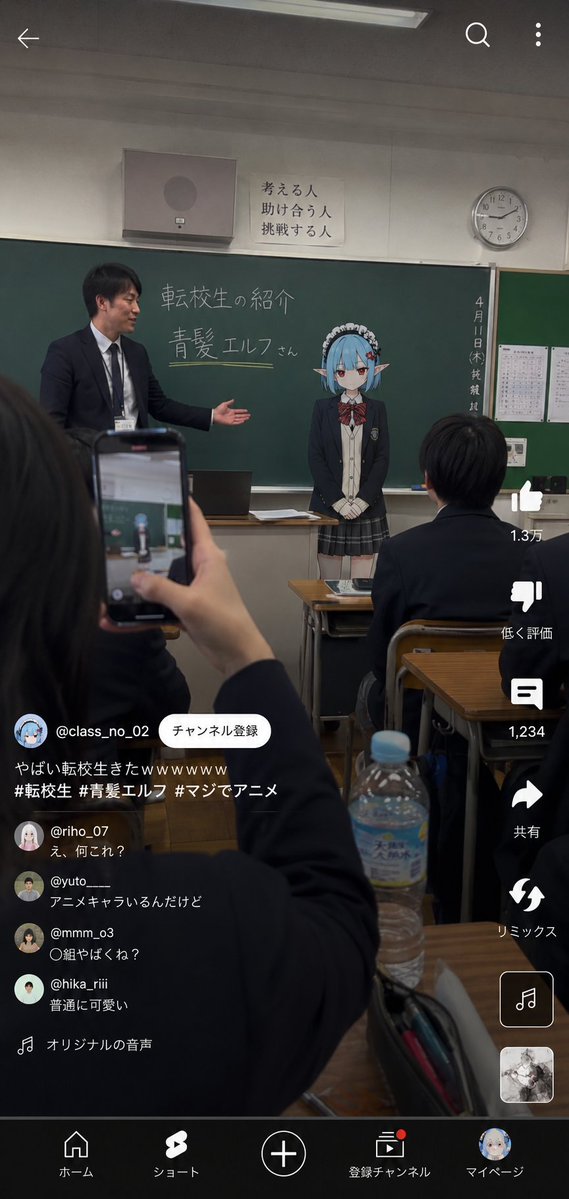
Case Media
Case Notes
This page keeps the media, full prompt, and original source together so you can inspect the result first and decide whether the prompt is worth copying, saving, or comparing.
Case Insights
To make this page easier to search, cite, and reuse later, the case is also broken down into practical guidance about usage, visual cues, and prompt structure.
Best Fit Scenarios
- Use this as a ui & social screens benchmark when you need a fast style baseline before rewriting your own prompt.
- It is especially helpful if your target overlaps with Neon, Cinematic, Illustration and you want to judge the image result before tuning wording.
- Keep it as a control sample when you compare nearby prompt variants one variable at a time.
Visual Signals To Notice
- The clearest style signals here are Neon, Cinematic, Illustration, so those should usually stay in your first rewrite.
- The important layer is usually interface density, card hierarchy, and how the screen tells the story before you read small text.
- This case keeps 2 media outputs, which makes it easier to check whether the style remains stable across multiple results.
How The Prompt Is Structured
- The prompt reads as a long, highly specified prompt, which is useful when you want to judge how much specificity this direction needs.
- Its keyword cluster is centered on Neon, Cinematic, Illustration, so you can usually keep that cluster while swapping subject, camera, layout, or copy details.
- A practical rewrite path is: keep the outcome, keep the strongest style cues, then replace only the subject and environment blocks.
Good Follow-up Questions
- What changes first if you keep Neon, Cinematic, Illustration but switch the subject matter?
- Which part of the result comes from section-level structure (UI & Social Screens) versus tag-level style cues?
- Which related cases in the same section give you a cleaner or more extreme variation of the same direction?
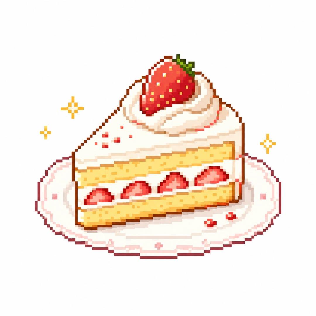
Full Prompt
Create a cute and stylish pixel-art illustration based on the uploaded image in the style of: “cute retro pixel food icon + cozy game asset + high quality pixel art” Core Goals: - Automatically analyze the main subject of the uploaded image - If the subject is food, naturally include related elements such as plates, trays, cups, packaging, containers, holders, or side props - Reinterpret the main subject into an adorable and delicious-looking pixel-art food illustration - Avoid generic AI illustration aesthetics completely - The final result should feel like a real indie-game food item, retro game icon, or collectible pixel sticker - Maintain a warm, cozy, charming atmosphere - Every pixel should remain crisp, intentional, and high-quality - Simplify food textures and colors in a cute and readable way - The artwork should feel like a “save-worthy pixel food image” - Automatically choose a minimal solid-color background that best complements the food - Use a centered icon-style composition - Never use overly detailed or complex backgrounds - Keep the composition simple but visually rich with refined pixel details - Small decorative elements such as sparkles, crumbs, sauce droplets, or tiny accents may be added naturally - The result may resemble a game UI asset, inventory icon, SNS profile image, emoji, or retro game collectible item Style Direction: - retro pixel food art - cozy pixel aesthetic - indie game food asset - cute snack icon - warm retro palette - tiny pixel shading - kawaii pixel illustration - nostalgic handheld game vibe - clean pixel outline - adorable food sprite - soft retro gaming mood - minimal pixel composition Pixel Rules: - Pixels must appear large, sharp, and clearly visible - Never create blurry upscale-style fake pixel art - Minimize anti-aliasing - Keep pixel edges crisp and clean - The artwork should feel handcrafted in a real pixel editor - Avoid soft brush textures - Even if the resolution appears low, the final image itself must remain clean and sharp Color Rules: - Automatically extract the food’s dominant colors to build the palette - Use a limited retro-style color palette - Avoid excessive neon tones, HDR effects, or glossy rendering - Prioritize warm and cute color combinations - Use a white background that makes the food stand out clearly Composition Rules: - Focus on a centered food-icon composition - Ensure the food remains large, readable, and visually clear - Keep spacing minimal and clean - Additional surrounding elements should remain small accent details only - Tiny pixel sparkles, hearts, crumbs, or sauce drops are acceptable IMPORTANT: - Absolutely avoid generic AI-generated illustration aesthetics - No blurry upscale pixel effect - No 3D-rendered appearance - No complex backgrounds - Avoid dramatic shadows or cinematic lighting - Maintain clean and polished pixel structure without broken pixels - The result must resemble an actual game sprite or collectible pixel asset - Keep the food silhouette cute, readable, and visually iconic CHARACTER RULES: - Never add eyes, mouths, facial expressions, or human-like features to the food - No anthropomorphic food style - No kawaii-face food characters - No mascot-like appearance - No living-food character designs - No “object with face” style - Keep the food cute through shape, color, texture, and stylization only - Preserve the appearance of real food while making it visually charming - The food should feel like a game item, not a living creature The final image ratio must always remain 1:1.