Case Media
Case Notes
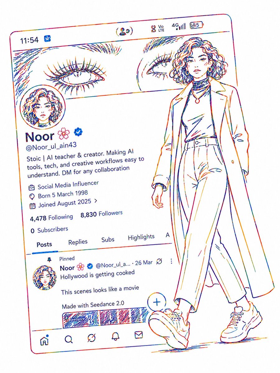
This page keeps the media, full prompt, and original source together so you can inspect the result first and decide whether the prompt is worth copying, saving, or comparing.
Case Insights
To make this page easier to search, cite, and reuse later, the case is also broken down into practical guidance about usage, visual cues, and prompt structure.
Best Fit Scenarios
- Use this as a ui & social screens benchmark when you need a fast style baseline before rewriting your own prompt.
- It is especially helpful if your target overlaps with Neon, Portrait, Fashion and you want to judge the image result before tuning wording.
- Keep it as a control sample when you compare nearby prompt variants one variable at a time.
Visual Signals To Notice
- The clearest style signals here are Neon, Portrait, Fashion, so those should usually stay in your first rewrite.
- The important layer is usually interface density, card hierarchy, and how the screen tells the story before you read small text.
- This case keeps 2 media outputs, which makes it easier to check whether the style remains stable across multiple results.
How The Prompt Is Structured
- The prompt reads as a long, highly specified prompt, which is useful when you want to judge how much specificity this direction needs.
- Its keyword cluster is centered on Neon, Portrait, Fashion, so you can usually keep that cluster while swapping subject, camera, layout, or copy details.
- A practical rewrite path is: keep the outcome, keep the strongest style cues, then replace only the subject and environment blocks.
Good Follow-up Questions
- What changes first if you keep Neon, Portrait, Fashion but switch the subject matter?
- Which part of the result comes from section-level structure (UI & Social Screens) versus tag-level style cues?
- Which related cases in the same section give you a cleaner or more extreme variation of the same direction?
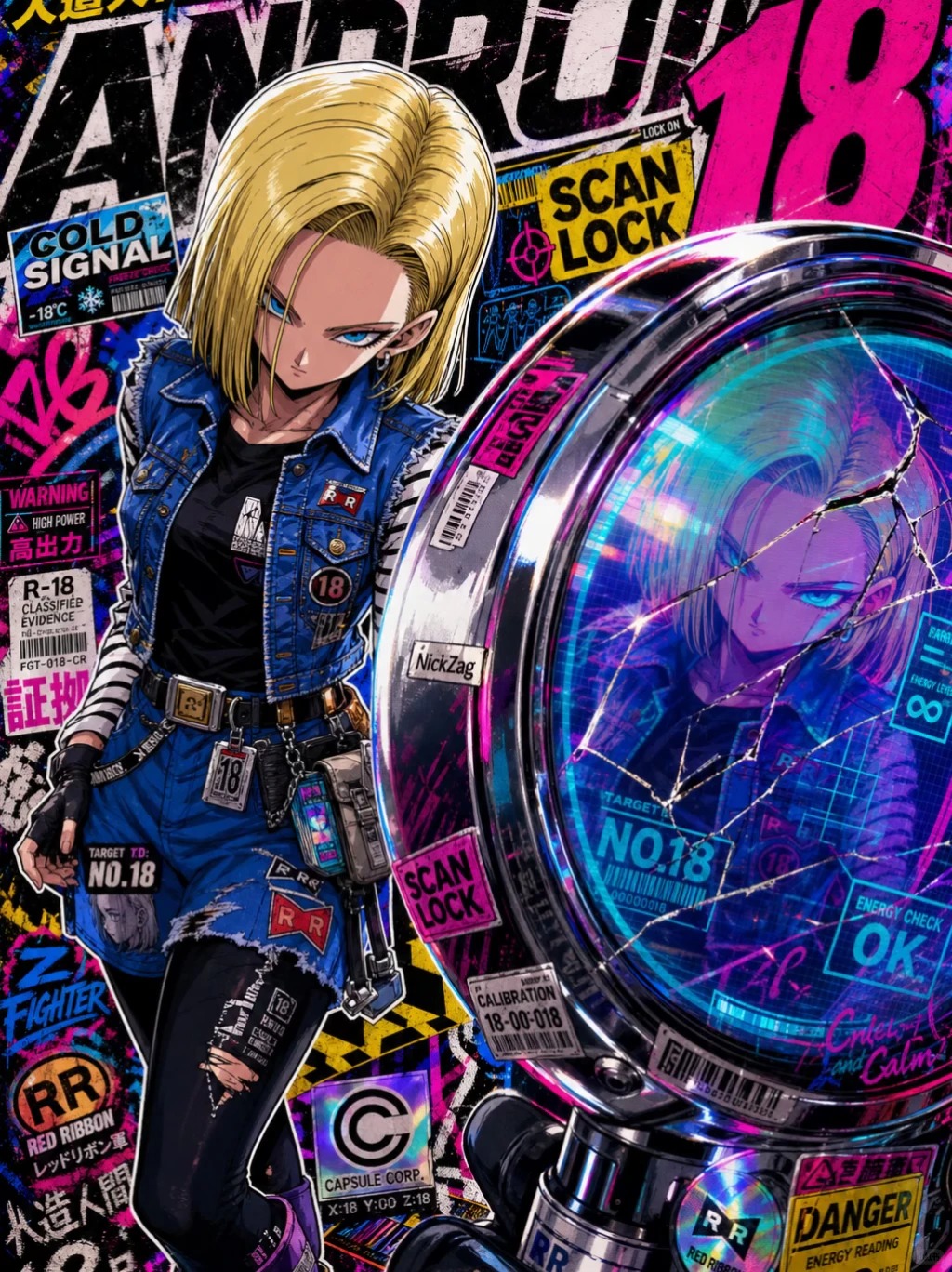
Full Prompt
Cyberpunk anime character poster, Android 18 / Artificial Human No. 18 theme, vertical collector card composition. Short blonde hair, blue eyes, cold and confident expression, wearing blue techwear short jacket, black cropped top, leather miniskirt, metal belt, chains, high-top techwear boots, highlighting slender figure and high fashion sense. Character stands in a fashion magazine pose, one hip tilted, one leg forward creating perspective, hand pulling the collar, cool and lazy posture. Background is a high-density cyberpunk street collage: neon pink, electric blue, strong black and white contrast, torn stickers, warning labels, barcodes, Japanese signs, English titles, Red Ribbon Army logo, ANDROID 18, NO.18, SCAN LOCK, TARGET ACQUIRED, DANGER, WARNING and other text. Beside her is a large metal scanning device, displaying blue-purple holographic UI, No. 18 portrait, scanning grid, energy readings. Style is high-end Japanese anime illustration, game character card, futuristic scanning interface, street.