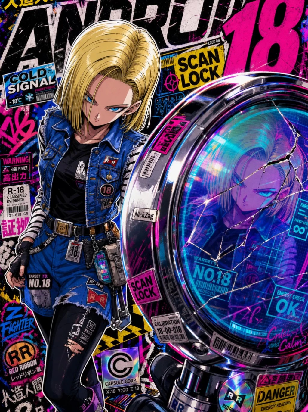
Case Media
Case Notes
This page keeps the media, full prompt, and original source together so you can inspect the result first and decide whether the prompt is worth copying, saving, or comparing.
Case Insights
To make this page easier to search, cite, and reuse later, the case is also broken down into practical guidance about usage, visual cues, and prompt structure.
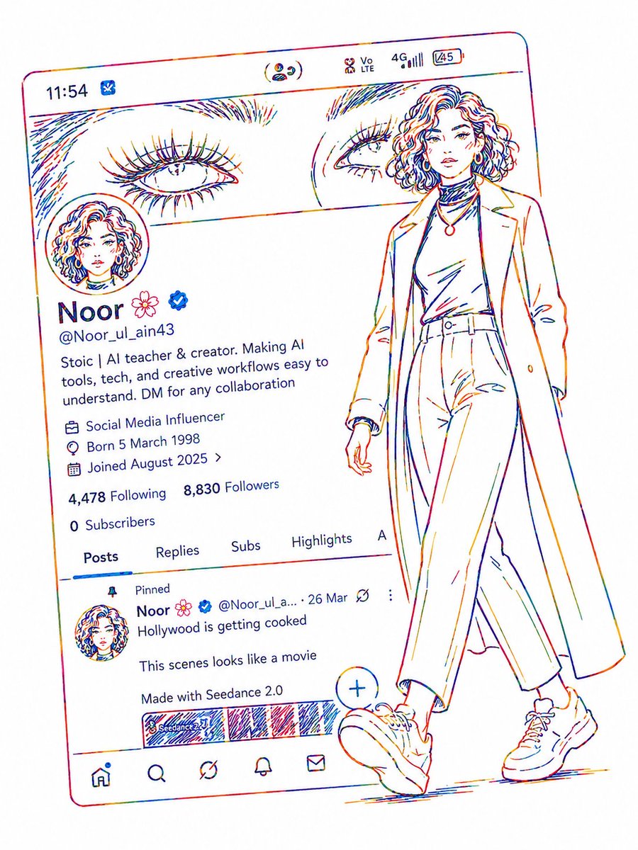
Best Fit Scenarios
- Use this as a ui & social screens benchmark when you need a fast style baseline before rewriting your own prompt.
- It is especially helpful if your target overlaps with Neon, Portrait, Fashion and you want to judge the image result before tuning wording.
- Keep it as a control sample when you compare nearby prompt variants one variable at a time.
Visual Signals To Notice
- The clearest style signals here are Neon, Portrait, Fashion, so those should usually stay in your first rewrite.
- The important layer is usually interface density, card hierarchy, and how the screen tells the story before you read small text.
- This case keeps one primary output, so the first image should be treated as the main visual reference.
How The Prompt Is Structured
- The prompt reads as a long, highly specified prompt, which is useful when you want to judge how much specificity this direction needs.
- Its keyword cluster is centered on Neon, Portrait, Fashion, so you can usually keep that cluster while swapping subject, camera, layout, or copy details.
- A practical rewrite path is: keep the outcome, keep the strongest style cues, then replace only the subject and environment blocks.
Good Follow-up Questions
- What changes first if you keep Neon, Portrait, Fashion but switch the subject matter?
- Which part of the result comes from section-level structure (UI & Social Screens) versus tag-level style cues?
- Which related cases in the same section give you a cleaner or more extreme variation of the same direction?
Full Prompt
Create a minimalist {argument name="visual style" default="rainbow neon line-art"} illustration of a stylish female AI creator profile page on a social media app interface. Use clean continuous colorful sketch strokes on a pure white background, inspired by modern contour drawing art. The female character should stand outside the profile frame in a confident walking pose wearing a {argument name="outfit details" default="long coat, high-neck top, loose pants, and sneakers"}. Add elegant facial line details, curly short hair, and fashion-model vibes. The profile UI should include a circular profile picture, username ‘{argument name="creator name" default="Noor"}’, verification badge, follower count, bio text, tabs, and a post preview. Add thin multicolor outlines only with no solid fill, maintaining a premium futuristic aesthetic. Ultra clean composition, minimal shadows, artistic neon pencil sketch style, modern social media poster design.