Case Media
Case Notes
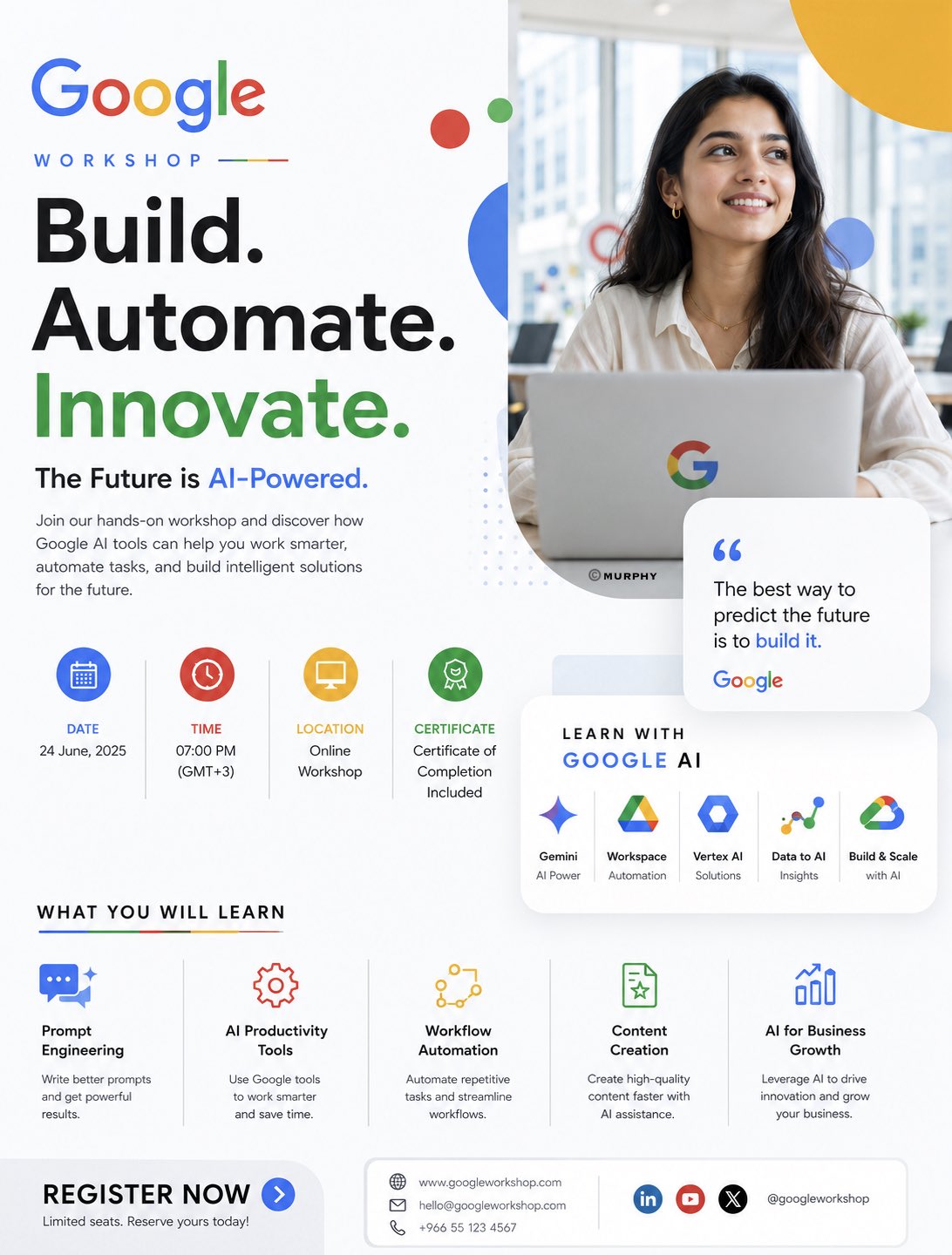
This page keeps the media, full prompt, and original source together so you can inspect the result first and decide whether the prompt is worth copying, saving, or comparing.
Case Insights
To make this page easier to search, cite, and reuse later, the case is also broken down into practical guidance about usage, visual cues, and prompt structure.
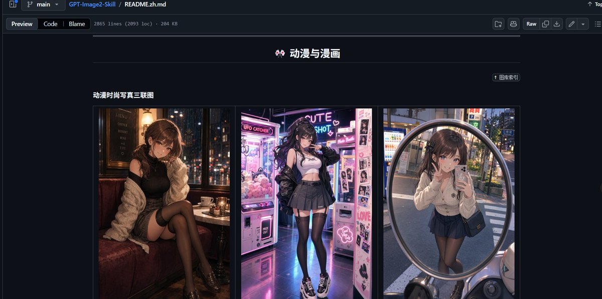
Best Fit Scenarios
- Use this as a ui & social screens benchmark when you need a fast style baseline before rewriting your own prompt.
- It is especially helpful if your target overlaps with Neon, Portrait, Cinematic and you want to judge the image result before tuning wording.
- Keep it as a control sample when you compare nearby prompt variants one variable at a time.
Visual Signals To Notice
- The clearest style signals here are Neon, Portrait, Cinematic, so those should usually stay in your first rewrite.
- The important layer is usually interface density, card hierarchy, and how the screen tells the story before you read small text.
- This case keeps 2 media outputs, which makes it easier to check whether the style remains stable across multiple results.
How The Prompt Is Structured
- The prompt reads as a long, highly specified prompt, which is useful when you want to judge how much specificity this direction needs.
- Its keyword cluster is centered on Neon, Portrait, Cinematic, so you can usually keep that cluster while swapping subject, camera, layout, or copy details.
- A practical rewrite path is: keep the outcome, keep the strongest style cues, then replace only the subject and environment blocks.
Good Follow-up Questions
- What changes first if you keep Neon, Portrait, Cinematic but switch the subject matter?
- Which part of the result comes from section-level structure (UI & Social Screens) versus tag-level style cues?
- Which related cases in the same section give you a cleaner or more extreme variation of the same direction?
Full Prompt
OPENAI WORKSHOP EDITORIAL AI SYSTEMS CAMPAIGN You are a senior Art Director specializing in luxury editorial technology branding and minimalist AI campaign design. Create a premium promotional poster for an OpenAI workshop using the uploaded logo (@logo) and trainer image (@trainer). IMPORTANT: The final result must feel like an official OpenAI creative campaign — NOT a generic workshop flyer. The design must resemble: OpenAI product launches, Sam Altman keynote aesthetics, modern AI operating systems, editorial technology magazines, minimal premium interface design. OPENAI BRAND DNA OpenAI is NOT: • playful • colorful • startup-heavy • corporate marketing OpenAI IS: • intelligent • quiet • editorial • minimal • futuristic • system-oriented • research-driven The atmosphere should feel: calm, premium, intentional, highly intelligent. CORE VISUAL DIRECTION Minimal editorial composition. Use: • asymmetrical layout • large negative space • restrained design system • subtle interface layering • premium typography hierarchy • calm futuristic atmosphere • clean modular structure Avoid: • colorful gradients everywhere • workshop-card overload • corporate icon grids • excessive holograms • startup-style compositions • Google-style playful layouts COLOR SYSTEM Primary colors: • warm white • off-white • soft ivory • graphite black • muted charcoal Accent colors: • subtle emerald green • soft sage glow • muted monochrome gradients Use color sparingly. The poster should feel: refined, quiet, editorial. BACKGROUND Minimal OpenAI-inspired environment. Use: • soft matte gradients • architectural whitespace • subtle interface blur • premium depth layering • gentle ambient shadows • restrained futuristic atmosphere Background should feel: clean, silent, intelligent. TRAINER TREATMENT The trainer should feel: • thoughtful • visionary • intelligent • modern • editorial Portrait style: • luxury magazine photography • soft cinematic grading • natural premium skin tones • calm facial expression • sophisticated styling Integration: • partially intersected by subtle interface panels • softly blended into composition • integrated with restrained glass structures NOT: • dramatic sci-fi integration • floating in holographic chaos • exaggerated VFX WARDROBE Minimal luxury styling: • monochrome clothing • black / off-white palette • subtle textures • modern founder aesthetic • quiet luxury fashion Think: OpenAI researcher × Apple keynote speaker × modern creative director. INTERFACE DESIGN Use subtle conversational AI elements: • minimal chat windows • soft modular cards • blurred interface systems • clean AI prompts • understated UI layers UI should feel: real, minimal, product-focused. Avoid: • neon dashboard overload • colorful AI graphics • excessive floating panels TYPOGRAPHY Typography is the main design language. Massive restrained headline: “OPENAI MASTERCLASS” Style: • oversized typography • editorial spacing • clean sans-serif • minimalist hierarchy • quiet confidence Subheadline: “Build Smarter Systems with AI” Typography should dominate composition elegantly. WORKSHOP DETAILS Keep details minimal and refined. Include: Date Time Online Session Certificate Included Topics: • Prompt Engineering • AI Workflows • Automation Systems • AI Productivity • Creative Intelligence CTA SECTION Minimal premium button: “REGISTER NOW” Style: • understated • monochrome • subtle emerald accent • premium material finish LIGHTING Soft editorial lighting. Use: • subtle directional light • calm shadows • soft highlights • restrained reflections • cinematic realism Avoid: • aggressive glow • heavy neon • dramatic cyberpunk lighting STYLE REFERENCES OpenAI Linear Notion Arc Browser Apple WWDC modern editorial technology magazines premium AI operating system branding