Case Media
Case Notes
This page keeps the media, full prompt, and original source together so you can inspect the result first and decide whether the prompt is worth copying, saving, or comparing.
Case Insights
To make this page easier to search, cite, and reuse later, the case is also broken down into practical guidance about usage, visual cues, and prompt structure.
Best Fit Scenarios
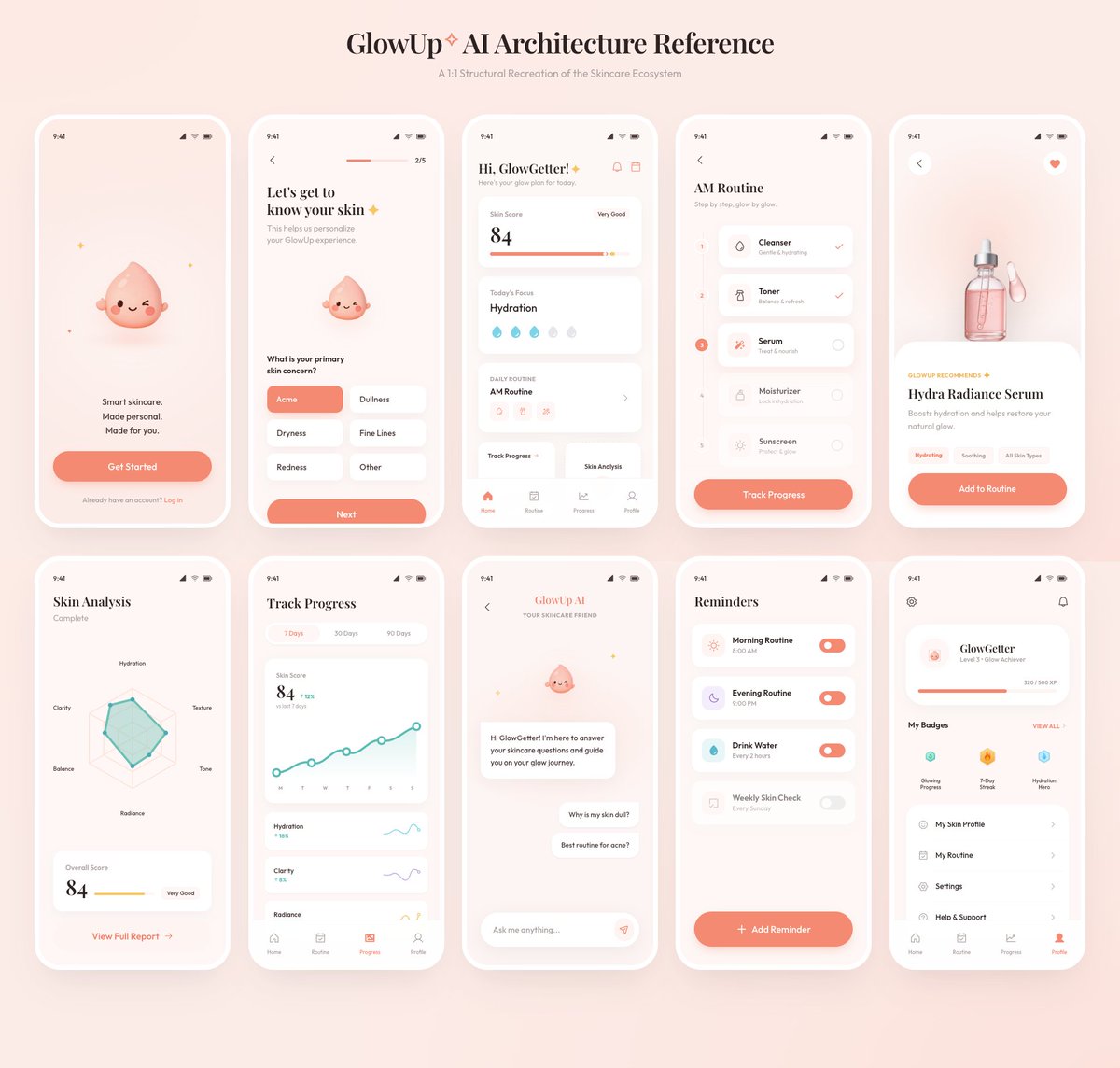
- Use this as a ui & social screens benchmark when you need a fast style baseline before rewriting your own prompt.
- It is especially helpful if your target overlaps with Poster, UI, Screenshot and you want to judge the image result before tuning wording.
- Keep it as a control sample when you compare nearby prompt variants one variable at a time.
Visual Signals To Notice
- The clearest style signals here are Poster, UI, Screenshot, so those should usually stay in your first rewrite.
- The important layer is usually interface density, card hierarchy, and how the screen tells the story before you read small text.
- This case keeps one primary output, so the first image should be treated as the main visual reference.
How The Prompt Is Structured
- The prompt reads as a long, highly specified prompt, which is useful when you want to judge how much specificity this direction needs.
- Its keyword cluster is centered on Poster, UI, Screenshot, so you can usually keep that cluster while swapping subject, camera, layout, or copy details.
- A practical rewrite path is: keep the outcome, keep the strongest style cues, then replace only the subject and environment blocks.
Good Follow-up Questions
- What changes first if you keep Poster, UI, Screenshot but switch the subject matter?
- Which part of the result comes from section-level structure (UI & Social Screens) versus tag-level style cues?
- Which related cases in the same section give you a cleaner or more extreme variation of the same direction?
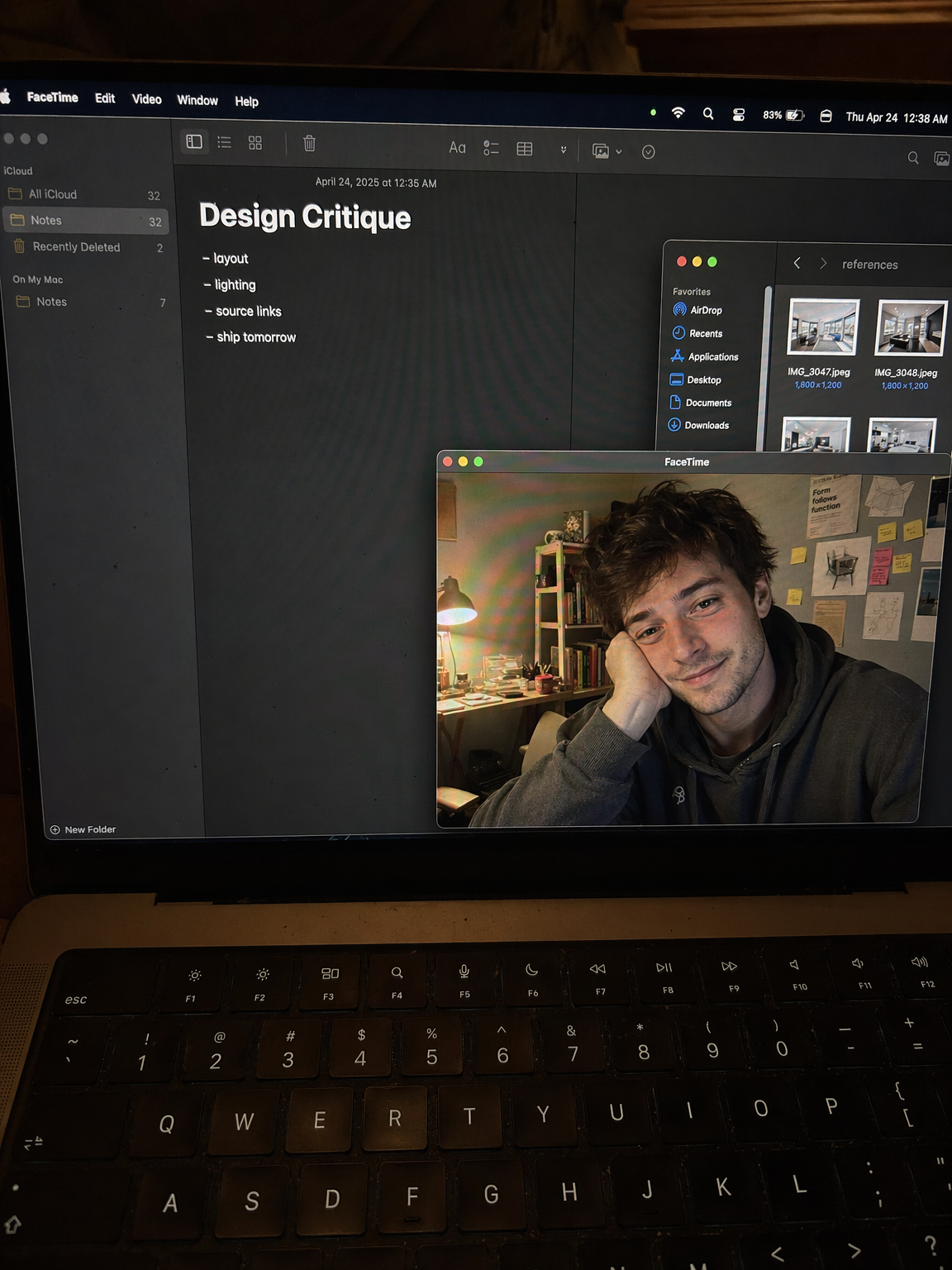
Full Prompt
Create a raw smartphone photo of a laptop screen, not a screenshot. Aspect ratio 3:4, high-angle downward POV from someone standing over a desk at night. The laptop display fills most of the frame, with a narrow strip of black keyboard and trackpad visible at the bottom. Strong realism: visible RGB subpixel grid, subtle moire bands, small dust specks, faint fingerprints, uneven glass reflections, handheld phone noise, slight perspective skew, no studio polish. macOS dark mode. Background app: Apple Notes with a late-night study note titled "Design Critique" and short visible bullets: "layout", "lighting", "source links", "ship tomorrow". Foreground app: FaceTime live preview window floating lower-right, showing a fictional adult man in his 20s sitting at a cluttered desk, hoodie, tired but amused expression, warm desk lamp behind him, books and sticky notes in the room. A second small Finder window with image thumbnails is partly visible behind it. Make it feel like an accidental real phone photo of a working laptop screen. No real-person likeness, no beauty filter, no perfect UI, no screenshot, no watermark, no cartoon, no 3D render.