Case Media
Case Notes
This page keeps the media, full prompt, and original source together so you can inspect the result first and decide whether the prompt is worth copying, saving, or comparing.
Case Insights
To make this page easier to search, cite, and reuse later, the case is also broken down into practical guidance about usage, visual cues, and prompt structure.
Best Fit Scenarios
- Use this as a ui & social screens benchmark when you need a fast style baseline before rewriting your own prompt.
- It is especially helpful if your target overlaps with Poster, UI, Screenshot and you want to judge the image result before tuning wording.
- Keep it as a control sample when you compare nearby prompt variants one variable at a time.
Visual Signals To Notice
- The clearest style signals here are Poster, UI, Screenshot, so those should usually stay in your first rewrite.
- The important layer is usually interface density, card hierarchy, and how the screen tells the story before you read small text.
- This case keeps one primary output, so the first image should be treated as the main visual reference.
How The Prompt Is Structured
- The prompt reads as a long, highly specified prompt, which is useful when you want to judge how much specificity this direction needs.
- Its keyword cluster is centered on Poster, UI, Screenshot, so you can usually keep that cluster while swapping subject, camera, layout, or copy details.
- A practical rewrite path is: keep the outcome, keep the strongest style cues, then replace only the subject and environment blocks.
Good Follow-up Questions
- What changes first if you keep Poster, UI, Screenshot but switch the subject matter?
- Which part of the result comes from section-level structure (UI & Social Screens) versus tag-level style cues?
- Which related cases in the same section give you a cleaner or more extreme variation of the same direction?
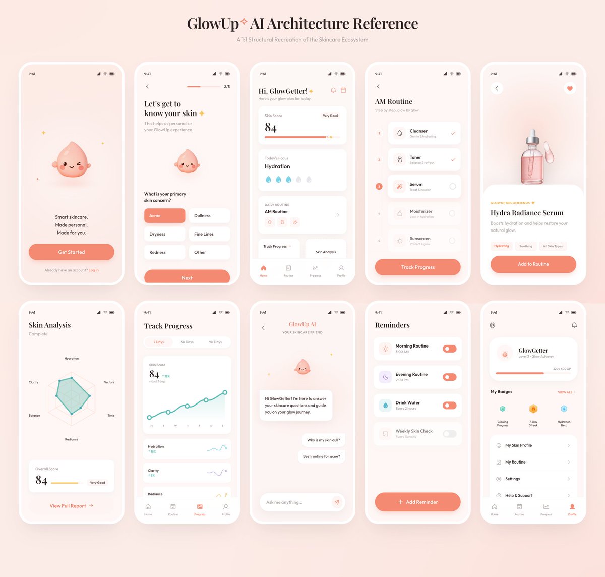
Full Prompt
Using the provided reference image as the source, recreate the GlowUp skincare mobile app architecture board as a clean, high-resolution UI presentation. Focus on the app screens from the right side of the reference, remove the surrounding canvas clutter and loose asset thumbnails, and redraw the interfaces crisply in the same soft peach/pink brand style with rounded white phone frames, subtle shadows, minimal icons, and the cute droplet mascot where it appears. Arrange exactly 10 mobile screens in a neat 2-row grid of 5 screens each, under the centered heading “{argument name="board title" default="GlowUp✧ AI Architecture Reference"}” and subtitle “{argument name="board subtitle" default="AI Structural Recreation of the Skincare Ecosystem"}”. Include these 10 screens: 1) welcome / get started screen, 2) onboarding skin concern selection screen, 3) GlowGetter dashboard with skin score and routine cards, 4) AM routine checklist, 5) Hydra Radiance Serum product detail, 6) skin analysis radar chart, 7) track progress line chart, 8) GlowUp AI chat screen, 9) reminders list, and 10) profile / badges screen. Keep the same visual identity from the reference: pastel peach background, coral CTA buttons, white cards, delicate typography, skincare-focused labels, tiny status bars, and airy spacing. Make the output look like a polished product-design showcase rather than a screenshot of the original board.