Case Media
Case Notes
This page keeps the media, full prompt, and original source together so you can inspect the result first and decide whether the prompt is worth copying, saving, or comparing.
Case Insights
To make this page easier to search, cite, and reuse later, the case is also broken down into practical guidance about usage, visual cues, and prompt structure.
Best Fit Scenarios
- Use this as a ui & social screens benchmark when you need a fast style baseline before rewriting your own prompt.
- It is especially helpful if your target overlaps with Poster, Illustration, UI and you want to judge the image result before tuning wording.
- Keep it as a control sample when you compare nearby prompt variants one variable at a time.
Visual Signals To Notice
- The clearest style signals here are Poster, Illustration, UI, so those should usually stay in your first rewrite.
- The important layer is usually interface density, card hierarchy, and how the screen tells the story before you read small text.
- This case keeps 2 media outputs, which makes it easier to check whether the style remains stable across multiple results.
How The Prompt Is Structured
- The prompt reads as a long, highly specified prompt, which is useful when you want to judge how much specificity this direction needs.
- Its keyword cluster is centered on Poster, Illustration, UI, so you can usually keep that cluster while swapping subject, camera, layout, or copy details.
- A practical rewrite path is: keep the outcome, keep the strongest style cues, then replace only the subject and environment blocks.
Good Follow-up Questions
- What changes first if you keep Poster, Illustration, UI but switch the subject matter?
- Which part of the result comes from section-level structure (UI & Social Screens) versus tag-level style cues?
- Which related cases in the same section give you a cleaner or more extreme variation of the same direction?
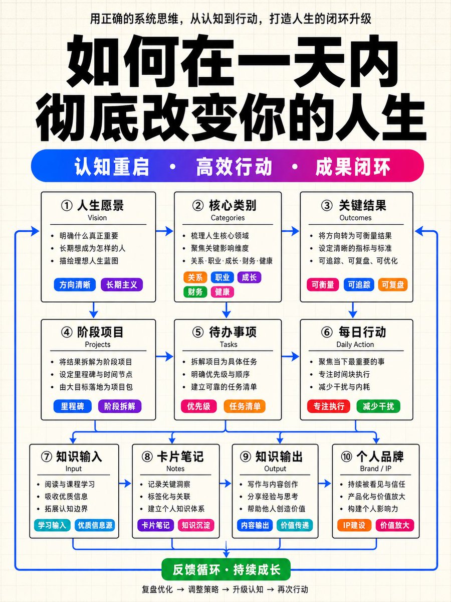
Full Prompt
Please generate a high-end Chinese knowledge architecture infographic with a vertical 9:16 composition. The overall visual language is fixed as: light cream-white grid paper background + cover-level oversized bold title + high-saturation blue-purple-magenta gradient keyword capsule bar + white-base black-bordered structural modules + colorful small capsule labels inside modules + blue arrow closed-loop connections. This is not an ordinary flowchart or a tech UI panel. Please generate a high-end infographic similar to a high-quality knowledge blogger's course cover, knowledge payment system diagram, or methodology architecture poster. The overall style must be restrained, clean, and highly orderly, but local colorful labels must be striking enough to make the image richer and more layered than an ordinary black-and-white architecture diagram. 1. Fixed Visual Style: Background: Use a light cream-white grid paper background with very fine, light gray grid lines. No gradients, dark backgrounds, heavy shadows, glassmorphism, skeuomorphism, tech HUD, or cyber UI. General Vibe: Minimalist, restrained, rational, and orderly structure. Black and white skeleton with colors used only for keyword bars, small labels, emphasis blocks, and blue arrows. 2. Top Title Area Layout: Top description sentence (small centered text extracted from content), Oversized bold Chinese main title (the largest visual element with high visual impact), and a Horizontal high-saturation gradient keyword capsule bar (blue to purple to magenta transition with 3 core keywords separated by white dots). 3. Main Module Structure Rules: 3-layer structure (3 + 3 + 4 modules). Total of 10 white-base modules with black borders and small rounded corners. Each module contains a Chinese title, English sub-title, 2-4 short sentences, and colorful small capsule labels. 4. Content Automatic Arrangement Rules: Automatically extract and organize content into Strategy/Cognition (Layer 1), Action/Execution (Layer 2), and Input/Output/Brand (Layer 3). Use colorful labels for categories, sources, methods, tools, etc. If content is insufficient, maintain the 3+3+4 structure with reasonable generalizations. 5. Module Internal Color Accents: Vibrant colors must come from labels, not background colors. At least 5 modules must include high-saturation small capsule labels from the pool of blue, purple, magenta, orange, green, and cyan. 6. Blue Arrow Loop Rules: Use medium-high saturation blue arrows to show the flow from top to bottom and returning to create a closed loop. 7. Text Hierarchy: Clear weighting from the main title (thickest/largest) to the gradient bar text, module titles, and then body text. 8. Final Acceptance Criteria: Ensure grid background, top description, oversized title, gradient keyword bar, 3+3+4 module structure, colorful labels, and blue closed-loop arrows are all present and satisfy the style requirements. 9. Prohibitions: No gradient/dark backgrounds, no large color cards, no glassmorphism, no complex illustrations, no PPT or mind map styles, and no gray arrows. 10. User Variables: Top Title (Fill in main title here) and Content (Fill in natural language content here to be automatically processed).