Case Media
Case Notes
This page keeps the media, full prompt, and original source together so you can inspect the result first and decide whether the prompt is worth copying, saving, or comparing.
Case Insights
To make this page easier to search, cite, and reuse later, the case is also broken down into practical guidance about usage, visual cues, and prompt structure.
Best Fit Scenarios
- Use this as a ui & social screens benchmark when you need a fast style baseline before rewriting your own prompt.
- It is especially helpful if your target overlaps with Poster, Illustration, UI and you want to judge the image result before tuning wording.
- Keep it as a control sample when you compare nearby prompt variants one variable at a time.
Visual Signals To Notice
- The clearest style signals here are Poster, Illustration, UI, so those should usually stay in your first rewrite.
- The important layer is usually interface density, card hierarchy, and how the screen tells the story before you read small text.
- This case keeps one primary output, so the first image should be treated as the main visual reference.
How The Prompt Is Structured
- The prompt reads as a long, highly specified prompt, which is useful when you want to judge how much specificity this direction needs.
- Its keyword cluster is centered on Poster, Illustration, UI, so you can usually keep that cluster while swapping subject, camera, layout, or copy details.
- A practical rewrite path is: keep the outcome, keep the strongest style cues, then replace only the subject and environment blocks.
Good Follow-up Questions
- What changes first if you keep Poster, Illustration, UI but switch the subject matter?
- Which part of the result comes from section-level structure (UI & Social Screens) versus tag-level style cues?
- Which related cases in the same section give you a cleaner or more extreme variation of the same direction?
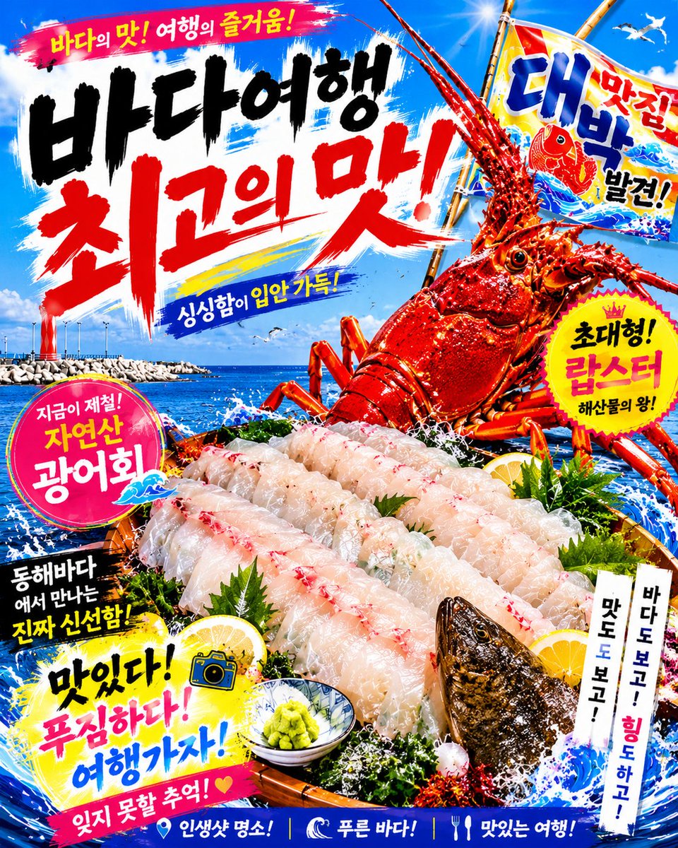
Full Prompt
Goal: Create a loud, hyper-saturated Korean seafood restaurant advertising poster for {argument name="restaurant theme" default="fresh natural flatfish sashimi and giant lobster"}, with an energetic travel-at-the-sea mood, aimed at attracting customers to a sashimi restaurant. Canvas: Vertical 4:5 poster, full-bleed, high contrast, glossy commercial food-ad style. Use a bright tropical blue sky and deep blue ocean background with white sea spray, seagulls, a harbor breakwater on the left horizon, and explosive brush-stroke graphics. Layout: Top third contains a huge hand-painted Korean calligraphy headline on a white and blue paint-splash background. Right side features a giant red spiny lobster emerging dramatically from ocean waves, angled upward, with long antennae crossing the sky. Bottom half is dominated by a lavish wooden platter of fresh sliced white fish sashimi over crushed ice, green garnish, seaweed, lemon slices, wasabi, and splashing water. Add a grilled or raw fish head at the lower right edge of the platter. Use diagonal composition, comic-book impact, and many overlapping stickers and banners. Text content: Include exactly 10 distinct Korean text blocks, styled as bold brush lettering, stickers, or banners: 1) top pink brush banner: {argument name="top slogan" default="바다의 맛! 여행의 즐거움!"}; 2) huge main black-and-red headline: {argument name="main headline" default="바다여행 최고의 맛!"}; 3) small blue slanted banner under headline: "싱싱함이 입안 가득!"; 4) right flag beside lobster: "대박 맛집 발견!"; 5) yellow starburst badge on right: "초대형! 랍스터 해산물의 왕!"; 6) pink circular badge on left: "지금이 제철! 자연산 광어회"; 7) black brush box on lower left: "동해바다에서 만나는 진짜 신선함!"; 8) yellow splash headline near bottom left: "맛있다! 푸짐하다! 여행가자!"; 9) pink bottom ribbon: "잊지 못할 추억! ♥"; 10) bottom blue footer strip with three icon-separated phrases: "인생샷 명소! | 푸른 바다! | 맛있는 여행!". Also add two narrow vertical white paper strips at lower right reading "맛도 보고!" and "바다도 보고! 힐링도 하고!". Subject details: Make the lobster extremely large, glossy, bright red-orange, covered in water droplets, with visible eyes, segmented shell, spiny legs, and dramatic claws/antennae. The sashimi platter should contain exactly 4 neat diagonal rows of translucent white flatfish slices with red accents, arranged in overlapping layers. Add exactly 3 visible lemon slices, 1 small patterned bowl of green wasabi, 1 fish head, 1 small camera icon, and at least 6 seagulls in the sky. Visual style: Korean street-market seafood flyer, maximalist, punchy, celebratory, with thick black ink strokes, red handwritten calligraphy, yellow highlights, magenta badges, blue wave graphics, white foam, sharp cutout edges, glossy food photography mixed with illustrated poster effects. Use saturated cyan, royal blue, hot pink, lemon yellow, white, black, and vivid lobster red. Constraints: Keep all Korean text legible and integrated into the design. Do not add English text. Avoid minimalist spacing; the poster should feel crowded, festive, and attention-grabbing. No watermark, no QR code, no phone number.