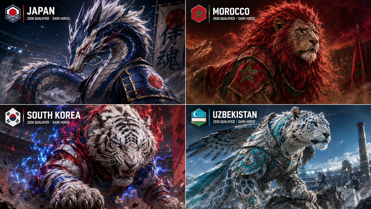
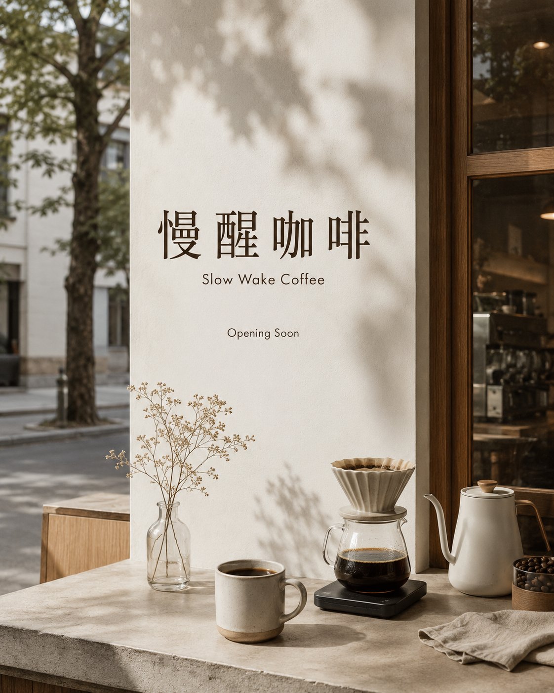
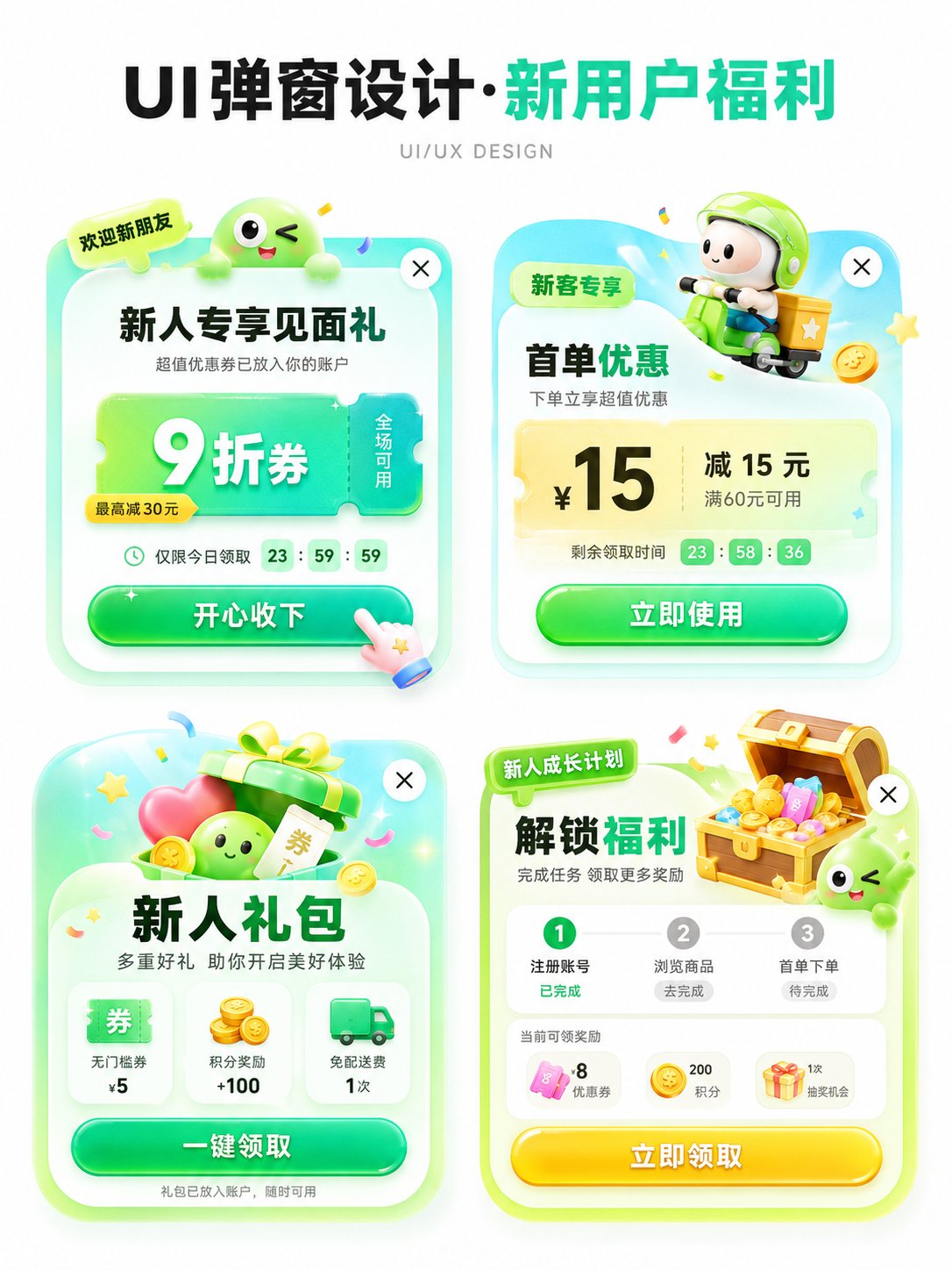
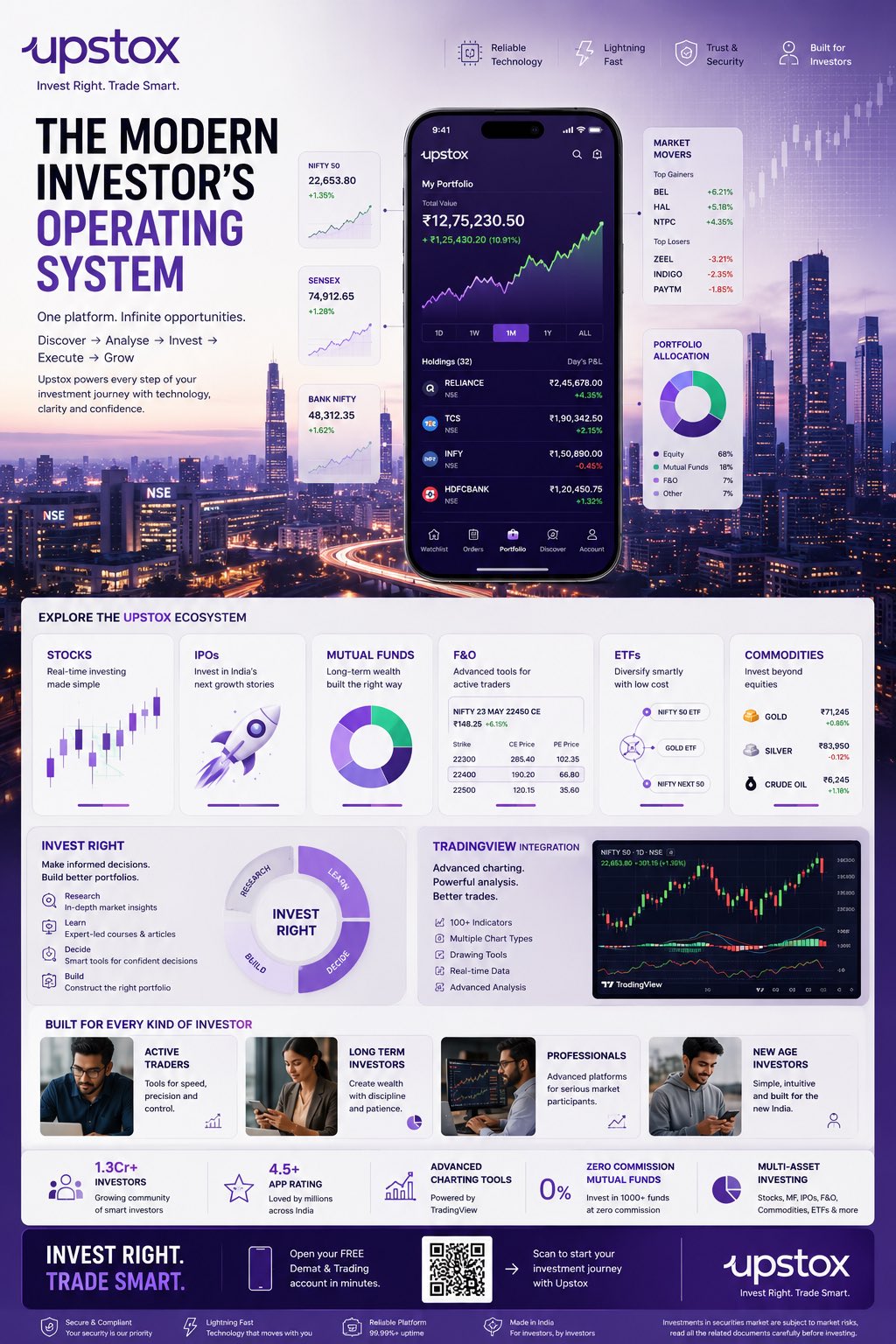
Case Media
Case Notes
This page keeps the media, full prompt, and original source together so you can inspect the result first and decide whether the prompt is worth copying, saving, or comparing.
Case Insights
To make this page easier to search, cite, and reuse later, the case is also broken down into practical guidance about usage, visual cues, and prompt structure.
Best Fit Scenarios
- Use this as a ui & social screens benchmark when you need a fast style baseline before rewriting your own prompt.
- It is especially helpful if your target overlaps with Poster, UI, Screenshot and you want to judge the image result before tuning wording.
- Keep it as a control sample when you compare nearby prompt variants one variable at a time.
Visual Signals To Notice
- The clearest style signals here are Poster, UI, Screenshot, so those should usually stay in your first rewrite.
- The important layer is usually interface density, card hierarchy, and how the screen tells the story before you read small text.
- This case keeps 2 media outputs, which makes it easier to check whether the style remains stable across multiple results.
How The Prompt Is Structured
- The prompt reads as a long, highly specified prompt, which is useful when you want to judge how much specificity this direction needs.
- Its keyword cluster is centered on Poster, UI, Screenshot, so you can usually keep that cluster while swapping subject, camera, layout, or copy details.
- A practical rewrite path is: keep the outcome, keep the strongest style cues, then replace only the subject and environment blocks.
Good Follow-up Questions
- What changes first if you keep Poster, UI, Screenshot but switch the subject matter?
- Which part of the result comes from section-level structure (UI & Social Screens) versus tag-level style cues?
- Which related cases in the same section give you a cleaner or more extreme variation of the same direction?
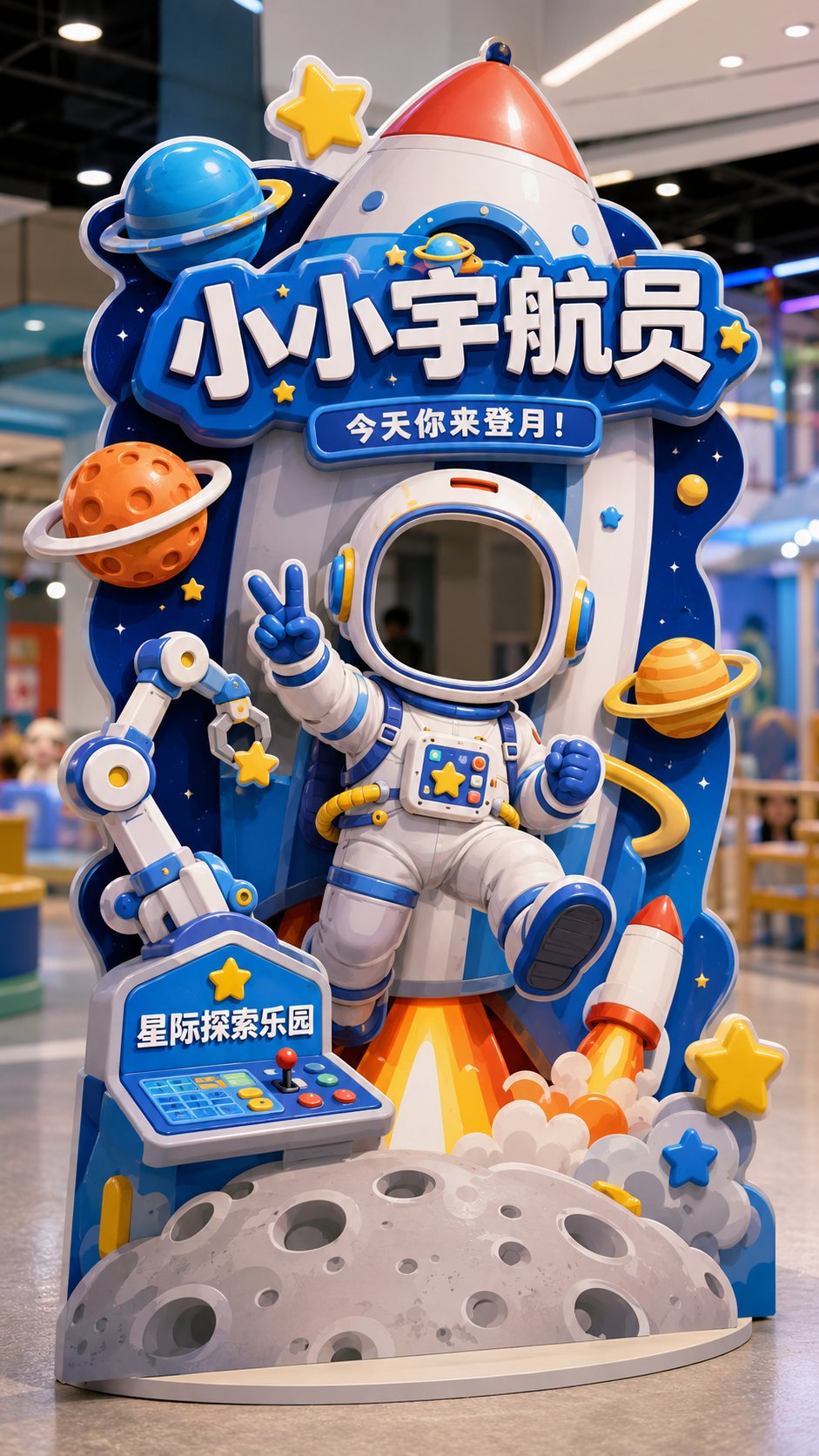
Full Prompt
Please generate a vertical 9:16 Chinese 'Interactive Check-in Shaped Standee' design mockup, with the theme [Theme] as a head-cover style photo check-in device, suitable for [Usage Scene]. The overall image is a complete interactive installation in a store / theme park / mall activity area, not a regular poster, not a white background graphic design draft, but a shaped standee suitable for customers to stand behind and put their heads in to take photos. Basic Information: Theme: [Little Astronaut / Dessert Magician / Cute Pet Nurse / Dinosaur Archaeology Captain / Other character themes] Usage Scene: [Parent-child Paradise / Science Exploration Museum / Dessert Shop / Parent-child Baking Studio / Pet Shop / Pet Park / Mall Activity Area / Children's Theme Park] Main Title: [Main Title] Subtitle: [An interactive slogan, for example: Today you come to the moon! / Today the sweetness is cast by you / Today you take care of the cuteness / Today you come to discover the ancient world!] Brand Name: [Brand Name / Venue Name] Overall Style: [Cute / Dreamy / Adventure / Adorable / Healing / Dramatic / Parent-child feel] Main Color: [Main Color] Visual Requirements: 1. Image aspect ratio must be vertical 9:16, fully displaying a landable interactive check-in shaped standee. 2. There must be a clear 'head cover opening / face cutout area' in the upper-middle part of the standee, suitable for real people to put their heads in for photos. 3. The head cover opening must naturally blend into the structure of the character itself, such as helmets, hats, arches, theme frames, or the character's head position, and should not look like a forced hole. 4. A complete character body must be designed below the opening, so that users feel like they have really become this character after putting their heads in. 5. Character movements should have a sense of interaction, such as waving, welcoming, making a V-sign, holding props, carrying things, reaching forward, pointing forward, etc. 6. The overall standee must be a shaped outline, not a regular rectangle, not a regular display stand; the shaped outline should be naturally formed by extending theme elements. 7. Add large-sized decorative elements according to the theme, such as rockets, planets, cream, cakes, candies, pets, bubbles, dinosaur eggs, fossils, rock layers, maps, tools, etc. 8. The image should have foreground, middle ground, and background layers to create a light 3D installation feel, rather than just a flat hole-digging poster. 9. No obvious white edges, no thick white outlines; reflect structural and 3D sense through theme color trimming, partial shadows, layered blocking, foreground extension, and shaped expansion. 10. Chinese characters should be few and large, mainly retaining: Main Title, Subtitle, Brand Name; do not pile up too much explanatory information. 11. Title text should naturally blend into the device structure, such as signboards, wooden boards, cream words, rock words, theme frames, etc., rather than appearing as separately pasted flat text blocks. 12. The standee should have a real material feel, like KT board, Forex board, or a shaped floor-standing photo device, with clear edges, a sense of thickness, and a stable base. 13. The background can be a simple and real indoor store, theme park, or activity area scene, slightly blurred, not overpowering the main subject. 14. The overall image should be bright, clear, good-looking, and fun, suitable for customers to take photos and share on social media. Final Effect: A high-completion Chinese interactive check-in shaped standee, where users can put their heads in to take photos, creating a strong sense of character immersion, with overall shaped extensions, a light 3D installation feel, and strong offline sharing attributes. Avoid: Regular posters, regular display stands, no openings, obvious white edges, too much text, messy background, unrealistic structure, or looking like a direct translation/copy of an English version.