Case Media
Case Notes
This page keeps the media, full prompt, and original source together so you can inspect the result first and decide whether the prompt is worth copying, saving, or comparing.
Case Insights
To make this page easier to search, cite, and reuse later, the case is also broken down into practical guidance about usage, visual cues, and prompt structure.
Best Fit Scenarios
- Use this as a ui & social screens benchmark when you need a fast style baseline before rewriting your own prompt.
- It is especially helpful if your target overlaps with Neon, Poster, UI and you want to judge the image result before tuning wording.
- Keep it as a control sample when you compare nearby prompt variants one variable at a time.
Visual Signals To Notice
- The clearest style signals here are Neon, Poster, UI, so those should usually stay in your first rewrite.
- The important layer is usually interface density, card hierarchy, and how the screen tells the story before you read small text.
- This case keeps one primary output, so the first image should be treated as the main visual reference.
How The Prompt Is Structured
- The prompt reads as a long, highly specified prompt, which is useful when you want to judge how much specificity this direction needs.
- Its keyword cluster is centered on Neon, Poster, UI, so you can usually keep that cluster while swapping subject, camera, layout, or copy details.
- A practical rewrite path is: keep the outcome, keep the strongest style cues, then replace only the subject and environment blocks.
Good Follow-up Questions
- What changes first if you keep Neon, Poster, UI but switch the subject matter?
- Which part of the result comes from section-level structure (UI & Social Screens) versus tag-level style cues?
- Which related cases in the same section give you a cleaner or more extreme variation of the same direction?
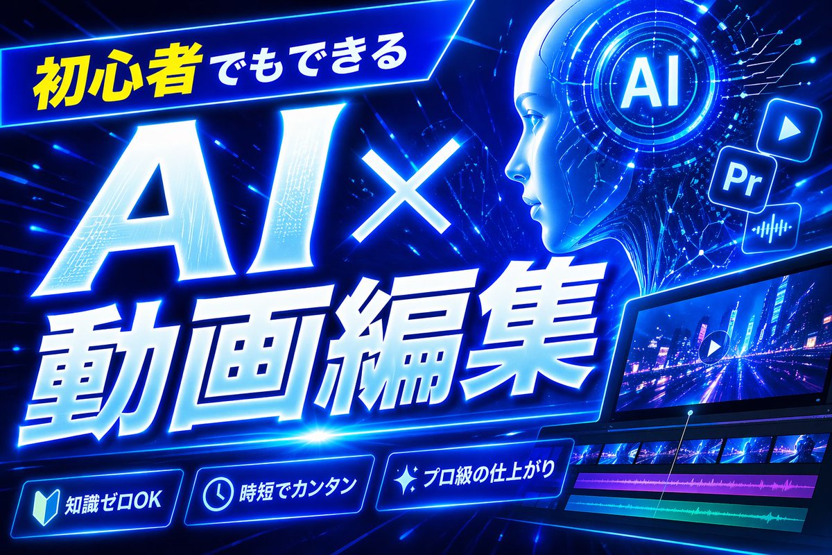
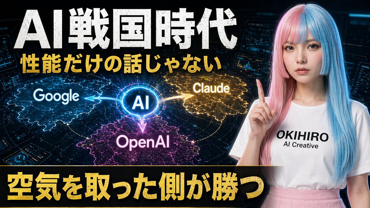
Full Prompt
A bold Japanese YouTube thumbnail about the AI competition era, 16:9 widescreen, high contrast, dramatic tech-news style. Use a dark futuristic control-room background filled with 3 glowing holographic dashboard screens and blue cyber interface elements around the edges. On the left and center, place a luminous circular hub labeled “AI” in bright blue, with 3 directional glowing energy arrows branching outward to competing platforms: “Google” on the left in a blue electric region, “Claude” on the upper right in a gold electric region, and “OpenAI” at the bottom center in a magenta-purple electric region. Add a subtle world-map or territory-battle visualization effect under each brand region, like illuminated digital land masses or influence zones. On the right side, show a young Japanese-looking woman from waist up, facing forward, wearing a long straight split-color wig with pastel pink on one side and pastel blue on the other, a plain white T-shirt with the printed text “OKIHIRO AI Creative”, and a light pink skirt. She raises one index finger beside her face in a presenter pose. Her face is fully obscured by a large soft-edged rectangular blur block. Across the top, add huge distressed white Japanese headline text: {argument name="headline text" default="AI戦国時代"}. Beneath it, add a second line in bold gold Japanese text: {argument name="subheadline text" default="性能だけの話じゃない"}. Across the bottom, place a wide black banner with massive bold gold Japanese text: {argument name="bottom text" default="空気を取った側が勝つ"}. Make the typography oversized, gritty, and attention-grabbing, with slight glow and drop shadow. Use a color palette of black, electric blue, gold, magenta, and neon white, with intense contrast and thumbnail readability.