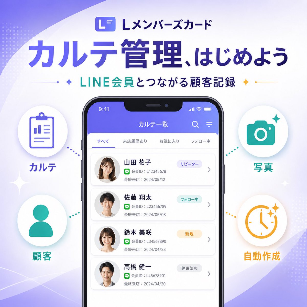
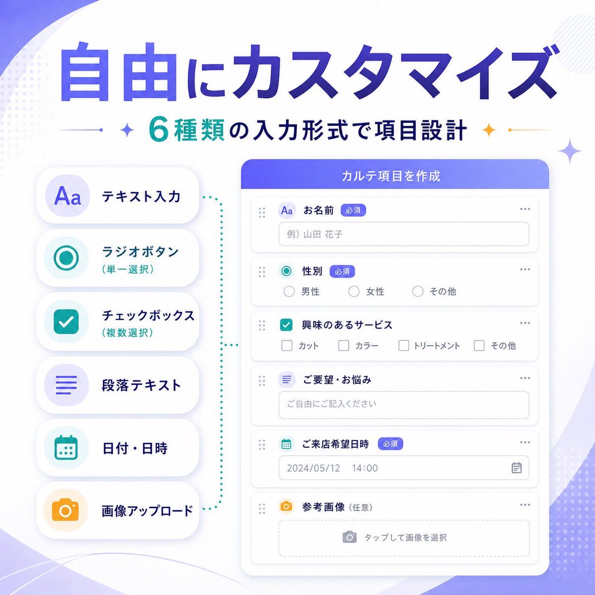
Case Media
Case Notes
This page keeps the media, full prompt, and original source together so you can inspect the result first and decide whether the prompt is worth copying, saving, or comparing.
Case Insights
To make this page easier to search, cite, and reuse later, the case is also broken down into practical guidance about usage, visual cues, and prompt structure.
Best Fit Scenarios
- Use this as a ui & social screens benchmark when you need a fast style baseline before rewriting your own prompt.
- It is especially helpful if your target overlaps with Portrait, Illustration, UI and you want to judge the image result before tuning wording.
- Keep it as a control sample when you compare nearby prompt variants one variable at a time.
Visual Signals To Notice
- The clearest style signals here are Portrait, Illustration, UI, so those should usually stay in your first rewrite.
- The important layer is usually interface density, card hierarchy, and how the screen tells the story before you read small text.
- This case keeps one primary output, so the first image should be treated as the main visual reference.
How The Prompt Is Structured
- The prompt reads as a long, highly specified prompt, which is useful when you want to judge how much specificity this direction needs.
- Its keyword cluster is centered on Portrait, Illustration, UI, so you can usually keep that cluster while swapping subject, camera, layout, or copy details.
- A practical rewrite path is: keep the outcome, keep the strongest style cues, then replace only the subject and environment blocks.
Good Follow-up Questions
- What changes first if you keep Portrait, Illustration, UI but switch the subject matter?
- Which part of the result comes from section-level structure (UI & Social Screens) versus tag-level style cues?
- Which related cases in the same section give you a cleaner or more extreme variation of the same direction?
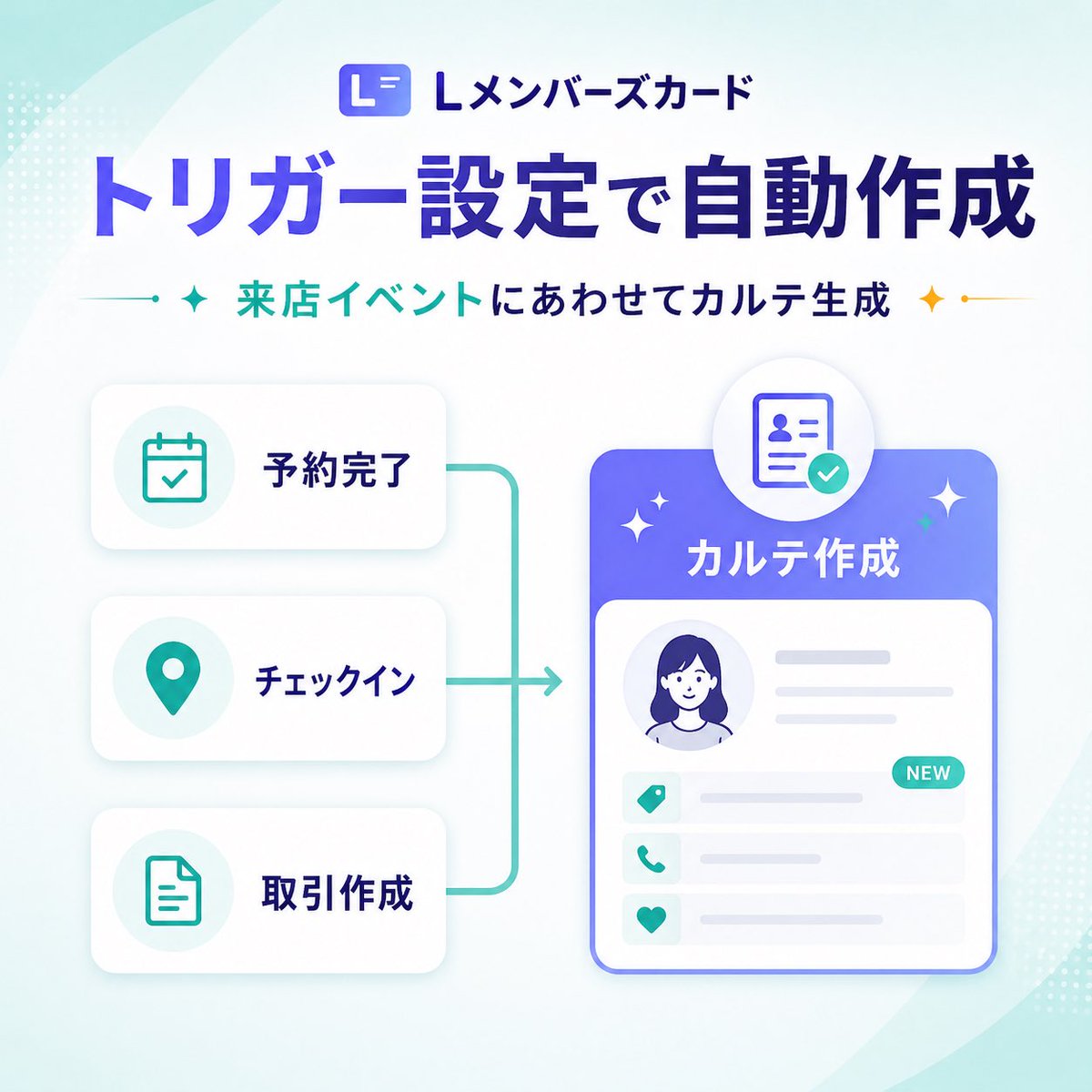
Full Prompt
{"type":"SaaS feature update banner infographic","style":"clean modern Japanese tech marketing graphic, high-quality corporate infographic, soft gradients, rounded UI cards, subtle shadows, minimal vector illustration","format":"square social media banner","aspect_ratio":"1:1","brand":{"logo_text":"Lメンバーズカード","logo_icon":"rounded square app icon with a stylized white L on a blue-purple gradient background"},"background":{"base":"very light white to pale mint gradient","decorations":{"count":6,"items":["large translucent curved shape sweeping from top left","large translucent curved shape sweeping from bottom right","small dotted halftone cluster at top left edge","small dotted halftone cluster at bottom right edge","soft ambient glow behind main card","faint teal gradient wash in corners"]}},"layout":{"sections":[{"title":"header","position":"top center","count":3,"labels":["Lメンバーズカード","トリガー設定で自動作成","来店イベントにあわせてカルテ生成"]},{"title":"left trigger cards","position":"left center","count":3,"labels":["予約完了","チェックイン","取引作成"]},{"title":"right output card","position":"right center","count":1,"labels":["カルテ作成"]}],"flow":"three stacked trigger cards on the left connect with teal bracket-like lines into a right-facing arrow pointing to a large profile record card on the right"},"text":{"headline":"{argument name=\"headline text\" default=\"トリガー設定で自動作成\"}","subheadline":"{argument name=\"subheadline text\" default=\"来店イベントにあわせてカルテ生成\"}"},"left_panel":{"cards":[{"label":"予約完了","icon":"calendar with checkmark","icon_color":"teal","card_style":"white rounded rectangle with soft gray shadow"},{"label":"チェックイン","icon":"map pin","icon_color":"teal","card_style":"white rounded rectangle with soft gray shadow"},{"label":"取引作成","icon":"document outline","icon_color":"teal","card_style":"white rounded rectangle with soft gray shadow"}]},"connector":{"color":"teal","shape":"vertical bracket line linking all three left cards to a single rightward arrow","stroke":"medium rounded line"},"right_panel":{"title":"{argument name=\"feature label\" default=\"カルテ作成\"}","container":"large rounded rectangle card with blue-to-purple gradient header and white body","top_badge":"circular floating badge above the card showing an ID/profile document icon with a teal checkmark","body_elements":{"count":6,"items":["circular avatar portrait placeholder of a woman with dark blue hair","two horizontal gray text lines to the right of avatar","three information rows with teal icons","small teal NEW pill badge on the first row","light gray placeholder lines for record details","thin blue outline around main card"]},"row_icons":["tag","phone","heart"]},"accent_graphics":{"count":4,"items":["left teal sparkle beside subheadline","right gold sparkle beside subheadline","two small white sparkles around the main right card","small teal dot accents on connector ends"]},"color_palette":{"primary":"deep blue-violet","secondary":"teal","accent":"gold","background":"white and pale mint"},"generation_notes":"Use crisp Japanese typography, bold oversized headline, balanced whitespace, polished SaaS product announcement aesthetic, vector UI mockup style, no photo realism, no busy textures"}