案例媒体
案例说明
这个页面把案例媒体、完整 Prompt 和出处放在一起,方便你先看结果,再判断这条 Prompt 是否值得复制、收藏或加入对比。
案例解读
为了方便搜索、引用和后续复用,这里会把案例的适用场景、画面重点和 Prompt 结构拆成更容易浏览的说明。
这类案例适合用在什么场景
- 把它当作 UI 与社交媒体截图 的基准案例最合适,先看成片方向,再决定自己的 Prompt 要往哪边改。
- 如果你的目标也落在 人像、海报、插画 这些方向,这条案例特别适合先看图判断风格,再回头微调描述。
- 做 Prompt 对比时,也很适合作为控制组,只改一个变量去看结果变化。
画面重点与风格信号
- 这条案例最明显的风格信号集中在 人像、海报、插画,所以第一次改写时最好先保留这些关键词。
- 这类案例更值得先看界面密度、卡片层级,以及屏幕内容有没有先于文字讲清故事。
- 当前只有一张主图,所以第一张结果图就是最核心的参考基准。
Prompt 结构可以怎么理解
- 这条 Prompt 整体属于一条比较长、约束条件很多的 Prompt,很适合拿来判断这类方向到底需要写到多细。
- 关键词簇主要围绕 人像、海报、插画 展开,所以复用时可以先保留这组风格词,再替换主体、镜头、环境或文案信息。
- 最稳的改写方式通常是先保留结果方向和最强风格信号,只替换主体设定与场景块。
如果你是带着问题来的,可以先看这些角度
- 如果保留 人像、海报、插画,只换主体题材,结果最先变化的会是哪一部分?
- 这条结果里,哪些特征更像是 UI 与社交媒体截图 的结构特征,哪些又是标签风格本身带来的?
- 同分类的相关案例里,哪几条能给你更克制或更极致的相邻变体?
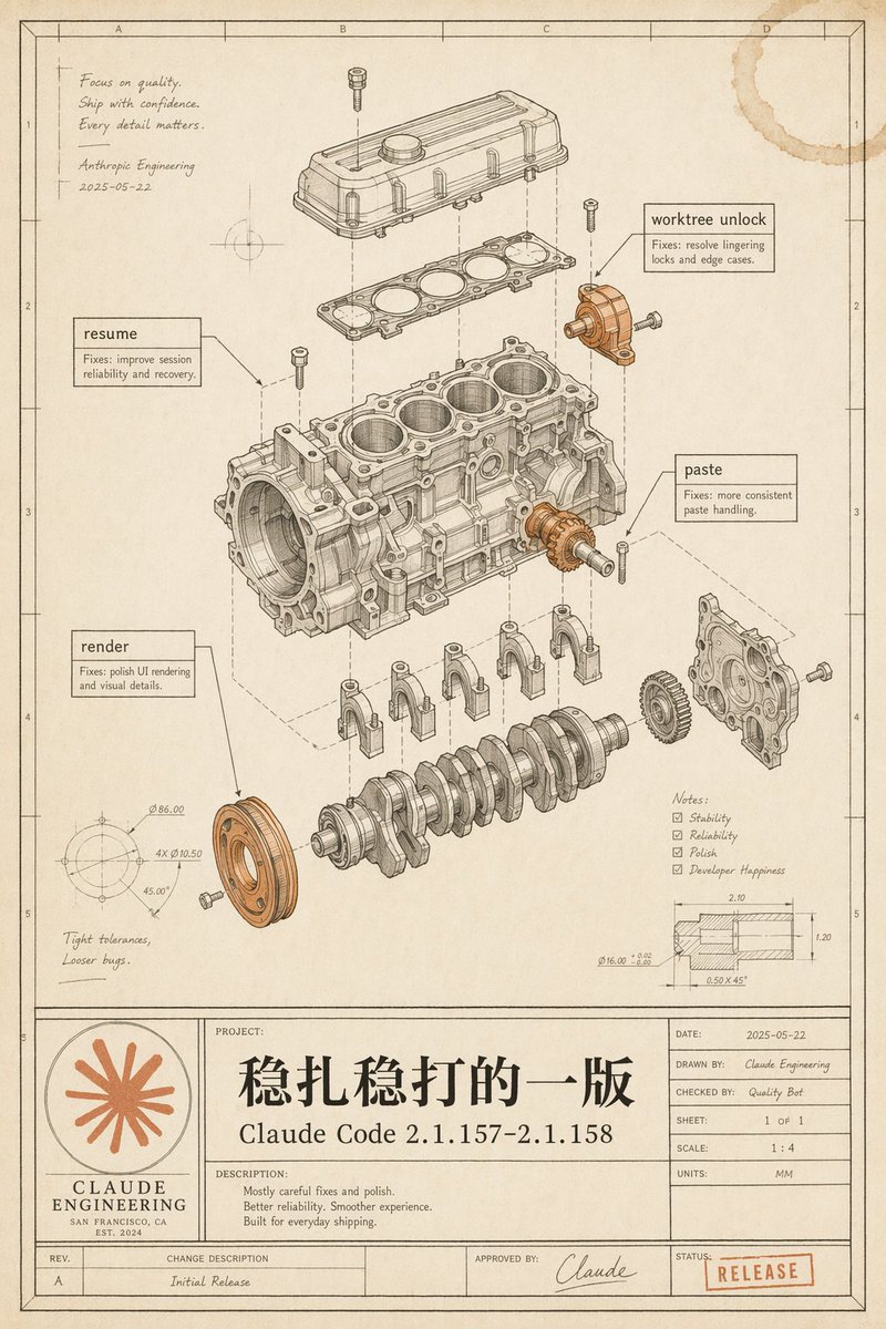
完整 Prompt
Goal: Create a vintage engineering blueprint poster for {argument name="software release name" default="Claude Code 2.1.157–2.1.158"}, presented as an exploded mechanical engine assembly diagram that metaphorically documents a polished software release. Canvas: Portrait technical drawing sheet, 4:5 aspect ratio, warm aged cream paper with subtle stains, worn edges, faint grid coordinates, thin black drafting border, and a title-block table along the bottom. Use monochrome ink linework with selective muted copper-orange highlights on a few mechanical parts and the logo/stamp. Main illustration: Center the page on a detailed exploded isometric engine block assembly, drawn like a patent/automotive CAD manual. Show exactly 11 major visible mechanical groups: 1) top valve cover, 2) gasket plate beneath it, 3) main engine block with four cylinder bores, 4) crankshaft at the bottom, 5) four connecting caps beneath the block, 6) front circular pulley highlighted in copper-orange, 7) right-side gear highlighted in copper-orange, 8) right-side front cover plate, 9) upper-right small bracket/actuator highlighted in copper-orange, 10) scattered bolts/screws around the assembly, 11) dashed vertical and diagonal alignment/construction lines connecting the exploded components. Keep all linework precise, layered, and technically plausible. Callouts and annotations: Include exactly 4 rectangular software-fix callout boxes with leader lines: 1) “resume” with small text “Fixes: improve session reliability and recovery.” 2) “worktree unlock” with small text “Fixes: resolve lingering locks and edge cases.” 3) “paste” with small text “Fixes: more consistent paste handling.” 4) “render” with small text “Fixes: polish UI rendering and visual details.” Add a handwritten note in the upper-left: “Focus on quality. Ship with confidence. Every detail matters.” followed by “Anthropic Engineering” and the date “2025-05-22”. Add lower-left handwritten note: “Tight tolerances, Looser bugs.” Add a lower-right notes checklist with exactly 4 checked items: “Stability”, “Reliability”, “Polish”, “Developer Happiness”. Add two small technical detail drawings: one circular dimension diagram in the lower-left with tiny dimension labels, and one sectional dimension diagram in the lower-right with tiny measurements. Bottom title block: Make a large blueprint title panel spanning the bottom. On the left, include a circular orange Claude-like radial starburst logo above the words “CLAUDE ENGINEERING”, “SAN FRANCISCO, CA”, and “EST. 2024”. In the central project area, write a very large Chinese project title {argument name="main Chinese title" default="稳扎稳打的一版"}, with the release name below it. Under “DESCRIPTION:” include exactly 3 short lines: “Mostly careful fixes and polish.” “Better reliability. Smoother experience.” “Built for everyday shipping.” On the right, include a standard engineering metadata table with: “DATE: 2025-05-22”, “DRAWN BY: Claude Engineering”, “CHECKED BY: Quality Bot”, “SHEET: 1 OF 1”, “SCALE: 1 : 4”, “UNITS: MM”. Along the bottom revision row include “REV. A”, “CHANGE DESCRIPTION Initial Release”, “APPROVED BY: Claude” with a signature, and a red-orange rubber stamp reading {argument name="status stamp" default="RELEASE"}. Visual style: High-end retro technical illustration, fine black/brown ink, hatching, small dimension ticks, subtle perspective, realistic paper grain, faint coffee-ring stain in the top-right corner, no glossy modern UI styling. The image should feel like a carefully archived engineering release drawing, elegant, intentional, and slightly nostalgic. Constraints: Preserve all listed text exactly where specified, keep the Chinese title prominent, avoid extra software names, avoid photorealistic rendering, avoid clutter outside the blueprint page, and make the mechanical diagram the visual focus.