案例媒体
案例说明
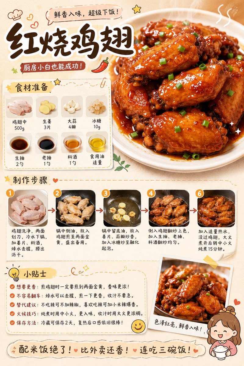
这个页面把案例媒体、完整 Prompt 和出处放在一起,方便你先看结果,再判断这条 Prompt 是否值得复制、收藏或加入对比。
案例解读
为了方便搜索、引用和后续复用,这里会把案例的适用场景、画面重点和 Prompt 结构拆成更容易浏览的说明。
这类案例适合用在什么场景
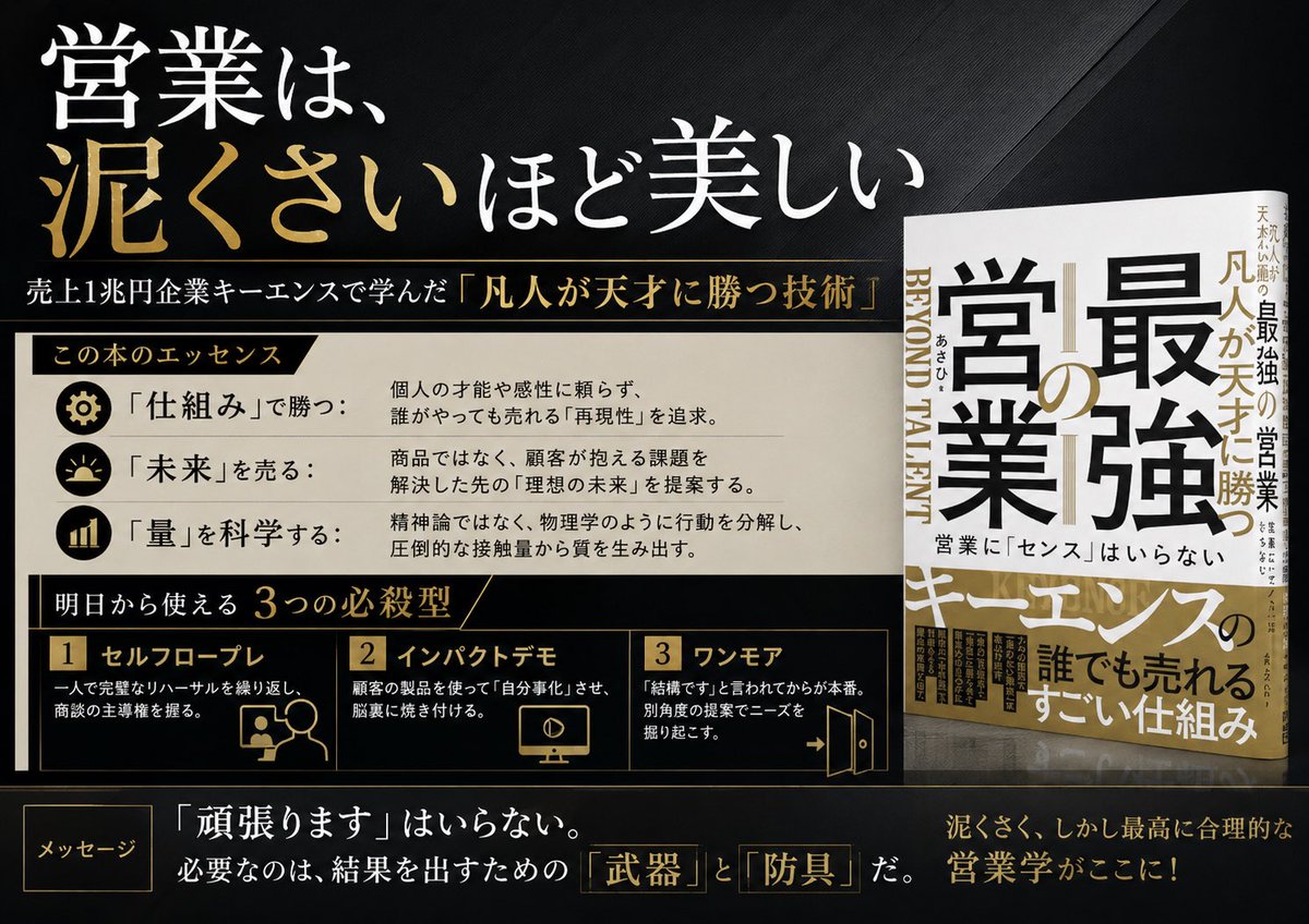
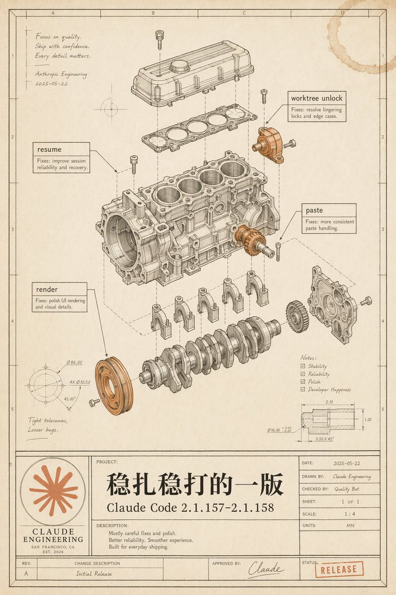
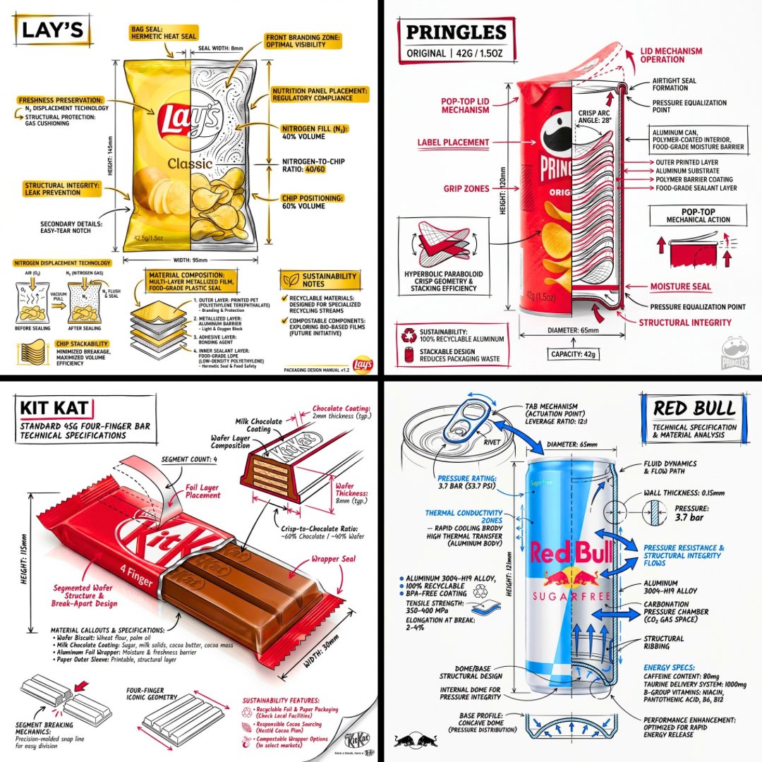
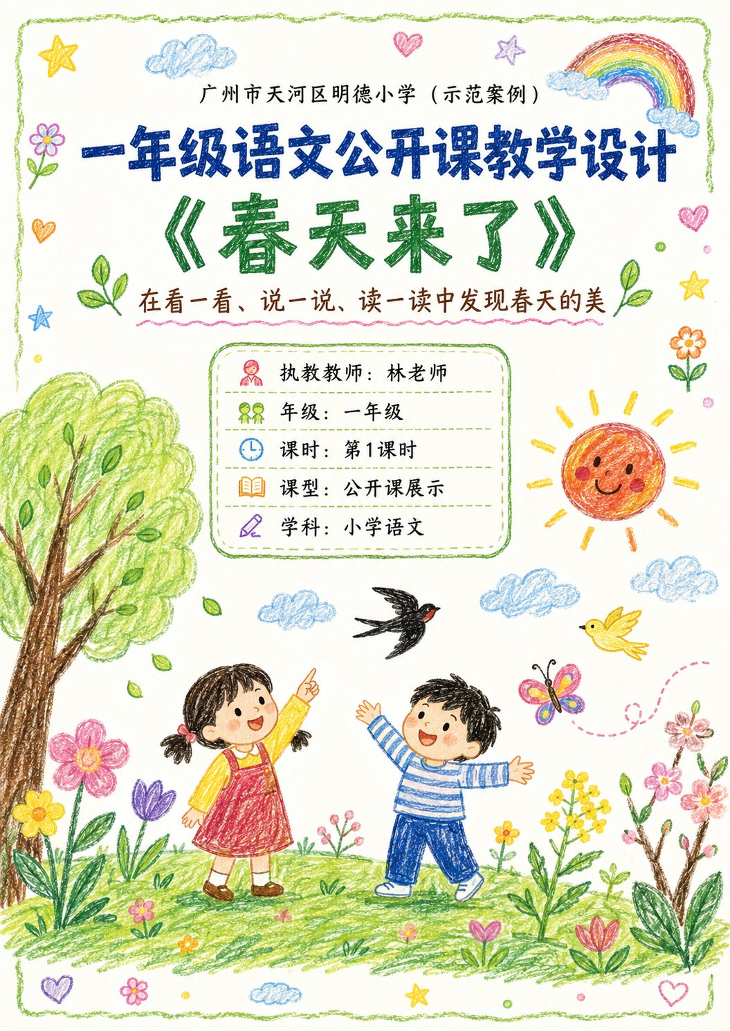
- 把它当作 UI 与社交媒体截图 的基准案例最合适,先看成片方向,再决定自己的 Prompt 要往哪边改。
- 如果你的目标也落在 海报、插画、UI 这些方向,这条案例特别适合先看图判断风格,再回头微调描述。
- 做 Prompt 对比时,也很适合作为控制组,只改一个变量去看结果变化。
画面重点与风格信号
- 这条案例最明显的风格信号集中在 海报、插画、UI,所以第一次改写时最好先保留这些关键词。
- 这类案例更值得先看界面密度、卡片层级,以及屏幕内容有没有先于文字讲清故事。
- 当前保留了 2 份媒体输出,适合顺手观察同一方向在多张结果里的稳定性。
Prompt 结构可以怎么理解
- 这条 Prompt 整体属于一条比较长、约束条件很多的 Prompt,很适合拿来判断这类方向到底需要写到多细。
- 关键词簇主要围绕 海报、插画、UI 展开,所以复用时可以先保留这组风格词,再替换主体、镜头、环境或文案信息。
- 最稳的改写方式通常是先保留结果方向和最强风格信号,只替换主体设定与场景块。
如果你是带着问题来的,可以先看这些角度
- 如果保留 海报、插画、UI,只换主体题材,结果最先变化的会是哪一部分?
- 这条结果里,哪些特征更像是 UI 与社交媒体截图 的结构特征,哪些又是标签风格本身带来的?
- 同分类的相关案例里,哪几条能给你更克制或更极致的相邻变体?
完整 Prompt
Generate a high-aesthetic gourmet recipe graphic note poster, with the theme "{argument name="dish name" default="[Dish Name]"}". [Overall Style] Fresh and healing gourmet infographic style, integrating: popular social media recipe layout, Japanese notebook feel, light hand-painted UI elements, and food magazine style. Overall visual: Warm cream background (off-white / light milk coffee), bright but not dazzling colors, vivid and tempting food colors, clean and tidy layout, suitable for vertical mobile reading. [Core Visual Structure] 1. Top Title Area - oversized font for dish name - paired with hand-drawn small icons (chili / heart / star / steam etc.) - add an appetizing slogan. 2. Main Visual Food Image - a super tempting close-up of the finished product - food is the visual center - obvious glossiness and heat - emphasize the "just out of the pot" feeling - lens has food photography quality. 3. Ingredient Preparation Module - uses card layout - shows main ingredients - each ingredient with small icon/photo - labeled quantities - neat and clear layout. 4. Preparation Steps Module - uses step numbering (1, 2, 3...) - each step includes: small step photo, short text description - arrows connecting the process - easy to understand at a glance - photos have a real cooking feel. 5. Tips Module - uses: hand-drawn note style, dashed borders, small light bulb icons. 6. Bottom Atmosphere Copy. [Visual Details] Abundant hand-drawn element embellishments, cute arrows, graffiti lines, rounded corner cards, slight paper texture, soft shadows, high information density but not cluttered. [Image Quality Requirements] High definition, high detail, extremely tempting food, suitable for social media covers, suitable for graphic notes, 4K food photography quality. [Emphasis] No AI painting feel, no low-quality illustration feel, no over-cartoonishness; should look more like: "High-quality graphic notes produced by a professional food blogger."