案例媒体
案例说明
这个页面把案例媒体、完整 Prompt 和出处放在一起,方便你先看结果,再判断这条 Prompt 是否值得复制、收藏或加入对比。
案例解读
为了方便搜索、引用和后续复用,这里会把案例的适用场景、画面重点和 Prompt 结构拆成更容易浏览的说明。
这类案例适合用在什么场景
- 把它当作 UI 与社交媒体截图 的基准案例最合适,先看成片方向,再决定自己的 Prompt 要往哪边改。
- 如果你的目标也落在 人像、海报、插画 这些方向,这条案例特别适合先看图判断风格,再回头微调描述。
- 做 Prompt 对比时,也很适合作为控制组,只改一个变量去看结果变化。
画面重点与风格信号
- 这条案例最明显的风格信号集中在 人像、海报、插画,所以第一次改写时最好先保留这些关键词。
- 这类案例更值得先看界面密度、卡片层级,以及屏幕内容有没有先于文字讲清故事。
- 当前保留了 2 份媒体输出,适合顺手观察同一方向在多张结果里的稳定性。
Prompt 结构可以怎么理解
- 这条 Prompt 整体属于一条比较长、约束条件很多的 Prompt,很适合拿来判断这类方向到底需要写到多细。
- 关键词簇主要围绕 人像、海报、插画 展开,所以复用时可以先保留这组风格词,再替换主体、镜头、环境或文案信息。
- 最稳的改写方式通常是先保留结果方向和最强风格信号,只替换主体设定与场景块。
如果你是带着问题来的,可以先看这些角度
- 如果保留 人像、海报、插画,只换主体题材,结果最先变化的会是哪一部分?
- 这条结果里,哪些特征更像是 UI 与社交媒体截图 的结构特征,哪些又是标签风格本身带来的?
- 同分类的相关案例里,哪几条能给你更克制或更极致的相邻变体?
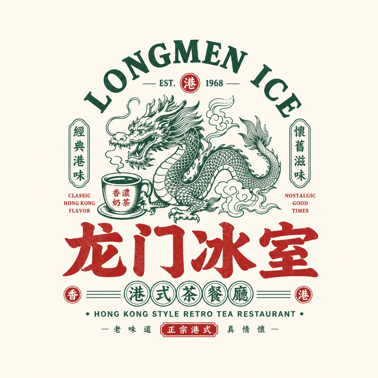
完整 Prompt
Please design a high-quality "Chinese Retro Food Emblem Logo" based on the following user-provided configuration: [User Input] - Brand Name / Project Name: [Brand Name / Project Name] - Subtitle / Product Name: [Subtitle / Product Name] - Type / Industry: [Type / Industry] - Regional Flavor: [Hong Kong / Cantonese / Hunan / Sichuan / Charcoal Grill / Night Market / Cha Chaan Teng / Roast / Seafood / Bistro, etc.] - Brand Positioning: [Brand Positioning] - Core Keywords: [Retro, Chinese Trend (Guochao), Storefront Signboard Vibe, Time-Honored Brand, Hustle & Bustle (Yanhuoqi), Martial Arts/Wuxia vibe, New Consumer Vibe, etc.] - Core Graphic: [Dragon / Phoenix / Crane / Tiger / Ox / Frog / Goose / Fish / Lobster / Utensils / Totems / Auspicious Patterns, etc.] - Core Food / Category Element: [Roast Goose / BBQ / Tea Drinks / Lobster / Noodles / Beef / Ice Room / Bistro, etc.] - Emotional Vibe: [Lively, Domineering, Retro, Classic, Regional, Bustling, Young, etc.] - Main Color: [Main Color] - Secondary Color: [Secondary Color] - Aspect Ratio: [Aspect Ratio] [Core Objective] Design a fully-realized "Chinese Retro Food Emblem Logo" ready for dining brands. This is not a poster or simple cartoon illustration, but a professional logo with a strong storefront, packaging, and brand system feel. It should focus on the main Chinese wordmark, integrating memorable graphics, category symbols, retro bilingual typography, and a structured emblem format. The final design must immediately communicate: 1. It is a dining/food brand; 2. It has a clear category and personality; 3. It feels like a mature brand primary logo rather than a decorative pattern. [Design Essence] The logo should integrate five key layers: 1. Chinese Main Wordmark: For brand recognition. 2. Graphic Symbol: For memory points and category association. 3. Emblem Structure: For overall completeness and integrity. 4. Bilingual Typography: For hierarchy and retro brand atmosphere. 5. Color System: To reinforce dining cues and emotional tone. [Key Principles] 1. The Chinese brand name must be bold, highly legible, and have a "storefront signboard" presence. 2. The logo must be a unified emblem rather than scattered elements. 3. The graphic must relate directly to the brand or food category. 4. English acts as an auxiliary element and must not overshadow the Chinese main text. 5. Highly adaptable for store signs, menus, packaging, and social media avatars. 6. Maintain a vintage, nostalgic vibe without looking messy or outdated. 7. Emphasize a "Guochao (Chinese Retro)" aesthetic rather than American cartoon or Japanese store styles. [Chinese Wordmark Requirements] 1. The Chinese brand name is the absolute protagonist. 2. Fonts should evoke vintage food signboards, classic packaging, or bold retro headlines. 3. Use bold, heavy fonts like Sans-serif (Heiti), Slab-serif (Songhei), or stylized commercial handwriting. 4. Do not use thin, minimalist, or default system fonts. [Graphic System Requirements] Create a highly relevant central graphic based on the [Core Graphic] and [Category Element]. - Options: Mythical beasts/animals (dragon, phoenix, tiger, ox, etc.), core ingredients/dishes (lobster, roast goose, noodles), traditional totems (seals, patterns), or cooking utensils/scenes. - Graphics should be memorable, stylized (e.g., retro illustration, woodcut, vintage label line art), and easy to integrate into the emblem. [Emblem Structure Requirements] Use a cohesive layout, such as: 1. Arched English text on top + central graphic + Chinese wordmark at the bottom. 2. Central main graphic + side badges + subtitle below. 3. Circular, oval, or plaque-style framing. 4. Symmetrical layouts with sub-seals and small stamp details. [Bilingual Typography Requirements] - Chinese dominant, English auxiliary (e.g., "HOUSE", "TAVERN", "BARBECUE", "ESTD", "SINCE"). - Use English to construct arches, state categories, or serve as composition borders. [Color System Requirements] Select a retro dining palette: - Black + Red (BBQ, Hotpot, Bistro) - Black + Gold/Bronze (Time-honored brands, Roast Goose, Cantonese) - Green + Red + Cream (Hong Kong café/Cha Chaan Teng) - Blue + Red + White (Seafood, modern night markets) - Red + Cream (Noodles, traditional snacks) Keep the palette cohesive, using 2-4 primary colors. [Presentation Requirements] - Displayed as a standalone logo mockup on a clean, simple background (light gray, cream, off-white). - Centered, complete, and professionally structured.