案例媒体
案例说明
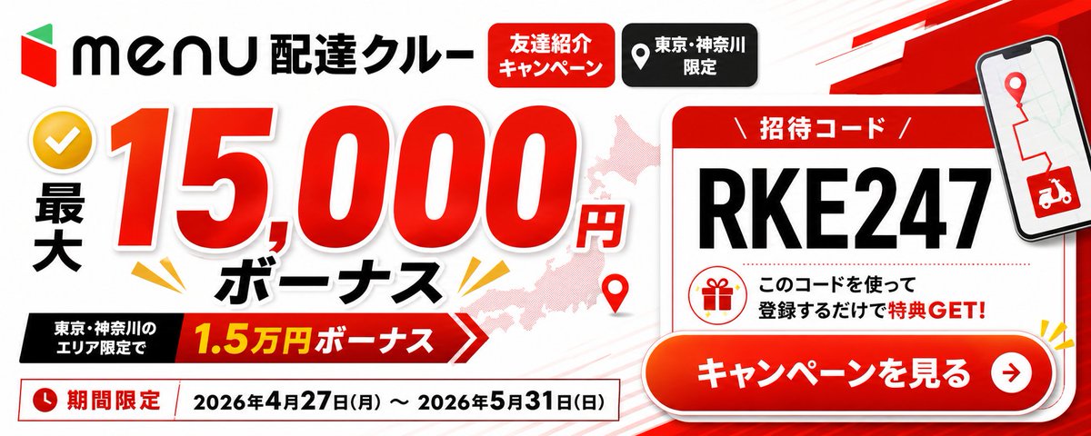
这个页面把案例媒体、完整 Prompt 和出处放在一起,方便你先看结果,再判断这条 Prompt 是否值得复制、收藏或加入对比。
案例解读
为了方便搜索、引用和后续复用,这里会把案例的适用场景、画面重点和 Prompt 结构拆成更容易浏览的说明。
这类案例适合用在什么场景
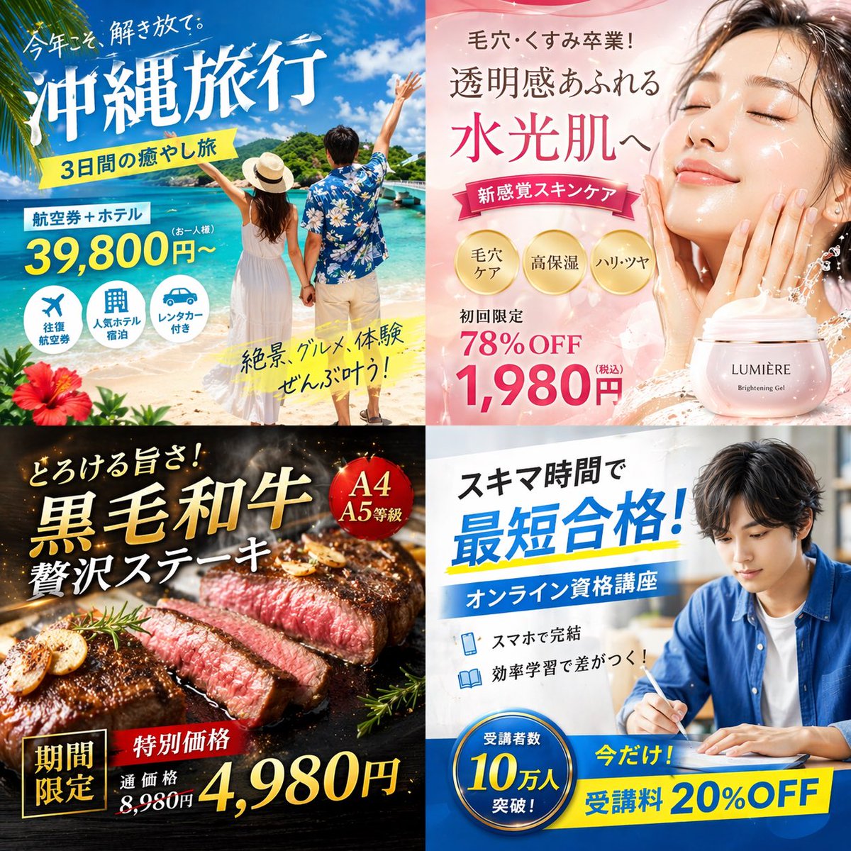
- 把它当作 UI 与社交媒体截图 的基准案例最合适,先看成片方向,再决定自己的 Prompt 要往哪边改。
- 如果你的目标也落在 UI、截图、角色 这些方向,这条案例特别适合先看图判断风格,再回头微调描述。
- 做 Prompt 对比时,也很适合作为控制组,只改一个变量去看结果变化。
画面重点与风格信号
- 这条案例最明显的风格信号集中在 UI、截图、角色,所以第一次改写时最好先保留这些关键词。
- 这类案例更值得先看界面密度、卡片层级,以及屏幕内容有没有先于文字讲清故事。
- 当前只有一张主图,所以第一张结果图就是最核心的参考基准。
Prompt 结构可以怎么理解
- 这条 Prompt 整体属于一条比较长、约束条件很多的 Prompt,很适合拿来判断这类方向到底需要写到多细。
- 关键词簇主要围绕 UI、截图、角色 展开,所以复用时可以先保留这组风格词,再替换主体、镜头、环境或文案信息。
- 最稳的改写方式通常是先保留结果方向和最强风格信号,只替换主体设定与场景块。
如果你是带着问题来的,可以先看这些角度
- 如果保留 UI、截图、角色,只换主体题材,结果最先变化的会是哪一部分?
- 这条结果里,哪些特征更像是 UI 与社交媒体截图 的结构特征,哪些又是标签风格本身带来的?
- 同分类的相关案例里,哪几条能给你更克制或更极致的相邻变体?
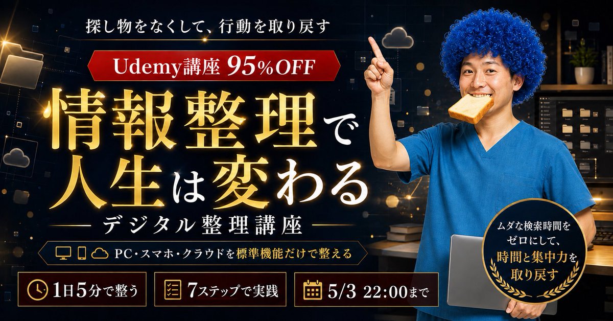
完整 Prompt
{"type":"wide Japanese promotional web banner advertisement","aspect_ratio":"2.4:1 landscape","style":"clean high-contrast commercial graphic design, bold red black white palette, glossy gradients, drop shadows, thick outlined typography, energetic delivery-service campaign look","brand":{"position":"top left","logo":"red and green geometric menu logo followed by black 'menu' wordmark","headline":"{argument name=\"service title\" default=\"配達クルー\"}"},"main_offer":{"position":"left and center","count":4,"elements":["yellow circular checkmark icon at far left","vertical black text '最大'","huge red number '15,000' with white outline and shadow","small red '円' and bold black 'ボーナス' below"],"primary_amount":"{argument name=\"bonus amount\" default=\"15,000円\"}","supporting_ribbon":{"position":"lower left-center","text":"東京・神奈川のエリア限定で 1.5万円ボーナス","colors":"black label block connected to red arrow ribbon with yellow amount text"}},"top_badges":{"position":"top center","count":2,"labels":["友達紹介キャンペーン","東京・神奈川限定"],"appearance":["red rounded rectangle with white text","black rounded rectangle with white location-pin icon and white text"]},"background":{"base":"white with faint diagonal speed lines","map":"pale pink silhouette map behind the main number and card","decorations_count":4,"decorations":["red map pin near lower center","yellow burst marks around the bonus text","red angular speed stripe in upper right","subtle gray/red line accents"]},"invitation_card":{"position":"right side","appearance":"large white rounded rectangle card with red header and red border, slight shadow","header":"招待コード","code":"{argument name=\"invitation code\" default=\"RKE247\"}","code_style":"very large bold black uppercase characters","message":"このコードを使って登録するだけで特典 GET!","icon":"red outline gift icon inside a circle"},"phone_mockup":{"position":"upper right overlapping card","screen":"map route with red pin and red delivery scooter icon","appearance":"tilted smartphone with black bezel and shadow"},"call_to_action":{"position":"bottom right overlapping invitation card","text":"{argument name=\"call to action text\" default=\"キャンペーンを見る\"}","appearance":"large glossy red-orange pill button with white bold text, white border, drop shadow, circular white arrow icon on the right"},"date_bar":{"position":"bottom left full width under offer","count":3,"elements":["red clock icon","red label '期間限定'","date range '{argument name=\"campaign dates\" default=\"2026年4月27日(月) ~ 2026年5月31日(日)\"}' in black inside a white outlined rectangle"]},"composition":"place the main bonus amount as the dominant focal point on the left, the invitation-code card and CTA as the dominant action area on the right, keep all Japanese text crisp and readable, use strong shadows and red accents for urgency"}