案例媒体
案例说明
这个页面把案例媒体、完整 Prompt 和出处放在一起,方便你先看结果,再判断这条 Prompt 是否值得复制、收藏或加入对比。
案例解读
为了方便搜索、引用和后续复用,这里会把案例的适用场景、画面重点和 Prompt 结构拆成更容易浏览的说明。
这类案例适合用在什么场景
- 把它当作 UI 与社交媒体截图 的基准案例最合适,先看成片方向,再决定自己的 Prompt 要往哪边改。
- 如果你的目标也落在 海报、UI、截图 这些方向,这条案例特别适合先看图判断风格,再回头微调描述。
- 做 Prompt 对比时,也很适合作为控制组,只改一个变量去看结果变化。
画面重点与风格信号
- 这条案例最明显的风格信号集中在 海报、UI、截图,所以第一次改写时最好先保留这些关键词。
- 这类案例更值得先看界面密度、卡片层级,以及屏幕内容有没有先于文字讲清故事。
- 当前只有一张主图,所以第一张结果图就是最核心的参考基准。
Prompt 结构可以怎么理解
- 这条 Prompt 整体属于一条比较长、约束条件很多的 Prompt,很适合拿来判断这类方向到底需要写到多细。
- 关键词簇主要围绕 海报、UI、截图 展开,所以复用时可以先保留这组风格词,再替换主体、镜头、环境或文案信息。
- 最稳的改写方式通常是先保留结果方向和最强风格信号,只替换主体设定与场景块。
如果你是带着问题来的,可以先看这些角度
- 如果保留 海报、UI、截图,只换主体题材,结果最先变化的会是哪一部分?
- 这条结果里,哪些特征更像是 UI 与社交媒体截图 的结构特征,哪些又是标签风格本身带来的?
- 同分类的相关案例里,哪几条能给你更克制或更极致的相邻变体?
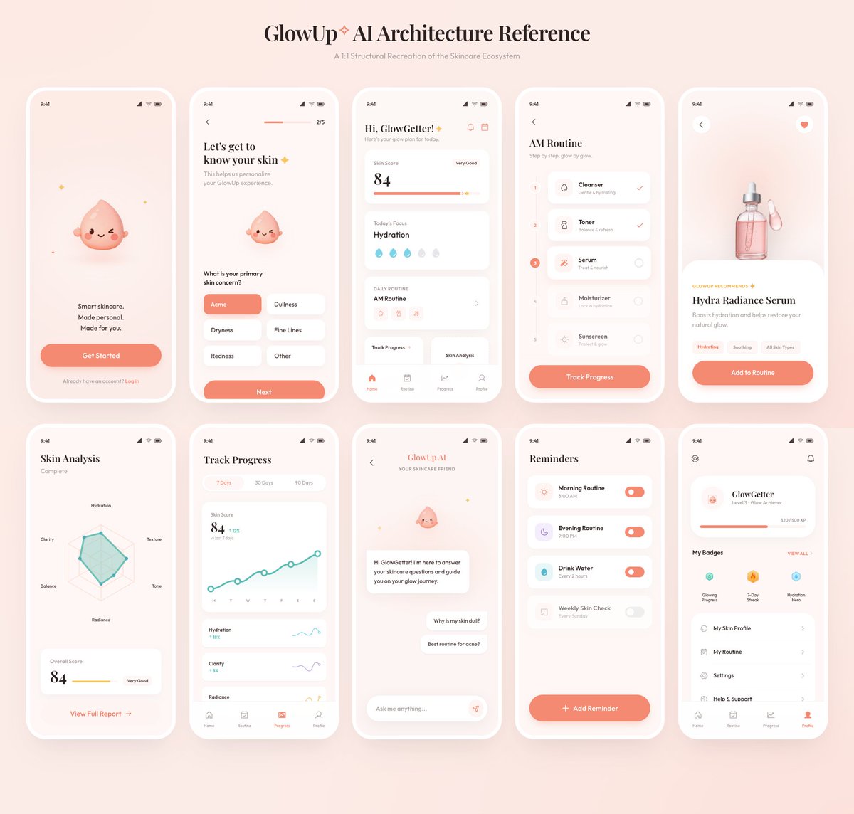
完整 Prompt
Using the provided reference image as the source, recreate the GlowUp skincare mobile app architecture board as a clean, high-resolution UI presentation. Focus on the app screens from the right side of the reference, remove the surrounding canvas clutter and loose asset thumbnails, and redraw the interfaces crisply in the same soft peach/pink brand style with rounded white phone frames, subtle shadows, minimal icons, and the cute droplet mascot where it appears. Arrange exactly 10 mobile screens in a neat 2-row grid of 5 screens each, under the centered heading “{argument name="board title" default="GlowUp✧ AI Architecture Reference"}” and subtitle “{argument name="board subtitle" default="AI Structural Recreation of the Skincare Ecosystem"}”. Include these 10 screens: 1) welcome / get started screen, 2) onboarding skin concern selection screen, 3) GlowGetter dashboard with skin score and routine cards, 4) AM routine checklist, 5) Hydra Radiance Serum product detail, 6) skin analysis radar chart, 7) track progress line chart, 8) GlowUp AI chat screen, 9) reminders list, and 10) profile / badges screen. Keep the same visual identity from the reference: pastel peach background, coral CTA buttons, white cards, delicate typography, skincare-focused labels, tiny status bars, and airy spacing. Make the output look like a polished product-design showcase rather than a screenshot of the original board.