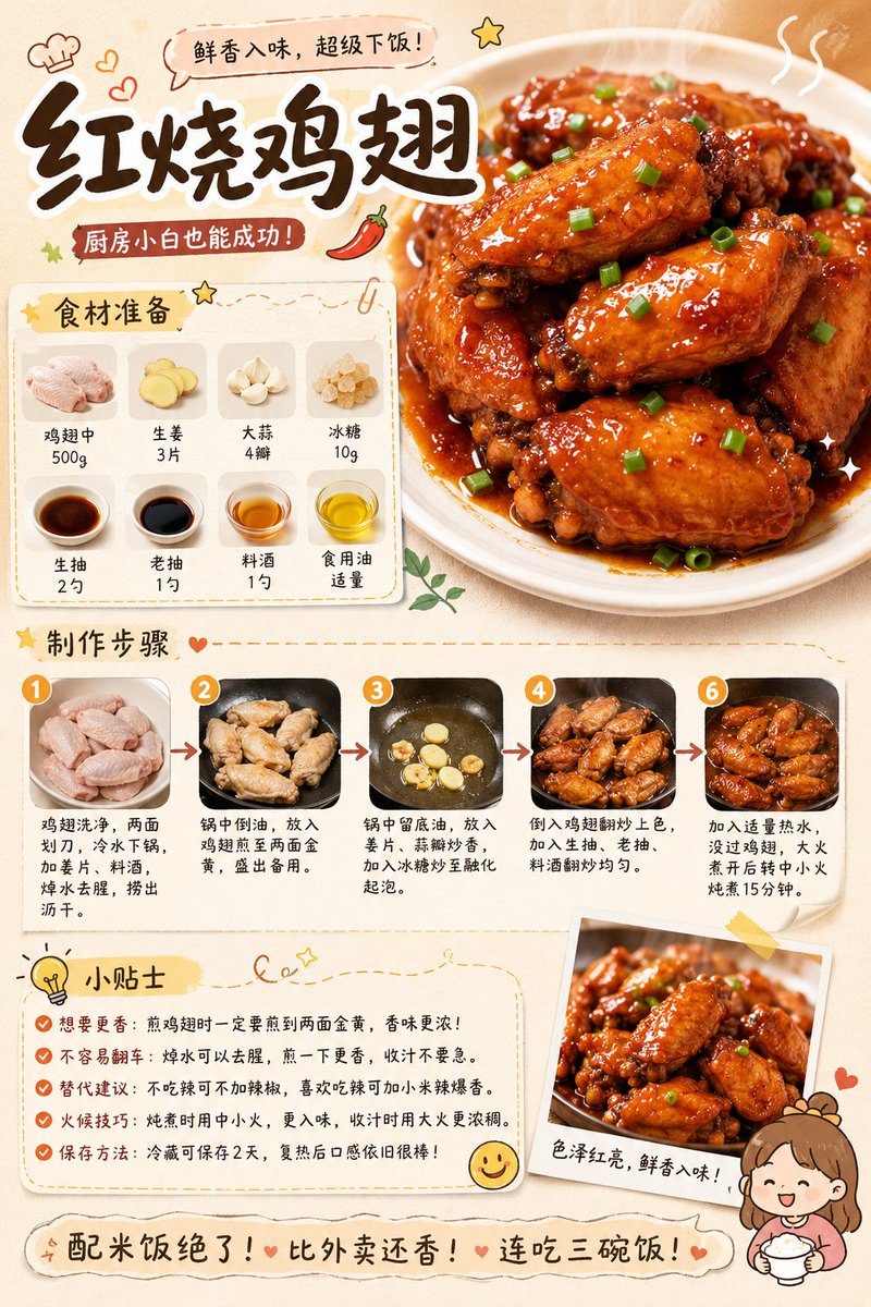
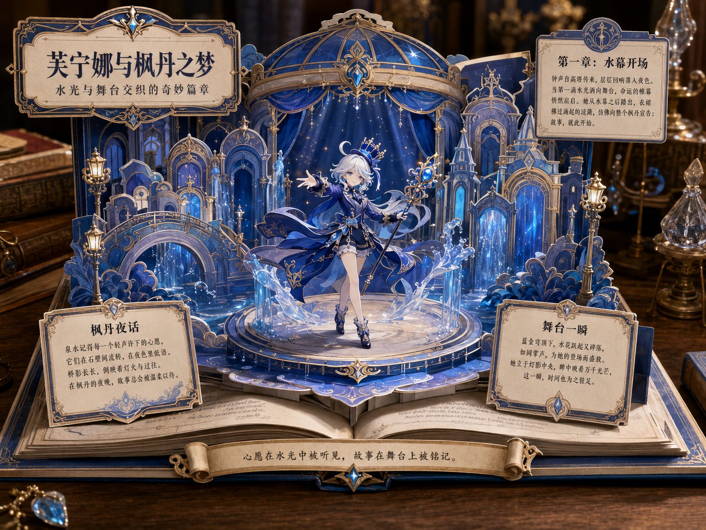
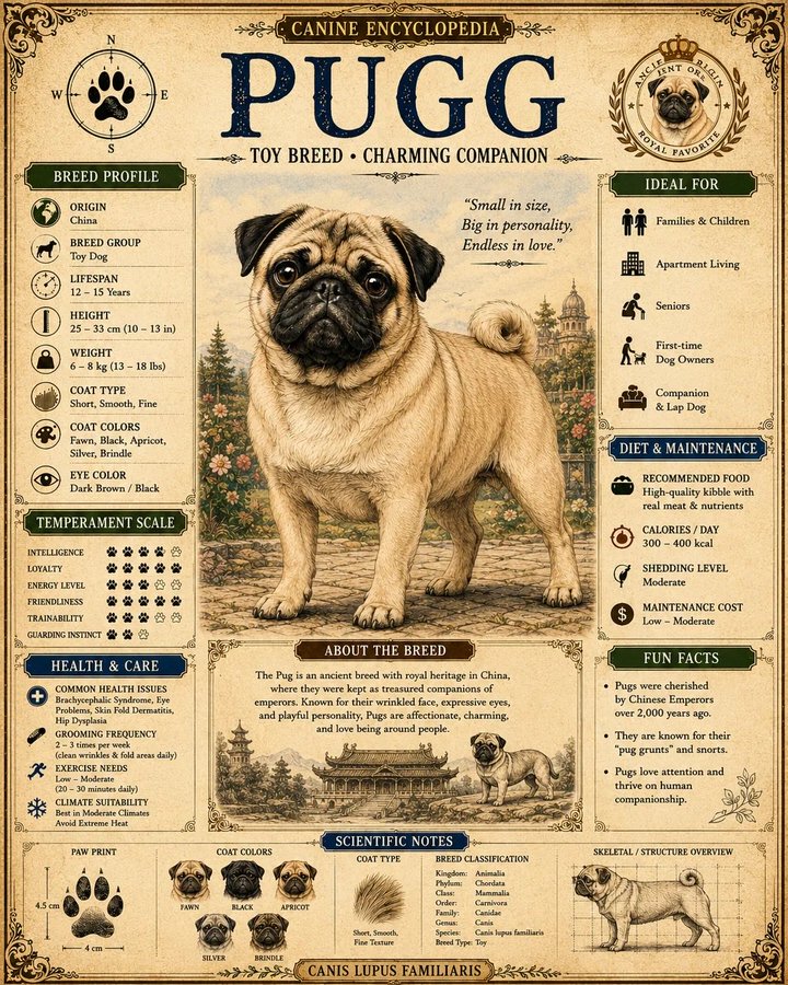
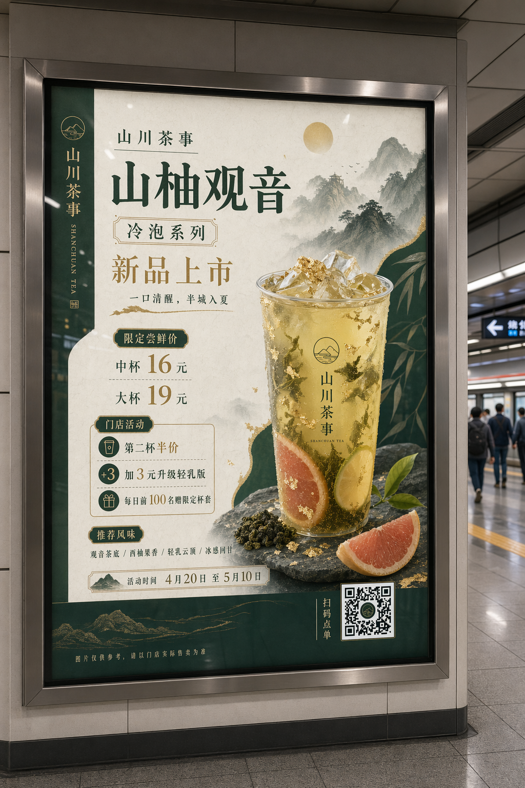
案例媒体
案例说明
这个页面把案例媒体、完整 Prompt 和出处放在一起,方便你先看结果,再判断这条 Prompt 是否值得复制、收藏或加入对比。
案例解读
为了方便搜索、引用和后续复用,这里会把案例的适用场景、画面重点和 Prompt 结构拆成更容易浏览的说明。
这类案例适合用在什么场景
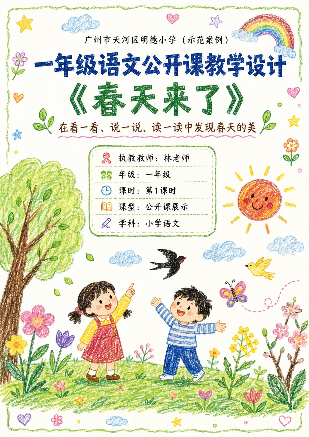
- 把它当作 UI 与社交媒体截图 的基准案例最合适,先看成片方向,再决定自己的 Prompt 要往哪边改。
- 如果你的目标也落在 海报、插画、UI 这些方向,这条案例特别适合先看图判断风格,再回头微调描述。
- 做 Prompt 对比时,也很适合作为控制组,只改一个变量去看结果变化。
画面重点与风格信号
- 这条案例最明显的风格信号集中在 海报、插画、UI,所以第一次改写时最好先保留这些关键词。
- 这类案例更值得先看界面密度、卡片层级,以及屏幕内容有没有先于文字讲清故事。
- 当前保留了 2 份媒体输出,适合顺手观察同一方向在多张结果里的稳定性。
Prompt 结构可以怎么理解
- 这条 Prompt 整体属于一条比较长、约束条件很多的 Prompt,很适合拿来判断这类方向到底需要写到多细。
- 关键词簇主要围绕 海报、插画、UI 展开,所以复用时可以先保留这组风格词,再替换主体、镜头、环境或文案信息。
- 最稳的改写方式通常是先保留结果方向和最强风格信号,只替换主体设定与场景块。
如果你是带着问题来的,可以先看这些角度
- 如果保留 海报、插画、UI,只换主体题材,结果最先变化的会是哪一部分?
- 这条结果里,哪些特征更像是 UI 与社交媒体截图 的结构特征,哪些又是标签风格本身带来的?
- 同分类的相关案例里,哪几条能给你更克制或更极致的相邻变体?
完整 Prompt
Please generate a set of 'Crayon-style Visual Lesson Plan' images based on the lesson theme, teaching information, and page content provided by the user. 【Task Goal】 Generate a set of lesson plan page images with unified style, suitable for public class displays. Output each image independently, do not stitch into a long image. Overall usage: Primary school lower grade Chinese public class display, parent observation, family committee observation, principal/director review, and also suitable as printable display lesson plan pages. 【Applicable Scenarios】 - Primary school lower grades (Year 1, Year 2 preferred) - Public class / Demonstration class / Teaching display - Subject priority: Primary school Chinese (can extend to Math, English, etc.) - Style is not childish scribbles, nor rigid official documents, but 'Children's crayon visuals + clear teaching logic + public class display sense'. ━━━━━━━━━━━━━━━━━━ I. Input Methods (Supports two modes) ━━━━━━━━━━━━━━━━━━ 【Mode A: User manually fills in content】 If the user directly provides school, topic, teacher, teaching goals, teaching flow, etc., please strictly organize according to the content provided by the user. 【Mode B: User uploads existing lesson plan / document / text content】 If the user uploads existing lesson plan content or pastes the full lesson plan text, please first understand and extract the content, then automatically organize it into a version suitable for multi-page display. Requirements: 1. Retain core teaching logic of the original lesson plan 2. Compress wordy text, enhance visualization and display feel 3. Prioritize extracting: Topic, goals, student situation, key points/difficulties, flow, blackboard design, after-class extension, home-school cooperation tips 4. Do not mechanically copy original text, convert into presentation language suitable for display pages. ━━━━━━━━━━━━━━━━━━ II. Output Quantity Rules (Important) ━━━━━━━━━━━━━━━━━━ 【Default Output Quantity】 Default generate 4 images. 【Customizable Quantity】 If the user explicitly specifies the number, execute according to the user-specified number. For example: - 1 image: Single page condensed version - 2 images: Cover + core content - 3 images: Cover + analysis page + flow page - 4 images: Cover + analysis page + flow (part 1) + flow (part 2) (Recommended default) - 5 images or more: Further split into more detailed content pages while maintaining unified style. 【Automatic Allocation Principle】 If the user specified number does not perfectly match the content volume, please automatically and reasonably split content, requirements: 1. Content allocation balanced 2. Do not have too much space at the front and crowding at the back 3. Each image should have a clear theme 4. Cover page priority retained 5. When fewer pages, appropriately merge content 6. When more pages, appropriately subdivide teaching flow, blackboard design, home-school cooperation, highlights modules, etc. ━━━━━━━━━━━━━━━━━━ III. Fixed Visual Rules ━━━━━━━━━━━━━━━━━━ 【Aspect Ratio】 Vertical, close to A4 paper ratio. Suggested ratio: 1000:1414 or similar. 【Overall Style】 10-year-old child's crayon hand-drawn style / Colorful crayon style / Child hand-drawn public class lesson plan style. Requirements: - White or warm white paper background - Obvious crayon strokes, child hand-drawn texture - Lines natural, slightly naive, but overall neat and clear - Colors bright and warm, dominated by soft crayon colors like red, yellow, blue, green, pink, orange - Overall like 'earnest yet childlike elementary public class display pages' - Cannot be too flashy, nor too rudimentary - Must have readability, display feel, layering - Do not make into kindergarten posters, nor ordinary Word screenshots. 【Layout Requirements】 - Each page must have a clear title - Cover page can use big title - Internal pages should not repeat oversized cover-style titles - Internal page tops only keep small headers or current page titles, do not overly occupy main text space - Main text content area should be sufficient, highlighting information volume and teaching logic - Module division clear - Information hierarchy clear - Text readability strong - White space moderate - Decorative elements serve content, not overshadow - Suitable for printing and display. 【Decorative Elements】 Appropriately use children's crayon-style decorative elements: - Flowers, clouds, sun, rainbows, stars, leaves, birds, butterflies, grass, hearts - Can add small illustrations related to the course theme - Decoration should be moderate, distributed naturally, do not fill the whole page. 【Font Presentation】 - Chinese titles can be made into crayon handwriting/child brushstroke feel - Body text must be clear and readable - Do not use too fancy or hard-to-recognize fonts - Do not use large areas of dense long paragraphs. ━━━━━━━━━━━━━━━━━━ IV. Page Structure Suggestions (Default 4P, adjustable by quantity) ━━━━━━━━━━━━━━━━━━ 【When 4 images, suggested structure】 P1 Cover Page P2 Teaching Analysis and Goal Design P3 Teaching Flow (Part 1) P4 Teaching Flow (Part 2) + Blackboard Design + Extension 【If user customizes quantity, adjust according to logic:】 1 image: Condensed overview page (Cover info + teaching goals + core flow + highlights) 2 images: 1. Cover + teaching goals/student situation/difficulty; 2. Teaching flow + blackboard design + extension 3 images: 1. Cover; 2. Teaching analysis and goal design; 3. Teaching flow + summary extension 4 images (Default): 1. Cover; 2. Analysis and goals; 3. Flow (part 1); 4. Flow (part 2) + blackboard design + home-school + highlights 5+ images: Further split into: Cover, Analysis, Goals/Difficulties, Flow (part 1), Flow (part 2), Blackboard design, Home-school, Highlights/Summary. ━━━━━━━━━━━━━━━━━━ V. Page Content Requirements ━━━━━━━━━━━━━━━━━━ 【Cover Page】 Include: School name, Course type, Topic name, Subtitle/Instructional blurb, Teacher, Grade, Class hour, Lesson type, Subject. Visual requirements: - Fullest visual, catchy - Can add child crayon scene illustrations related to topic - Warm, childlike, spring vibe (or matching topic) - Looks like lesson plan cover and display page. 【Teaching Analysis Pages】 Can include: Student analysis, teaching goals, focus, difficulties, preparation, assessment. Visual requirements: - Use independent rounded boxes/hand-drawn borders for modules - Simple icons for each module - Clear logic, not too crowded. 【Teaching Flow Pages】 Can include: Link name, time, teacher activity, student activity, design intent, observation points. Visual requirements: - Use vertical flow/segmented cards/timeline layout - Independent module for each link - Small illustrations for understanding - Rhythmic page. 【Summary/Extension Pages】 Can include: Summary, extension, blackboard design, home-school tips, highlights. Visual requirements: - Layout with main and secondary focus - Blackboard design can be on the right side - Home-school and highlights as auxiliary - Informative but clean. ━━━━━━━━━━━━━━━━━━ VI. Content Formatting Principles ━━━━━━━━━━━━━━━━━━ 1. Compress long content into readable text. 2. Retain professional teaching tone, avoid overly administrative language. 3. Language suitable for lower grade public class scenarios. 4. Accessible to teachers, parents, and principals. 5. Balance child affinity with professional credibility. 6. Not pure illustration posters, but 'visual lesson plans'. 7. Rich info but not messy. 8. Unified style. 9. Auto-balance content when page count varies. ━━━━━━━━━━━━━━━━━━ VII. If user doesn't provide full content, fill according to this template ━━━━━━━━━━━━━━━━━━ Please generate based on: - Quantity (Default 4) - School - Grade - Subject - Topic - Teacher - Class Hour - Lesson Type - Subtitle - Teaching Goals - Student Analysis - Key Points - Difficulties - Preparation - Flow - Blackboard Design - Summary - Extension - Home-school tips - Highlights. If not filled, auto-complete reasonably but keep real and compliant with lower grade logic. ━━━━━━━━━━━━━━━━━━ VIII. Output Summary ━━━━━━━━━━━━━━━━━━ Final Output: - Default 4 independent vertical A4 crayon-style lesson plan images (unless specified otherwise) - Unified style - Real content - Clear layout - Suitable for public class display - Suitable for parent/principal viewing - Not over-decorated - Not too simple - Not ordinary document screenshots - Balance of 'Children's crayon style + professional teaching design'.