案例媒体
案例说明
这个页面把案例媒体、完整 Prompt 和出处放在一起,方便你先看结果,再判断这条 Prompt 是否值得复制、收藏或加入对比。
案例解读
为了方便搜索、引用和后续复用,这里会把案例的适用场景、画面重点和 Prompt 结构拆成更容易浏览的说明。
这类案例适合用在什么场景
- 把它当作 UI 与社交媒体截图 的基准案例最合适,先看成片方向,再决定自己的 Prompt 要往哪边改。
- 如果你的目标也落在 海报、UI、截图 这些方向,这条案例特别适合先看图判断风格,再回头微调描述。
- 做 Prompt 对比时,也很适合作为控制组,只改一个变量去看结果变化。
画面重点与风格信号
- 这条案例最明显的风格信号集中在 海报、UI、截图,所以第一次改写时最好先保留这些关键词。
- 这类案例更值得先看界面密度、卡片层级,以及屏幕内容有没有先于文字讲清故事。
- 当前只有一张主图,所以第一张结果图就是最核心的参考基准。
Prompt 结构可以怎么理解
- 这条 Prompt 整体属于一条比较长、约束条件很多的 Prompt,很适合拿来判断这类方向到底需要写到多细。
- 关键词簇主要围绕 海报、UI、截图 展开,所以复用时可以先保留这组风格词,再替换主体、镜头、环境或文案信息。
- 最稳的改写方式通常是先保留结果方向和最强风格信号,只替换主体设定与场景块。
如果你是带着问题来的,可以先看这些角度
- 如果保留 海报、UI、截图,只换主体题材,结果最先变化的会是哪一部分?
- 这条结果里,哪些特征更像是 UI 与社交媒体截图 的结构特征,哪些又是标签风格本身带来的?
- 同分类的相关案例里,哪几条能给你更克制或更极致的相邻变体?
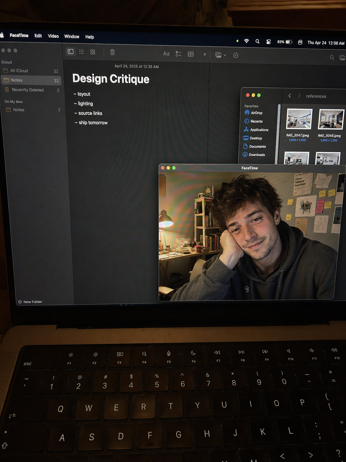
完整 Prompt
Create a raw smartphone photo of a laptop screen, not a screenshot. Aspect ratio 3:4, high-angle downward POV from someone standing over a desk at night. The laptop display fills most of the frame, with a narrow strip of black keyboard and trackpad visible at the bottom. Strong realism: visible RGB subpixel grid, subtle moire bands, small dust specks, faint fingerprints, uneven glass reflections, handheld phone noise, slight perspective skew, no studio polish. macOS dark mode. Background app: Apple Notes with a late-night study note titled "Design Critique" and short visible bullets: "layout", "lighting", "source links", "ship tomorrow". Foreground app: FaceTime live preview window floating lower-right, showing a fictional adult man in his 20s sitting at a cluttered desk, hoodie, tired but amused expression, warm desk lamp behind him, books and sticky notes in the room. A second small Finder window with image thumbnails is partly visible behind it. Make it feel like an accidental real phone photo of a working laptop screen. No real-person likeness, no beauty filter, no perfect UI, no screenshot, no watermark, no cartoon, no 3D render.