案例媒体
案例说明
这个页面把案例媒体、完整 Prompt 和出处放在一起,方便你先看结果,再判断这条 Prompt 是否值得复制、收藏或加入对比。
案例解读
为了方便搜索、引用和后续复用,这里会把案例的适用场景、画面重点和 Prompt 结构拆成更容易浏览的说明。
这类案例适合用在什么场景
- 把它当作 海报与插画 的基准案例最合适,先看成片方向,再决定自己的 Prompt 要往哪边改。
- 如果你的目标也落在 时尚、海报、插画 这些方向,这条案例特别适合先看图判断风格,再回头微调描述。
- 做 Prompt 对比时,也很适合作为控制组,只改一个变量去看结果变化。
画面重点与风格信号
- 这条案例最明显的风格信号集中在 时尚、海报、插画,所以第一次改写时最好先保留这些关键词。
- 重点多半在版式节奏、标题层级、插画材质和信息在画面里的摆放方式。
- 当前保留了 2 份媒体输出,适合顺手观察同一方向在多张结果里的稳定性。
Prompt 结构可以怎么理解
- 这条 Prompt 整体属于一条比较长、约束条件很多的 Prompt,很适合拿来判断这类方向到底需要写到多细。
- 关键词簇主要围绕 时尚、海报、插画 展开,所以复用时可以先保留这组风格词,再替换主体、镜头、环境或文案信息。
- 最稳的改写方式通常是先保留结果方向和最强风格信号,只替换主体设定与场景块。
如果你是带着问题来的,可以先看这些角度
- 如果保留 时尚、海报、插画,只换主体题材,结果最先变化的会是哪一部分?
- 这条结果里,哪些特征更像是 海报与插画 的结构特征,哪些又是标签风格本身带来的?
- 同分类的相关案例里,哪几条能给你更克制或更极致的相邻变体?
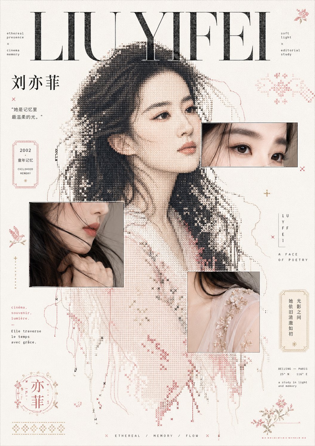
完整 Prompt
Generate an editorial magazine-style collage image based on a specific theme: the composition uses large areas of bright white space to support the content. The strongest visual weight comes from an enlarged silhouette of the main subject. The silhouette is shaped using a mixture of coarse halftone dots, pixel cross-stitch, and broken stitches. The edges retain an unfinished thread feel and a few loose points, translating the physical subject into a graphic that exists between a printing screen and hand embroidery. Two or three partial image windows with thin line outlines are overlaid on the main subject, capturing only the most tactile and recognizable details of the theme. The windows overlap with the pixel silhouette, creating layers where real images and dot patterns calibrate with each other. Typography serves as the core composition: a massive high-contrast serif title anchors the upper visual hierarchy, supplemented by narrow-letter-spaced pixel handwritten phrases, small captions, and scattered micro-annotations. The layout maintains the calmness, emptiness, and rhythmic reading pace of French editorial design. The background retains clean paper grain and slight scanning noise, with surrounding scattered folk art patterns derived from the theme, symbolic stamps, broken borders, and dot-matrix decorations, like graphic marks torn from old fabrics, receipts, and childhood memories. Colors are extracted from the theme's own materials, emotions, and cultural signals: high-brightness clear base colors are used in large areas, structural information uses clear dark colors to establish the center of gravity, and a small amount of theme-derived accent colors are used only for sub-titles, thin frames, and decorative symbols, maintaining a bright, clean mood with a touch of childhood ritual; all color boundaries are clear, saturation is restrained but not muddy, the texture is an airy paper feel and printing grain, without any aged or dirty treatment. Theme: Liu Yifei