案例媒体
案例说明
这个页面把案例媒体、完整 Prompt 和出处放在一起,方便你先看结果,再判断这条 Prompt 是否值得复制、收藏或加入对比。
案例解读
为了方便搜索、引用和后续复用,这里会把案例的适用场景、画面重点和 Prompt 结构拆成更容易浏览的说明。
这类案例适合用在什么场景
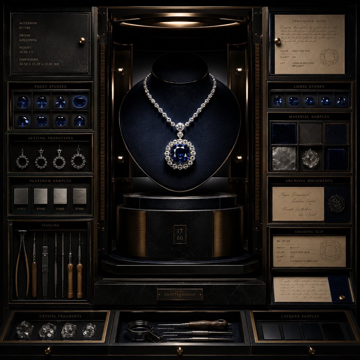
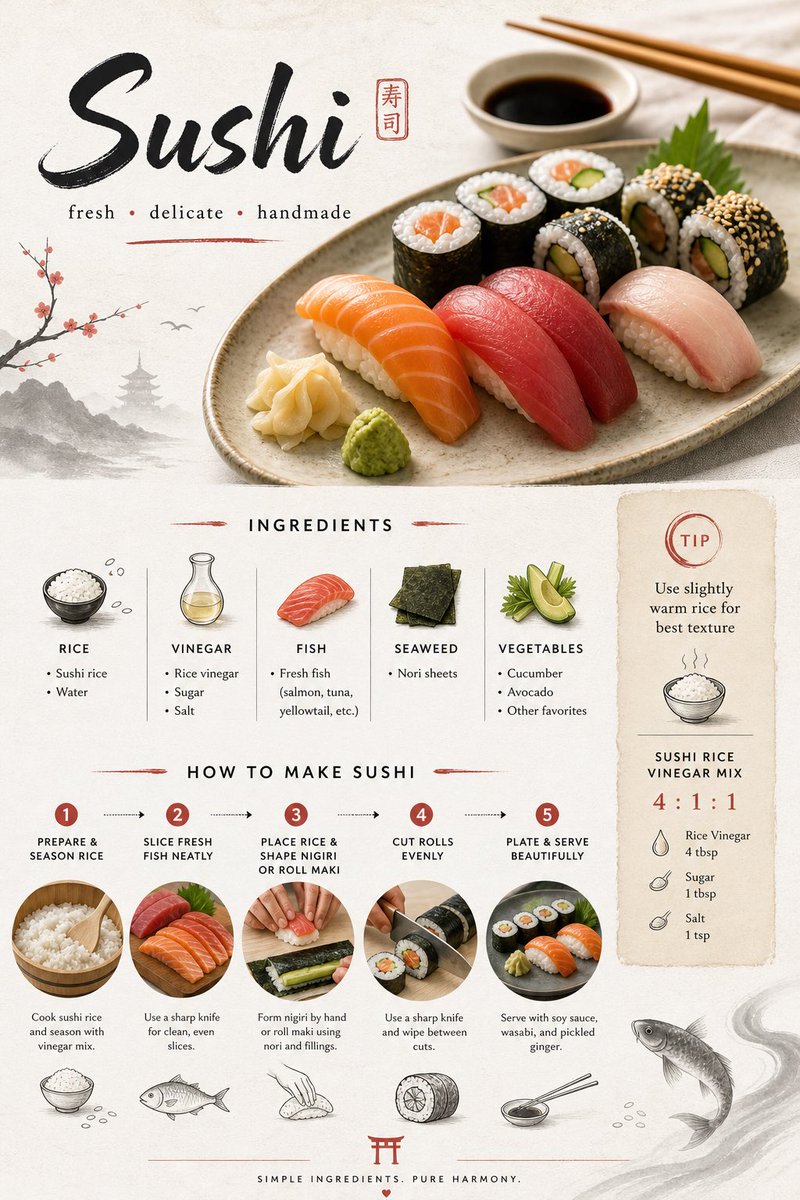
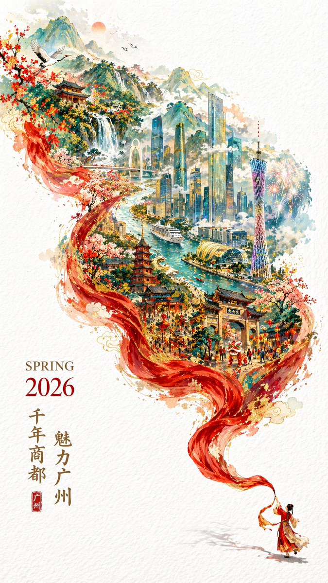
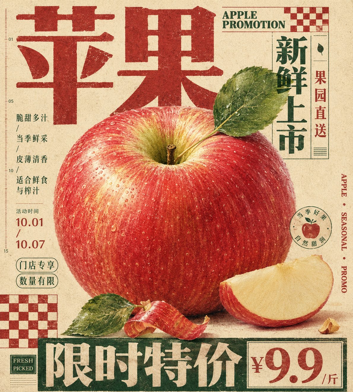
- 把它当作 海报与插画 的基准案例最合适,先看成片方向,再决定自己的 Prompt 要往哪边改。
- 如果你的目标也落在 时尚、海报、插画 这些方向,这条案例特别适合先看图判断风格,再回头微调描述。
- 做 Prompt 对比时,也很适合作为控制组,只改一个变量去看结果变化。
画面重点与风格信号
- 这条案例最明显的风格信号集中在 时尚、海报、插画,所以第一次改写时最好先保留这些关键词。
- 重点多半在版式节奏、标题层级、插画材质和信息在画面里的摆放方式。
- 当前保留了 2 份媒体输出,适合顺手观察同一方向在多张结果里的稳定性。
Prompt 结构可以怎么理解
- 这条 Prompt 整体属于一条比较长、约束条件很多的 Prompt,很适合拿来判断这类方向到底需要写到多细。
- 关键词簇主要围绕 时尚、海报、插画 展开,所以复用时可以先保留这组风格词,再替换主体、镜头、环境或文案信息。
- 最稳的改写方式通常是先保留结果方向和最强风格信号,只替换主体设定与场景块。
如果你是带着问题来的,可以先看这些角度
- 如果保留 时尚、海报、插画,只换主体题材,结果最先变化的会是哪一部分?
- 这条结果里,哪些特征更像是 海报与插画 的结构特征,哪些又是标签风格本身带来的?
- 同分类的相关案例里,哪几条能给你更克制或更极致的相邻变体?
完整 Prompt
Generate a vertical print poster based on a specific theme. First, translate the theme into an enlarged tactile main specimen or main material mass, placed at the center or middle-lower part of the frame, giving it clear identifiable edges, soft volume, local high-density details, and touchable material changes. The subject is not displayed in isolation but is sandwiched by giant titles, edge text, hard-edged checkerboard modules, and low-contrast explanatory text; the titles use heavy fonts with a clear skeleton, becoming top, bottom, or side edge architecture, participating in the composition like walls, bases, or sidebars, where the text first forms a structure and then carries semantics. Let the silhouette of the subject, subordinate fragments, material edges, or symbolic fragments partially overlap the titles, vertical text, and geometric blocks, forming a clear but restrained front-to-back layer, making the image and layout interpenetrate rather than avoid each other. The background is a full sheet of warm, low-noise, printable paper field, with subtle paper grain, fiber, particles, and a slight ink-absorption feel, used to unify the realistic subject, flat text, and geometric color blocks; the background maintains breathing and medium feel, not creating real space. Colors are layered by function: the paper base occupies the largest area; the subject retains the most delicate emotional colors, soft gradients, and local saturation; the titles, edge words, or checkerboards use flatter, more stable structural colors; the body text and notes recede into the paper surface with low contrast, the overall has a clear area difference, lightness order, and a balance where sweetness is suppressed by structure. Place one or two hard-edged checkerboard modules in the corners as graphic rhythm anchors; they have no perspective, no shadows, and are printed directly on the paper to balance the subject's curves, title volume, and white space pressure. Small body text should not look like independent description cards but should be compressed into a compact information texture, embedded in the white gaps around the subject, maintaining short line spacing, restrained colors, and an editorial instruction feel. The subject's details are only concentrated in positions that best convey tactile feel and thematic identity, while other subordinate edges are allowed to be cropped, blocked, or slightly softened to maintain primary and secondary hierarchy. The final surface has vintage printing passivation, text edges are slightly soft, color blocks have ink deposition, and paper grain passes through all layers without blurring the subject's details, overall presenting a mixture of carefully typeset editorial poster, packaging plate, and specimen description. This theme: Apple promotion poster. Ratio 9:10.