案例媒体
案例说明
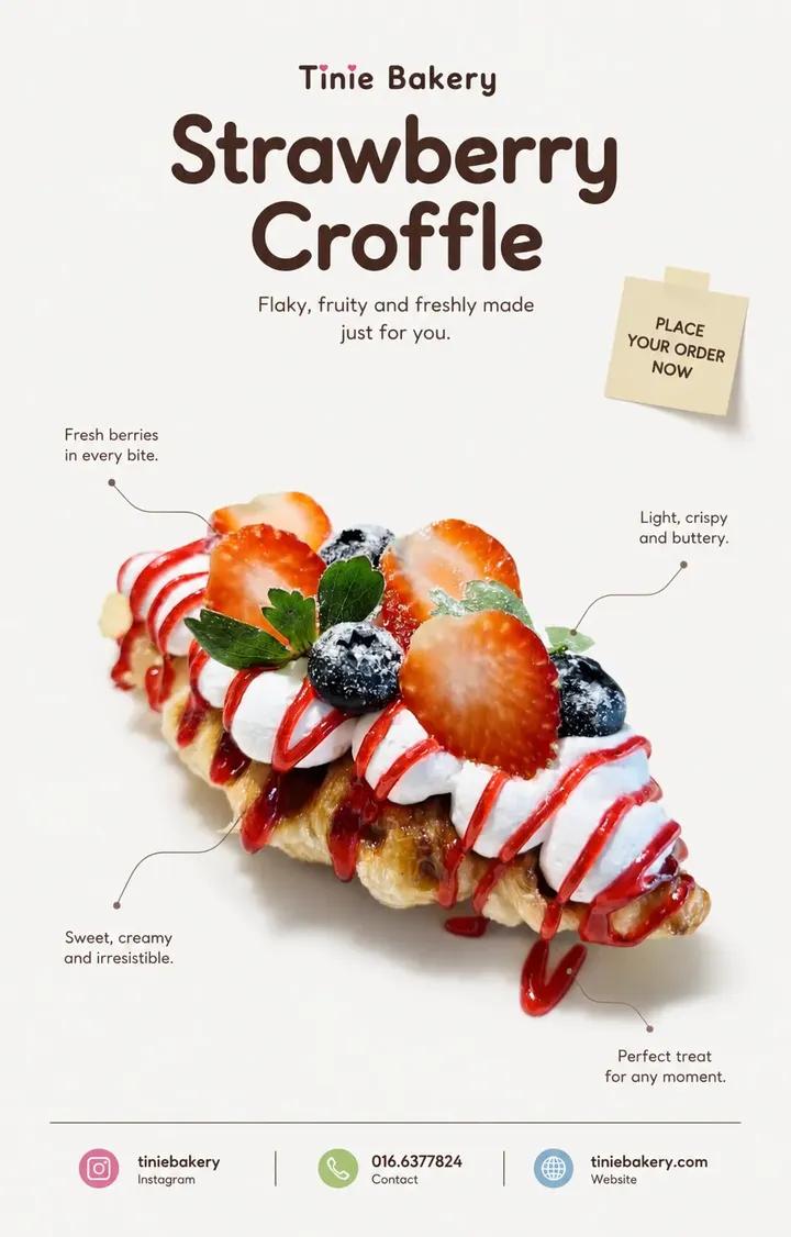
这个页面把案例媒体、完整 Prompt 和出处放在一起,方便你先看结果,再判断这条 Prompt 是否值得复制、收藏或加入对比。
案例解读
为了方便搜索、引用和后续复用,这里会把案例的适用场景、画面重点和 Prompt 结构拆成更容易浏览的说明。
这类案例适合用在什么场景
- 把它当作 海报与插画 的基准案例最合适,先看成片方向,再决定自己的 Prompt 要往哪边改。
- 如果你的目标也落在 时尚、海报、插画 这些方向,这条案例特别适合先看图判断风格,再回头微调描述。
- 做 Prompt 对比时,也很适合作为控制组,只改一个变量去看结果变化。
画面重点与风格信号
- 这条案例最明显的风格信号集中在 时尚、海报、插画,所以第一次改写时最好先保留这些关键词。
- 重点多半在版式节奏、标题层级、插画材质和信息在画面里的摆放方式。
- 当前只有一张主图,所以第一张结果图就是最核心的参考基准。
Prompt 结构可以怎么理解
- 这条 Prompt 整体属于一条比较长、约束条件很多的 Prompt,很适合拿来判断这类方向到底需要写到多细。
- 关键词簇主要围绕 时尚、海报、插画 展开,所以复用时可以先保留这组风格词,再替换主体、镜头、环境或文案信息。
- 最稳的改写方式通常是先保留结果方向和最强风格信号,只替换主体设定与场景块。
如果你是带着问题来的,可以先看这些角度
- 如果保留 时尚、海报、插画,只换主体题材,结果最先变化的会是哪一部分?
- 这条结果里,哪些特征更像是 海报与插画 的结构特征,哪些又是标签风格本身带来的?
- 同分类的相关案例里,哪几条能给你更克制或更极致的相邻变体?
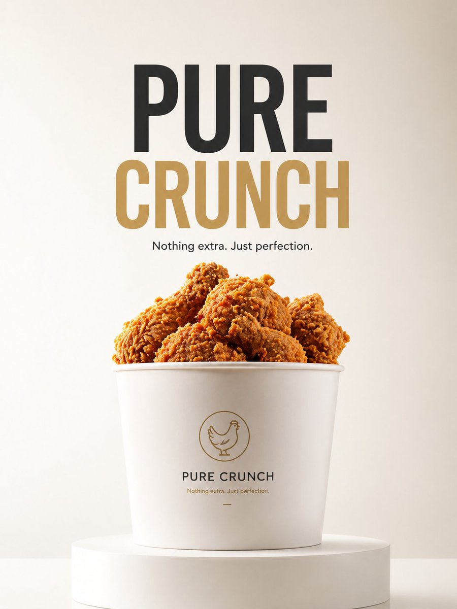
完整 Prompt
MINIMAL EDITORIAL PRODUCT POSTER (CLEAN REFERENCE STYLE • DESIGN LOCKED • STRICT PRODUCT PRESERVATION) ASPECT RATIO: 4:5 VERTICAL PRODUCT : [……] BRAND : [……] CONTACT / INSTAGRAM : […..] ━━━━━━━━━━━━━━━━━━ Analyze the uploaded product first. Use the reference ONLY for: • composition • typography hierarchy • whitespace • editorial mood • color atmosphere Keep the SAME visual direction. Do not redesign the style. ━━━━━━━━━━━━━━━━━━ DESIGN LOCK — IMPORTANT Preserve the existing design language. Keep: • clean editorial layout • cute atmosphere • center-focused product • quote placement • thin callout lines • sticky note placement • footer structure • rounded typography • generous whitespace Do not introduce new design ideas. ━━━━━━━━━━━━━━━━━━ PRODUCT — ULTRA STRICT MODE The uploaded product is the ONLY visual source. Treat the product as LOCKED. Maintain approximately 99% visual similarity. Do NOT: • regenerate product • redesign product • reinterpret product • recreate hidden parts • change shape • change texture • change color • change proportions • improve appearance • smooth imperfections • add ingredients • remove ingredients • modify details • replace packaging STRICTLY PRESERVE: • silhouette • proportions • original texture • original reflections • original toppings • original details • original count • original placement • original imperfections • original colors Allowed ONLY: ✓ isolate ✓ reposition ✓ crop ✓ soft realistic shadow ✓ remove packaging ONLY if product remains identical If product changes: KEEP ORIGINAL PRODUCT. Adjust layout around the product. Never adjust product for layout. ━━━━━━━━━━━━━━━━━━ LAYOUT Product remains visually centered. Do not force perfect symmetry. Keep large breathing space. Keep composition clean. Adding Brand Name and product name at Header ━━━━━━━━━━━━━━━━━━ CALLOUT Create 2–4 short editorial quotes. Place around the product. Every quote MUST connect to the product using: thin subtle callout lines. Callout lines are mandatory. Style: clean minimal editorial ━━━━━━━━━━━━━━━━━━ STICKY NOTE Create ONE small sticky note. Place near upper composition area. Text: PLACE YOUR ORDER NOW Style: • natural paper feeling • lightly attached • slightly imperfect angle • subtle paper texture • small scale • soft shadow Feels natural. Not decorative. ━━━━━━━━━━━━━━━━━━ TYPOGRAPHY Rounded sans only. No italic. Elegant. Minimal. Premium. ━━━━━━━━━━━━━━━━━━ FOOTER Include: [PRODUCT NAME] [BRAND] [CONTACT / INSTAGRAM] Clean hierarchy. Minimal spacing. adding coloured symbol for instagram, contact, website ━━━━━━━━━━━━━━━━━━ BACKGROUND Keep clean. No decorative elements. Do not add: • leaves • botanical shadow • flowers • props • sparkles • icons • decorative fillers Use whitespace. ━━━━━━━━━━━━━━━━━━ COLOR Cool neutral tone. Soft contrast. Keep product colors original. ━━━━━━━━━━━━━━━━━━ FINAL FEEL Same clean editorial design. Same cute atmosphere. Only improve product preservation.