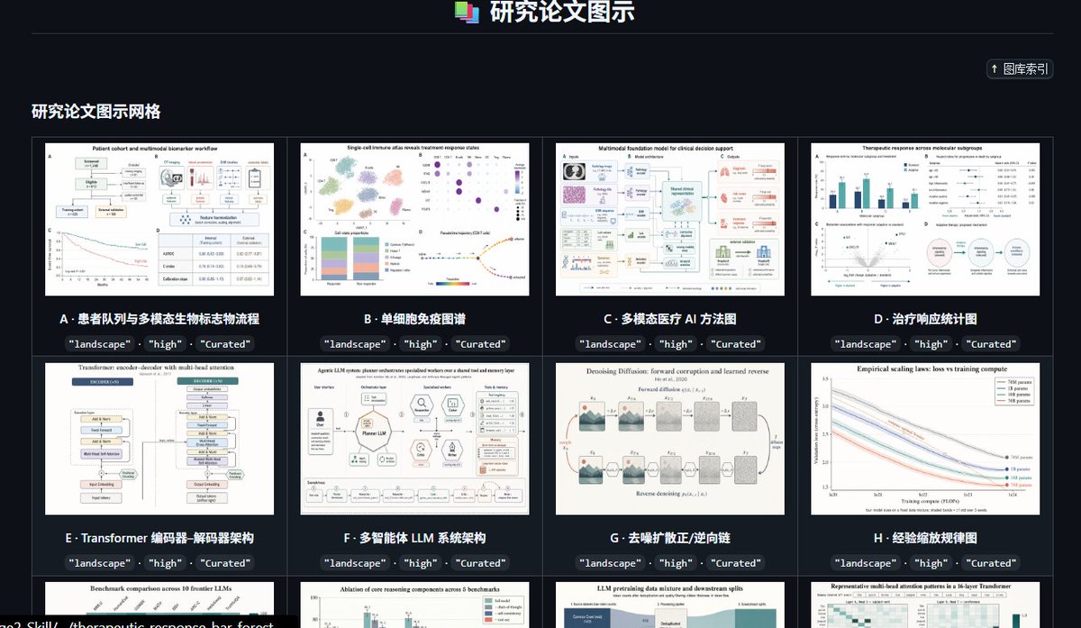
案例媒体
案例说明
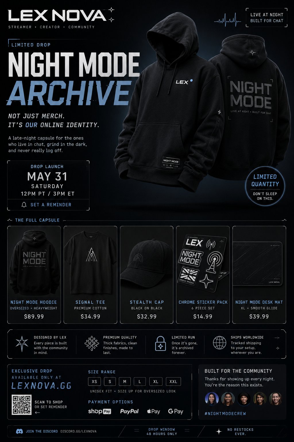
这个页面把案例媒体、完整 Prompt 和出处放在一起,方便你先看结果,再判断这条 Prompt 是否值得复制、收藏或加入对比。
案例解读
为了方便搜索、引用和后续复用,这里会把案例的适用场景、画面重点和 Prompt 结构拆成更容易浏览的说明。
这类案例适合用在什么场景
- 把它当作 模型对比与社区 的基准案例最合适,先看成片方向,再决定自己的 Prompt 要往哪边改。
- 如果你的目标也落在 时尚、海报、UI 这些方向,这条案例特别适合先看图判断风格,再回头微调描述。
- 做 Prompt 对比时,也很适合作为控制组,只改一个变量去看结果变化。
画面重点与风格信号
- 这条案例最明显的风格信号集中在 时尚、海报、UI,所以第一次改写时最好先保留这些关键词。
- 这类案例最有价值的地方通常是看差异:到底改了什么、哪里崩了、是哪段 Prompt 造成的变化。
- 当前保留了 2 份媒体输出,适合顺手观察同一方向在多张结果里的稳定性。
Prompt 结构可以怎么理解
- 这条 Prompt 整体属于一条比较长、约束条件很多的 Prompt,很适合拿来判断这类方向到底需要写到多细。
- 关键词簇主要围绕 时尚、海报、UI 展开,所以复用时可以先保留这组风格词,再替换主体、镜头、环境或文案信息。
- 最稳的改写方式通常是先保留结果方向和最强风格信号,只替换主体设定与场景块。
如果你是带着问题来的,可以先看这些角度
- 如果保留 时尚、海报、UI,只换主体题材,结果最先变化的会是哪一部分?
- 这条结果里,哪些特征更像是 模型对比与社区 的结构特征,哪些又是标签风格本身带来的?
- 同分类的相关案例里,哪几条能给你更克制或更极致的相邻变体?
完整 Prompt
Create a premium, highly believable Creator Merch Drop Poster for an imaginary creator, streamer, artist, or internet personality called [CREATOR NAME]. The goal is to make the merch feel like a real limited-edition drop with strong community hype, visual identity, and collector appeal. The poster should feel like an official launch asset for a creator brand people would repost, wait for, and rush to buy before it sells out. Creator / drop details: - Creator name: [CREATOR NAME] - Creator type: [STREAMER / YOUTUBER / MUSIC ARTIST / DIGITAL CREATOR / VTUBER / PODCAST HOST / INTERNET ICON / MEME PERSONA] - Drop name: [DROP NAME] - Merch type: [APPAREL / CAPSULE COLLECTION / ACCESSORIES / POSTERS / DESK ITEMS / PLUSH / HYBRID DROP] - Core concept: [WHAT THE DROP IS ABOUT] - Main appeal: [WHY FANS WANT IT] - Audience: [AUDIENCE] - Brand energy: [COOL / PLAYFUL / CHAOTIC / PREMIUM / IRONIC / SOFT / HARDCORE / DESIGN-LED] - Cultural vibe: [STREAMER CULTURE / Y2K INTERNET / VTUBER / STREETWEAR / FAN MERCH / ARTIST DROP / HYPE CULTURE / EDITORIAL CREATOR BRAND] - Reality level: [BELIEVABLE CREATOR DROP / BELIEVABLE PREMIUM MERCH LINE / STYLIZED BUT REAL / DEADPAN FICTIONAL] Poster structure: Build the visual like an official creator-merch campaign poster. Include sections such as: - creator name or logo - merch drop title - hero item or lineup - launch date / time - short campaign tagline - optional “limited quantity” cue - optional product highlights - optional pricing hints - optional drop window or preorder message - optional website or QR-style CTA - optional fan-community cue - optional edition label or collection number For the copy, include: - one strong merch-drop headline - 1 to 3 support lines - language that feels native to creator culture and online drops - a balance between hype, intimacy, and commercial clarity - wording that feels official, community-driven, and repostable Include: - a strong creator-brand title treatment - premium drop hierarchy - believable merch styling - polished launch info - strong fan desirability - realistic community hype cues - instantly shareable creator-brand energy - clear purchase urgency Visual direction: - Make the poster feel like a real creator launch people would save, repost, and set reminders for - Emphasize identity, fandom, exclusivity, and drop culture - Balance retail clarity with strong creator-brand worldbuilding - Make it suitable for Instagram drops, community posts, launch countdowns, store banners, or fan repost accounts - The result should look like a genuine high-performing merch campaign Art direction: - Style: [CREATOR DROP POSTER / STREAMER MERCH CAMPAIGN / STREETWEAR-LIKE CREATOR VISUAL / FAN-CULTURE PRODUCT POSTER / CLEAN DTC MERCH AD / Y2K INTERNET DROP] - Color palette: [PALETTE] - Typography feel: [BOLD HYPE TYPE / CLEAN CREATOR SANS / STREETWEAR DISPLAY / INTERNET-CORE MIX / PREMIUM EDITORIAL] - Material feel: [DROP POSTER / SOCIAL LAUNCH GRAPHIC / STORE BANNER / CREATOR CAMPAIGN SHEET / DIGITAL PROMO ASSET] - Lighting or image mood: [FLASHY / CLEAN PRODUCT STUDIO / INTERNET GLOW / PREMIUM STREETWEAR / SOFT CREATOR BRAND / HIGH-CONTRAST] - Background: [SOLID COLOR / UI SPACE / STUDIO SET / GRADIENT / FAN-CULTURE COLLAGE / PRODUCT STAGE] Composition: - Show the poster as one cohesive merch-drop campaign image - Make the creator name, hero merch, and launch timing instantly readable - Use real drop-poster hierarchy and fan-commerce logic - Make the merch feel desirable, limited, and culturally current - Make the final output feel like a premium fake creator-merch campaign with viral potential Output quality: - ultra-detailed - visually structured - commercially believable - culturally fluent - polished creator-brand styling - strong hierarchy and spacing - premium merch-drop composition - instantly shareable visual concept Optional content blocks: - countdown cue - preorder note - size range strip - collection number - fan-club exclusive badge - QR code - website URL style text - “ships worldwide” cue - sold-out-soon line - product carousel preview Avoid: - generic merch mockups - weak creator branding - fake-looking drop info - cluttered layout - random typography choices - amateur fan-merch aesthetics - too much copy fighting the hero product - obvious parody unless intentionally chosen