案例媒体
案例说明
这个页面把案例媒体、完整 Prompt 和出处放在一起,方便你先看结果,再判断这条 Prompt 是否值得复制、收藏或加入对比。
案例解读
为了方便搜索、引用和后续复用,这里会把案例的适用场景、画面重点和 Prompt 结构拆成更容易浏览的说明。
这类案例适合用在什么场景
- 把它当作 模型对比与社区 的基准案例最合适,先看成片方向,再决定自己的 Prompt 要往哪边改。
- 如果你的目标也落在 时尚、海报、插画 这些方向,这条案例特别适合先看图判断风格,再回头微调描述。
- 做 Prompt 对比时,也很适合作为控制组,只改一个变量去看结果变化。
画面重点与风格信号
- 这条案例最明显的风格信号集中在 时尚、海报、插画,所以第一次改写时最好先保留这些关键词。
- 这类案例最有价值的地方通常是看差异:到底改了什么、哪里崩了、是哪段 Prompt 造成的变化。
- 当前只有一张主图,所以第一张结果图就是最核心的参考基准。
Prompt 结构可以怎么理解
- 这条 Prompt 整体属于一条比较长、约束条件很多的 Prompt,很适合拿来判断这类方向到底需要写到多细。
- 关键词簇主要围绕 时尚、海报、插画 展开,所以复用时可以先保留这组风格词,再替换主体、镜头、环境或文案信息。
- 最稳的改写方式通常是先保留结果方向和最强风格信号,只替换主体设定与场景块。
如果你是带着问题来的,可以先看这些角度
- 如果保留 时尚、海报、插画,只换主体题材,结果最先变化的会是哪一部分?
- 这条结果里,哪些特征更像是 模型对比与社区 的结构特征,哪些又是标签风格本身带来的?
- 同分类的相关案例里,哪几条能给你更克制或更极致的相邻变体?
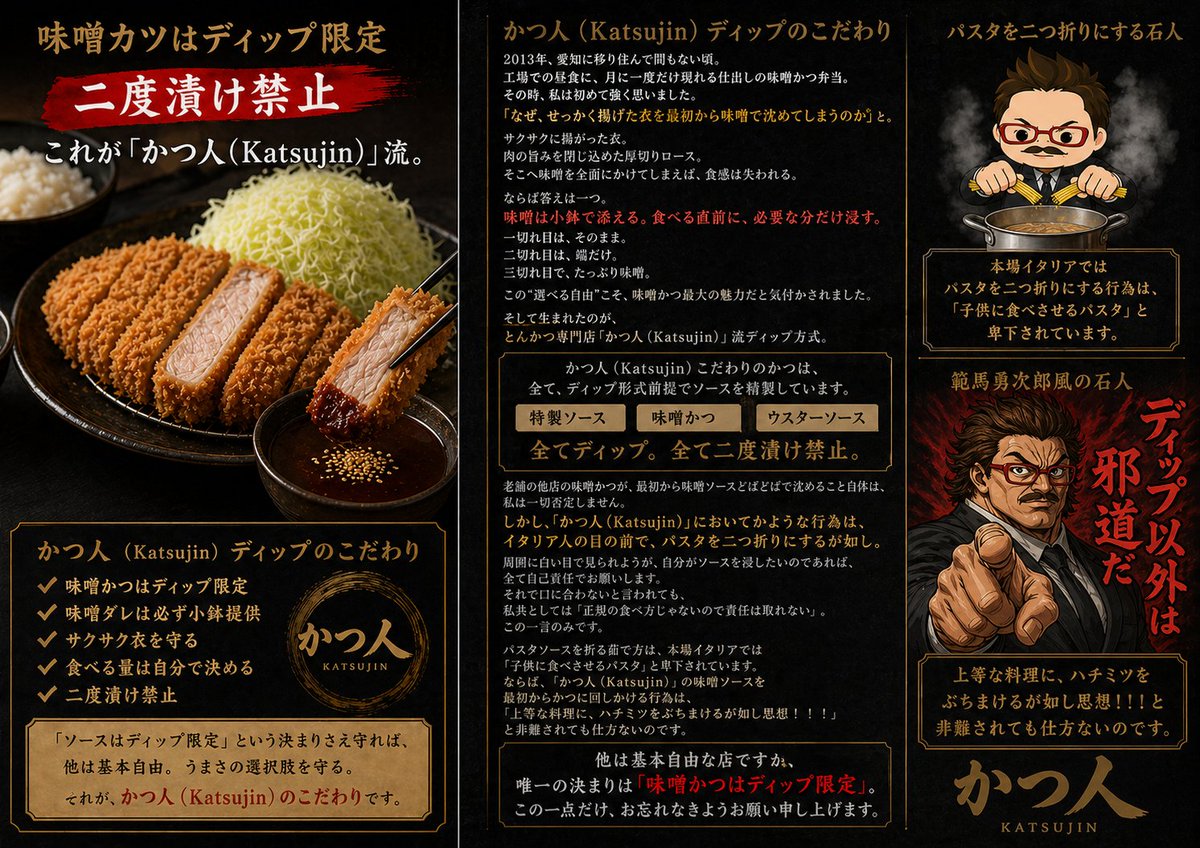
完整 Prompt
Goal: Create a dramatic Japanese promotional infographic poster for a highly opinionated tonkatsu specialty restaurant, {argument name="restaurant name" default="かつ人 (Katsujin)"}, focused on the rule that miso katsu sauce is dip-only and double-dipping is forbidden. Canvas: Wide horizontal 16:9 poster divided into three vertical panels by thin antique-gold borders. Use a black charcoal background with smoky texture, dark red brush accents, warm gold typography, and premium izakaya/ramen-shop menu aesthetics. Overall mood: intense, masculine, theatrical, slightly satirical. Left panel: Show a realistic close-up food photo style scene: a black ceramic plate with sliced golden-brown tonkatsu, one piece held by black chopsticks and dipped into a small bowl of dark miso sauce with sesame seeds. Include shredded cabbage piled high and a bowl of rice in the background. At the top, large Japanese headline text: 「味噌カツはディップ限定」. Under it, a red paint-stroke banner with big white text: 「二度漬け禁止」. Add a subtitle: 「これが『かつ人(Katsujin)』流。」. At the bottom, place a framed information box titled 「かつ人(Katsujin)ディップのこだわり」 with exactly 5 checkmark bullet points: 「味噌かつはディップ限定」, 「味噌ダレは必ず小鉢提供」, 「サクサク衣を守る」, 「食べる量は自分で決める」, 「二度漬け禁止」. Include a circular gold brush logo reading 「かつ人 KATSUJIN」 and a parchment note: 「『ソースはディップ限定』という決まりさえ守れば、他は基本自由。うまさの選択肢を守る。それが、かつ人(Katsujin)のこだわりです。」 Center panel: Create a text-heavy editorial explanation column. Header: 「かつ人(Katsujin)ディップのこだわり」. Add multiple short Japanese paragraphs explaining the origin of the dip rule, with key emphasis lines in red. Include a boxed comparison strip with exactly 3 labeled sauce choices: 「特製ソース」, 「味噌かつ」, 「ウスターソース」. Beneath it, add a bold central rule line: 「全てディップ。全て二度漬け禁止。」. Continue with dense explanatory Japanese copy about preserving crisp breading, choosing sauce quantity, and respecting restaurant etiquette. End with a framed bottom warning emphasizing: 「唯一の決まりは『味噌かつはディップ限定』。」 Keep the text visually plausible and neatly typeset, but prioritize legibility of major headings and rules. Right panel: Top section shows a chibi-style stern chef mascot with short brown hair, red glasses, small mustache, suit-like chef outfit, and chopsticks held over a pot of sauce, with steam rising. Header text above: 「パスタを二つ折りにする石人」. Below the mascot, add a framed warning box: 「本場イタリアではパスタを二つ折りにする行為は『子供に食べさせるパスタ』と卑下されています。」. Middle section shows a dramatic manga-style angry man pointing directly at the viewer, black suit, fiery red smoky background, intense expression; place a simple rectangular censor blur over the center of the face. Add large vertical red brush text beside him: 「ディップ以外は邪道だ」 and a smaller title above: 「範馬勇次郎風の石人」. Bottom section contains another framed quote box: 「上等な料理に、ハチミツをぶちまけるが如し思想!!と非難されても仕方ないのです。」. Finish with a large gold calligraphy-style logo at the bottom: 「かつ人」 with small roman letters 「KATSUJIN」. Visual style: Photorealistic food on the left, dense Japanese magazine-ad typography in the center, anime/chibi and manga caricature elements on the right. Use gold borders, parchment panels, red brush callouts, smoky lighting, high contrast, and appetizing tonkatsu texture. Make it look like a premium restaurant introduction image with intentionally strong opinions. Constraints: Use exactly 3 main vertical panels, exactly 5 checkmark bullets in the left-panel list, exactly 3 sauce labels in the center comparison strip, and exactly 2 character illustrations on the right. Do not add watermarks or social media UI.