案例媒体
案例说明
这个页面把案例媒体、完整 Prompt 和出处放在一起,方便你先看结果,再判断这条 Prompt 是否值得复制、收藏或加入对比。
案例解读
为了方便搜索、引用和后续复用,这里会把案例的适用场景、画面重点和 Prompt 结构拆成更容易浏览的说明。
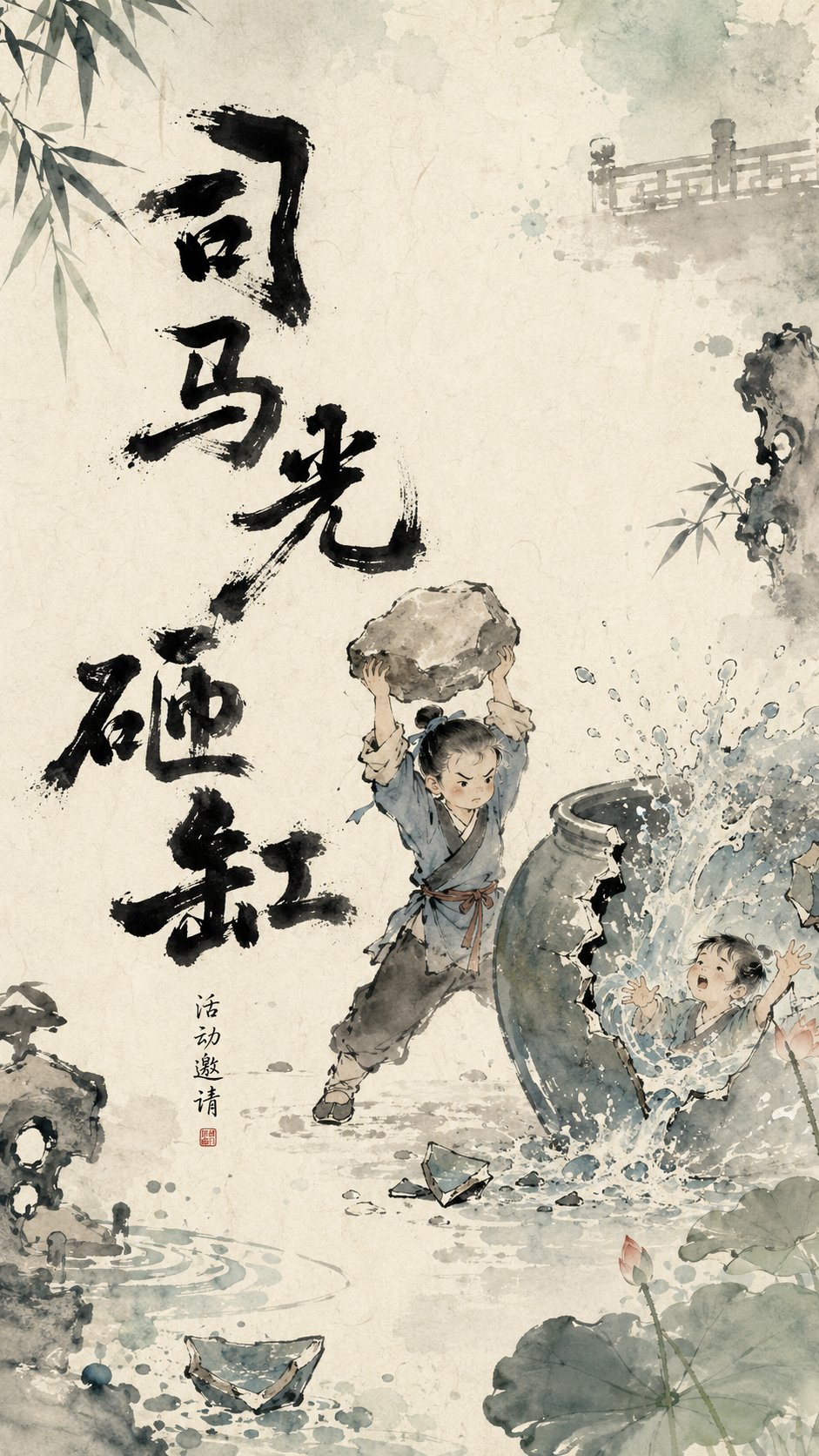
这类案例适合用在什么场景
- 把它当作 角色设计 的基准案例最合适,先看成片方向,再决定自己的 Prompt 要往哪边改。
- 如果你的目标也落在 海报、角色、排版 这些方向,这条案例特别适合先看图判断风格,再回头微调描述。
- 做 Prompt 对比时,也很适合作为控制组,只改一个变量去看结果变化。
画面重点与风格信号
- 这条案例最明显的风格信号集中在 海报、角色、排版,所以第一次改写时最好先保留这些关键词。
- 重点可以先看轮廓、服饰语言、情绪气质,以及角色是否一眼就能立住。
- 当前只有一张主图,所以第一张结果图就是最核心的参考基准。
Prompt 结构可以怎么理解
- 这条 Prompt 整体属于一条比较长、约束条件很多的 Prompt,很适合拿来判断这类方向到底需要写到多细。
- 关键词簇主要围绕 海报、角色、排版 展开,所以复用时可以先保留这组风格词,再替换主体、镜头、环境或文案信息。
- 最稳的改写方式通常是先保留结果方向和最强风格信号,只替换主体设定与场景块。
如果你是带着问题来的,可以先看这些角度
- 如果保留 海报、角色、排版,只换主体题材,结果最先变化的会是哪一部分?
- 这条结果里,哪些特征更像是 角色设计 的结构特征,哪些又是标签风格本身带来的?
- 同分类的相关案例里,哪几条能给你更克制或更极致的相邻变体?
完整 Prompt
Design a visual poster with Oriental ink wash animation temperament for the theme [Straw Boats Borrowing Arrows]. The overall visual logic follows 'heavy ink to establish the bones, light colors to create the atmosphere, negative space for narration, and breathing edges.' The background is a warm Xuan paper texture with natural smudging of off-white, light blue-grey, and light watery tones, featuring slight paper grain, watermarks, and ink diffusion. The core text in the image is not fixed in one position but is intelligently laid out according to the main subject's movement, line of sight, negative space, and visual center of gravity. The title can appear on the left, right, top, bottom, diagonally, partially exposed at the edges, or scattered around the main subject. The text position should look like a naturally grown part of the image, rather than post-production typography pasted on. The main title serves as a heavy ink visual anchor participating in the composition, playing the role of grounding the image, supporting the main subject, guiding the line of sight, or creating rhythm. The title font is hand-written heavy ink calligraphy, with strokes that are thick, wet, naive, and irregular, featuring 'flying white', broken strokes, ink clumps, seepage, and rough edges. Character sizes are varied, with a slightly swaying center of gravity, possessing the handcrafted feel of children's picture books and Chinese ink wash animation opening titles. The title does not use regular commercial fonts but should be like a set of black graphic symbols, echoing the main subject, edge elements, and negative space. The center of the image maintains moderate negative space, letting the main characters or core objects rest lightly in the air of the paper. Add light-colored edge elements based on the theme (e.g., [straw boats, arrows in the fog]), which extend in from the outside of the frame, showing only parts and not fully displayed. Edge elements use ink wash light colors, transparent smudging, and local blurring to create off-screen space and a sense of breathing. Color mainly appears at the edges and four corners, while the center area remains restrained and clean. The overall temperament is poetic, childlike, Oriental, warm, and has a hand-drawn feel, like a breathing frame of a Chinese ink wash animation poster. The image should have a high-end design sense of 'heavy ink text as the skeleton, light color edges as the atmosphere, and negative space to tell the story.' Theme: Straw Boats Borrowing Arrows Ratio: 9:16