案例媒体
案例说明
这个页面把案例媒体、完整 Prompt 和出处放在一起,方便你先看结果,再判断这条 Prompt 是否值得复制、收藏或加入对比。
案例解读
为了方便搜索、引用和后续复用,这里会把案例的适用场景、画面重点和 Prompt 结构拆成更容易浏览的说明。
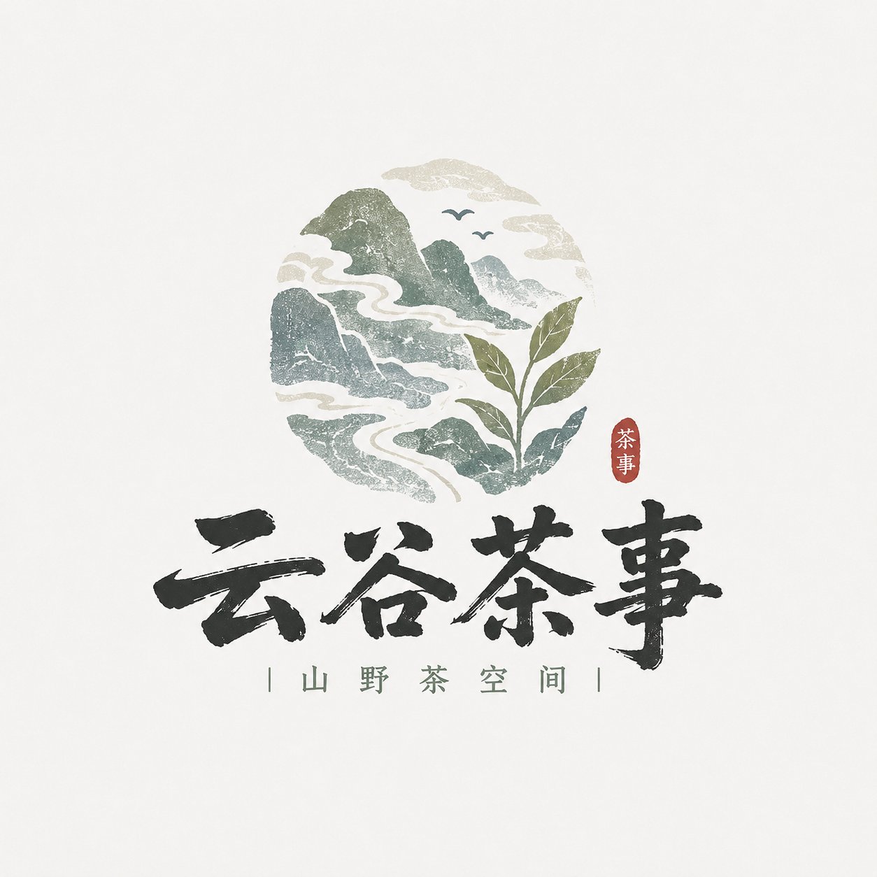
这类案例适合用在什么场景
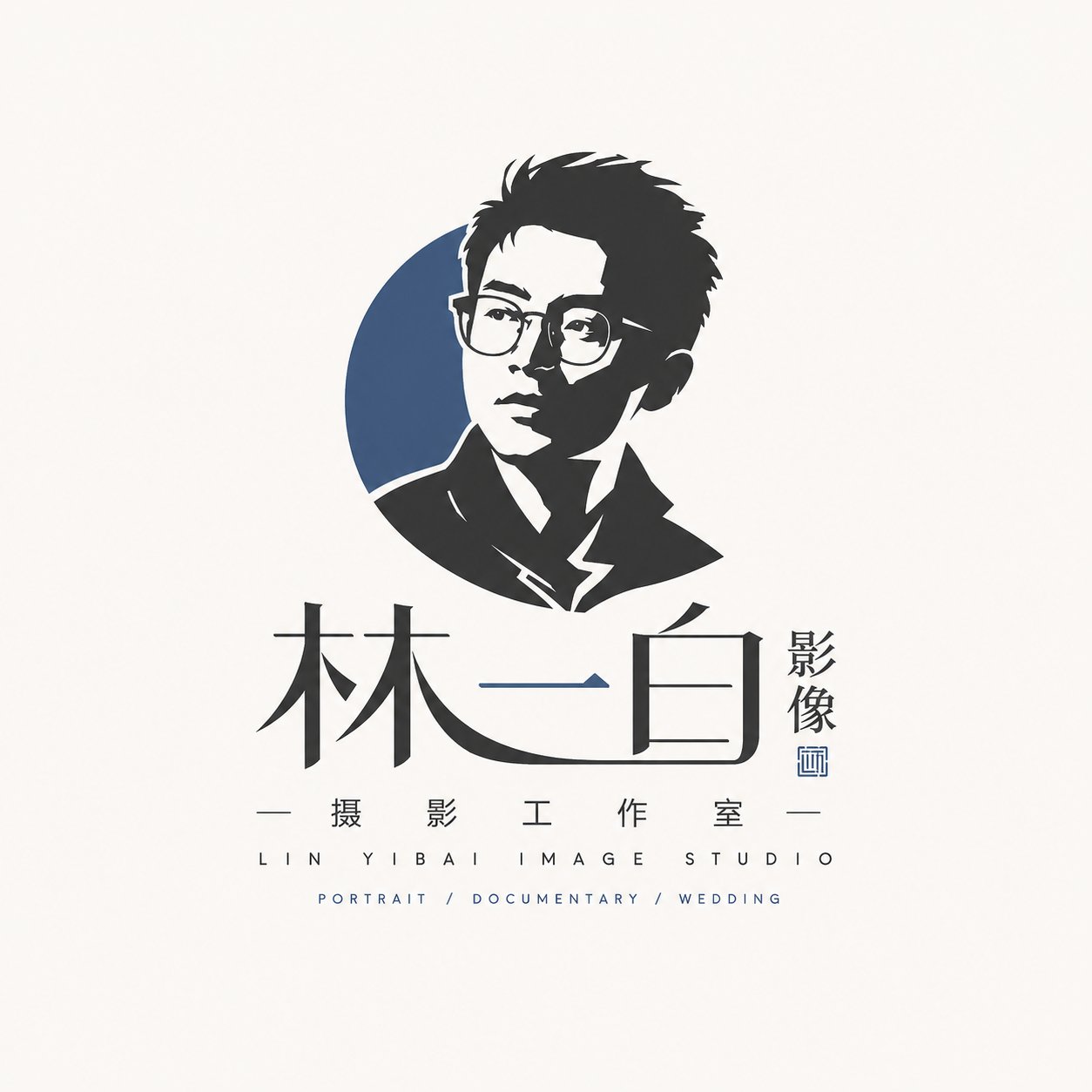
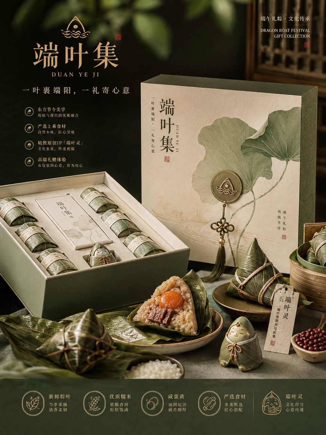
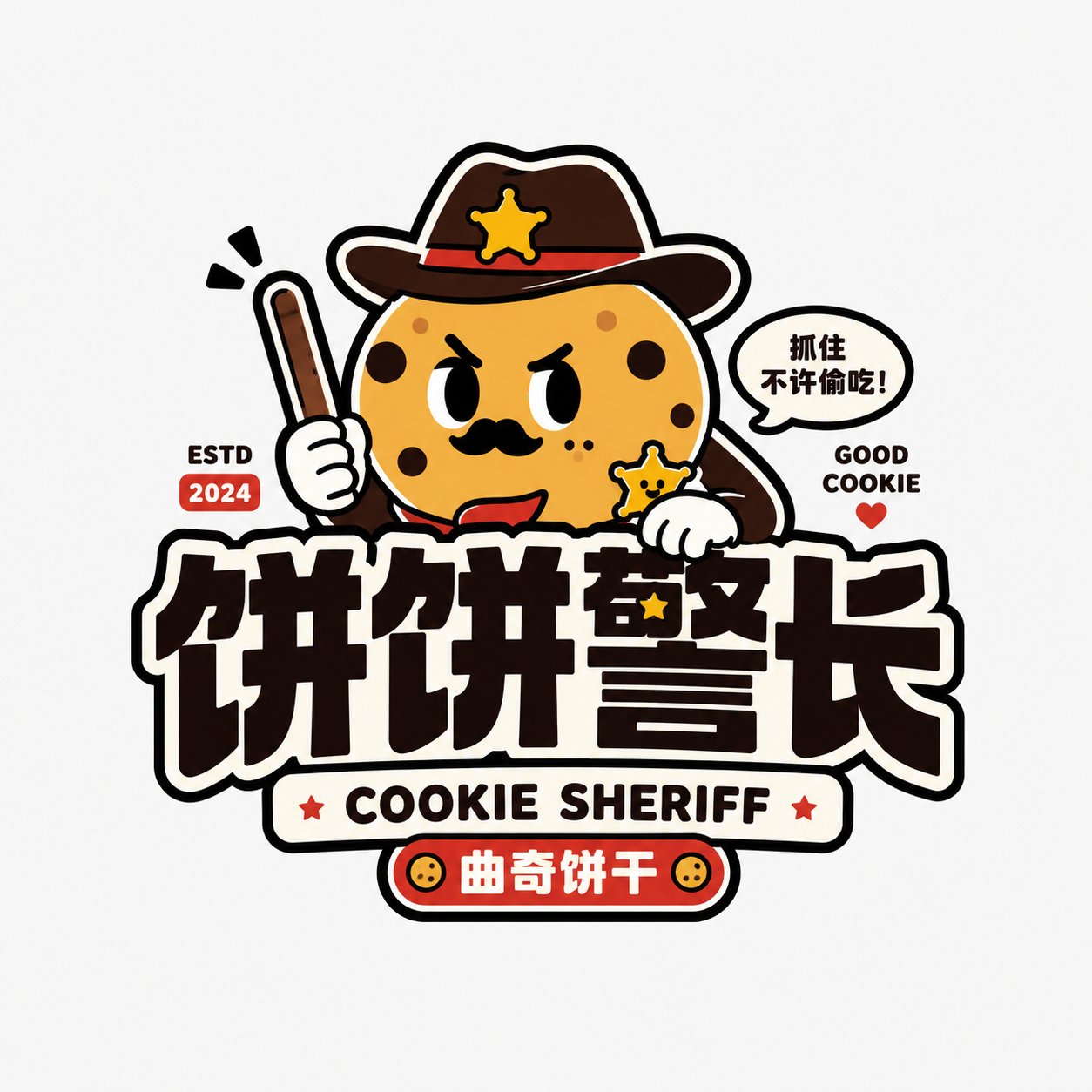
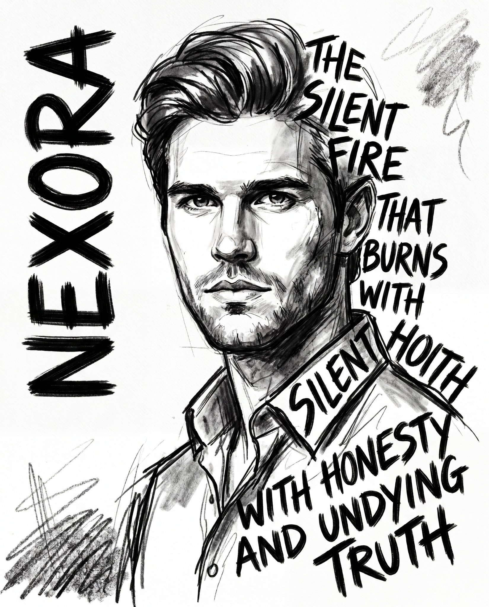
- 把它当作 角色设计 的基准案例最合适,先看成片方向,再决定自己的 Prompt 要往哪边改。
- 如果你的目标也落在 人像、海报、插画 这些方向,这条案例特别适合先看图判断风格,再回头微调描述。
- 做 Prompt 对比时,也很适合作为控制组,只改一个变量去看结果变化。
画面重点与风格信号
- 这条案例最明显的风格信号集中在 人像、海报、插画,所以第一次改写时最好先保留这些关键词。
- 重点可以先看轮廓、服饰语言、情绪气质,以及角色是否一眼就能立住。
- 当前保留了 2 份媒体输出,适合顺手观察同一方向在多张结果里的稳定性。
Prompt 结构可以怎么理解
- 这条 Prompt 整体属于一条比较长、约束条件很多的 Prompt,很适合拿来判断这类方向到底需要写到多细。
- 关键词簇主要围绕 人像、海报、插画 展开,所以复用时可以先保留这组风格词,再替换主体、镜头、环境或文案信息。
- 最稳的改写方式通常是先保留结果方向和最强风格信号,只替换主体设定与场景块。
如果你是带着问题来的,可以先看这些角度
- 如果保留 人像、海报、插画,只换主体题材,结果最先变化的会是哪一部分?
- 这条结果里,哪些特征更像是 角色设计 的结构特征,哪些又是标签风格本身带来的?
- 同分类的相关案例里,哪几条能给你更克制或更极致的相邻变体?
完整 Prompt
Please design a high-completion 'Local Craft Illustrated Wordmark Logo' based on user input for [Brand Name / Project Name] [Subtitle / Product Name] [Type / Industry] [Brand Positioning] [Core Keywords] [Core Graphics] [Terroir Info] [Emotional Vibe] [Main Color] [Accent Color] [Aspect Ratio]. [User Input] Brand Name / Project Name: [] Subtitle / Product Name: [] Type / Industry: [] Brand Positioning: [] Core Keywords: [] Core Graphics: [] Terroir Info: [] Emotional Vibe: [] Main Color: [] Accent Color: [] Aspect Ratio: [] [Core Goal] The design objective is a 'Local Craft Illustrated Wordmark Logo' that truly possesses a sense of place and handmade texture. [Design Essence] The focus of this type of logo is not to be 'explosive', but to be 'flavorful', 'local', and 'handmade'. Please complete the following integration: 1. Primary recognition via Chinese brand name; 2. Supplement terroir information with small graphics; 3. Establish mountain/food/craft vibe with low-saturation natural colors; 4. Enhance brand warmth with light woodcut, light printing, and light handmade texture; 5. Form a wordmark logo suitable for small shops, local brands, and cultural/creative brands. [Most Important Principles] 1. The Chinese brand name must be the protagonist, clear, recognizable, with a calligraphic or small shop signage feel; 2. Graphics should be small and precise, used to express place information, food attributes, or craft characteristics; 3. Do not make it a large commercial badge or a heavy national-trend catering trademark; 4. Do not make it a high-saturation trendy cartoon; 5. Do not just write text, and do not just draw images, it must be a fusion of 'Text + Image'; 6. It must have a handmade and rustic feel, but cannot be roughly out of control; 7. Must retain a natural, quiet, and authentic brand temperament; 8. Must avoid directly copying the specific mountain shape, composition, figures, borders, or symbol combinations of any ready-made brand or reference image; only borrow style methods, not specific patterns. [Font / Wordmark Requirements] 1. Chinese brand name as the main body; 2. Wordmark should have a handwritten feel, brush stroke feel, folk signage feel, small shop writing feel, or light woodcut feel; 3. Can be slightly naive, rustic, or folk-art style, but must be clearly readable; 4. Do not make it a modern corporate sans-serif font, nor too geometric; 5. Do not make it overly explosive wild cursive calligraphy; 6. Needs to look like 'a name grown from this local brand itself', rather than a stiffly applied font. [Graphic System Requirements] Please design small illustrated elements around [Core Graphics] and [Terroir Info]. Graphics can include but are not limited to: - Mountains, water, clouds, bridges, fields, ancient roads, villages, doors and windows, arches; - Tea leaves, rice grains, wine jars, stone mills, tofu, bowls, chopsticks, steam, noodles; - Birds, branches, foliage, small beasts, rural animals; - Craftsmen, handmade scenes, printmaking-style small figures; - Local patterns, seals, small labels. Graphic Requirements: 1. Graphics should assist brand recognition, not overshadow it; 2. Graphics should be simple, informative, and have a local feel; 3. Graphics can be hand-drawn, woodcut, print, or printing-feel oriented; 4. Do not make it complex realistic illustration; 5. Graphics must have a clear relationship with the industry and brand temperament; 6. Do not make it identical to the specific patterns, mountain shapes, figure postures, or door/window styles in reference images; perform clear reorganization and innovation in element selection and compositional relationships. [Composition Requirements] Choose a suitable composition method according to the brand type: 1. Mountain & Terroir Type: Chinese wordmark + small landscape graphic + white space; 2. Handmade Food Type: Chinese wordmark + food/utensil graphic + small subtitle; 3. Printmaking Craft Type: Chinese wordmark + craftsman/woodcut frame small image + vertical small text; 4. Terroir Artifact Type: Chinese wordmark + symbolic object like wine jar/stone mill/tea ware/door view. [Color Requirements] Overall color scheme is mainly low saturation, natural, and rustic. Requirements: 1. Number of colors should not be too many; suggest 2~5 main colors; 2. Colors should resemble natural objects, old prints, ingredients, or handmade materials; 3. Do not use overly fluorescent, gorgeous, or trendy high-saturation colors; 4. Red can only be used as a small accent, not overused. [Texture Requirements] Please moderately express: 1. Light woodcut feel; 2. Light printmaking feel; 3. Light printing graininess; 4. Light paper texture feel; 5. Hand-drawn edge feel; 6. Handmade warmth feel. [Auxiliary Element Requirements] Small auxiliary information can be added: - Small subtitle - Small seal - Small dots - Small slogan - Origin / Handmade / Craftsmanship explanation - Pinyin or English minimal support But must be restrained; the focus remains on the Logo body. [Visual Presentation Requirements] 1. This is an independent Logo display image, not a poster; 2. Background clean; light gray-white, beige, or paper white suggested; 3. Logo body clear, complete, and centered; 4. Overall look like a mature small brand main mark; 5. Suitable for packaging, storefront, cup stickers, labels, social media avatars, and brand main images. [Style Keywords] Local Craft Illustrated Wordmark Logo, Local Craft Illustrated Wordmark Logo, sense of place, small shop vibe, mountain terroir, handmade eatery, printmaking craftsman, natural color scheme, text-image fusion, Chinese written wordmark, light printing feel, folk art temperament, cultural/creative small shop brand. [Acceptance Criteria] Ensure the final result satisfies: 1. Brand name readable at a glance; 2. Sense of place or food/craft attribute felt at a glance; 3. Small shop brand feel, not large corporate trademark feel; 4. Natural combination of text and image; 5. Natural and pleasing color scheme; 6. Unified style but not overly imitating reference images; 7. Can stand as a real brand logo. [Output Requirement] Please finally output a high-completion 'Local Craft Illustrated Wordmark Logo'. It must take the Chinese brand name as the core, combined with terroir graphics, natural colors, and light handmade printing texture, to form a small shop-style mark that has local flavor, brand recognition, and can be used in reality.