案例媒体
案例说明
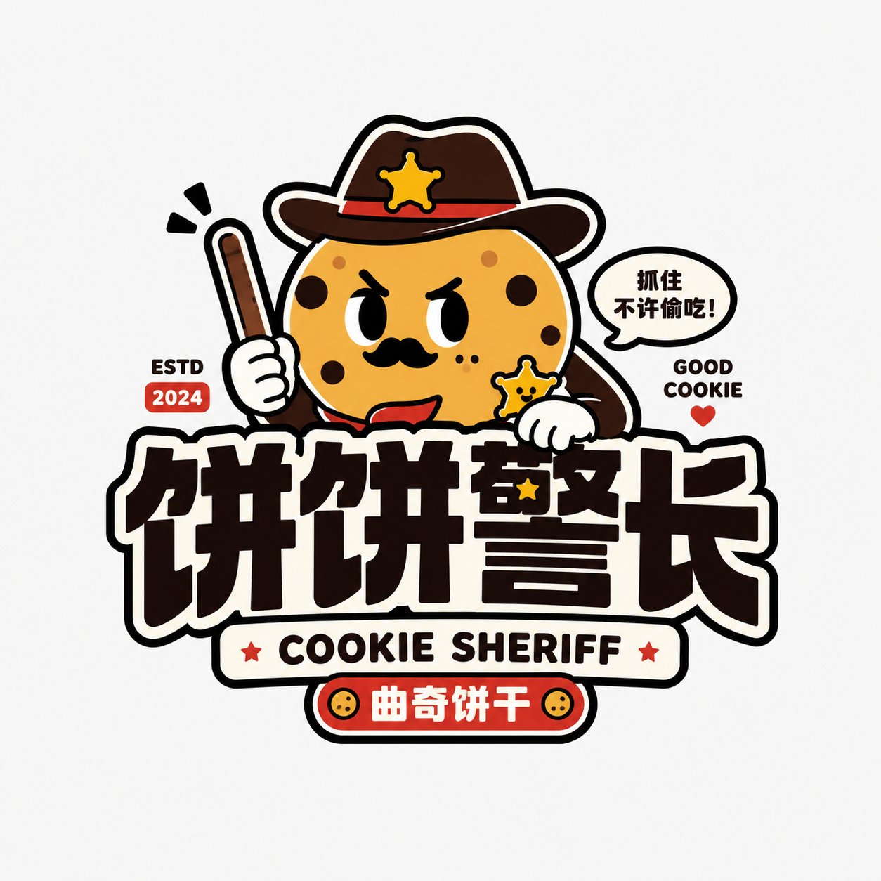
这个页面把案例媒体、完整 Prompt 和出处放在一起,方便你先看结果,再判断这条 Prompt 是否值得复制、收藏或加入对比。
案例解读
为了方便搜索、引用和后续复用,这里会把案例的适用场景、画面重点和 Prompt 结构拆成更容易浏览的说明。
这类案例适合用在什么场景
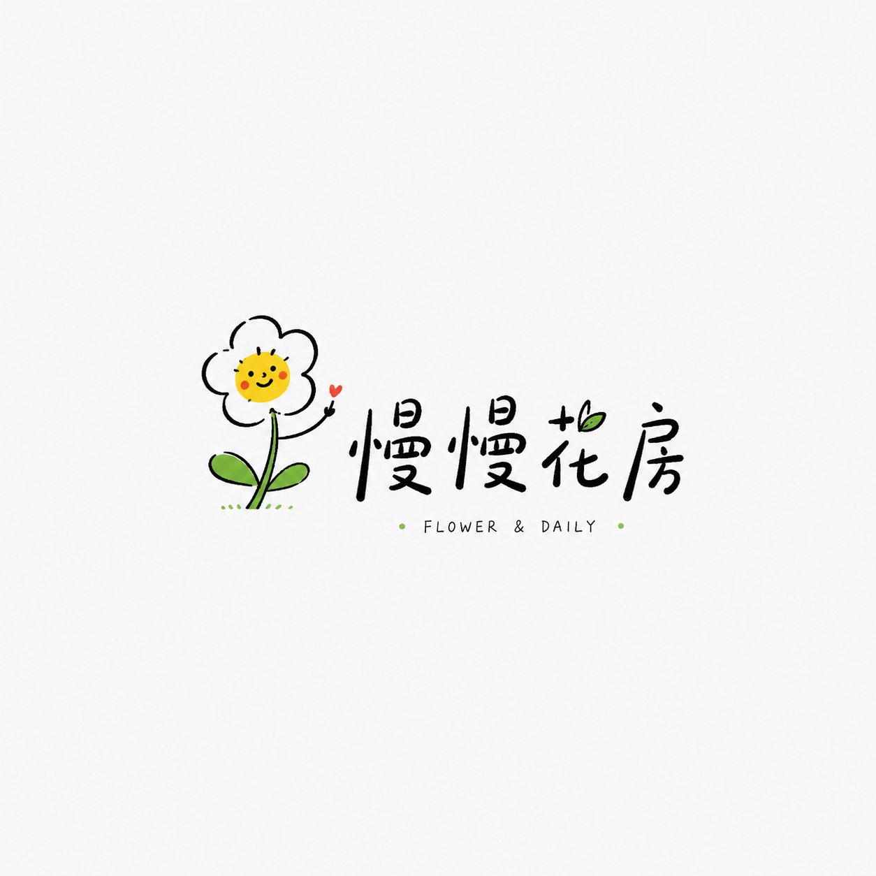
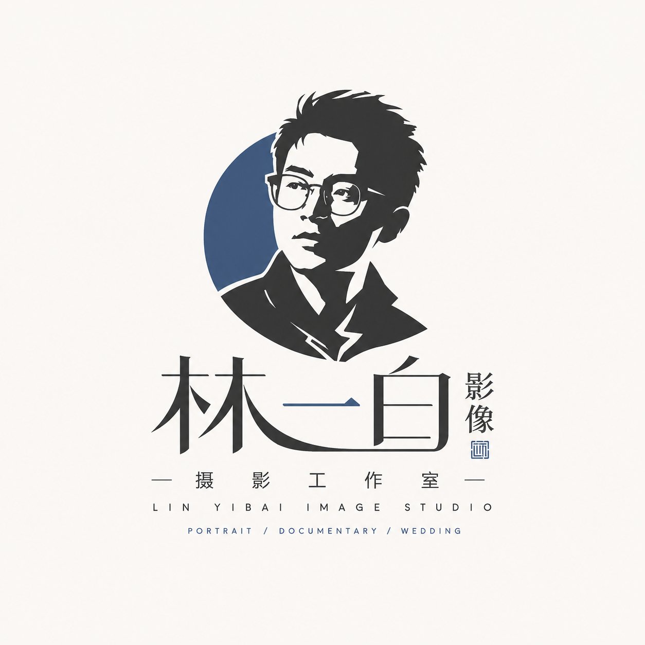
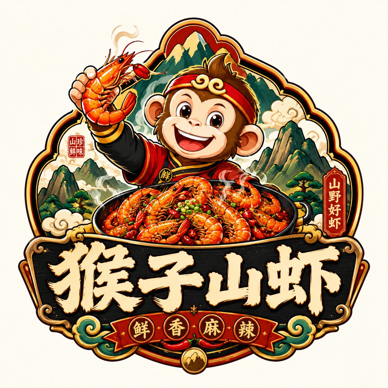
- 把它当作 角色设计 的基准案例最合适,先看成片方向,再决定自己的 Prompt 要往哪边改。
- 如果你的目标也落在 人像、海报、插画 这些方向,这条案例特别适合先看图判断风格,再回头微调描述。
- 做 Prompt 对比时,也很适合作为控制组,只改一个变量去看结果变化。
画面重点与风格信号
- 这条案例最明显的风格信号集中在 人像、海报、插画,所以第一次改写时最好先保留这些关键词。
- 重点可以先看轮廓、服饰语言、情绪气质,以及角色是否一眼就能立住。
- 当前保留了 2 份媒体输出,适合顺手观察同一方向在多张结果里的稳定性。
Prompt 结构可以怎么理解
- 这条 Prompt 整体属于一条比较长、约束条件很多的 Prompt,很适合拿来判断这类方向到底需要写到多细。
- 关键词簇主要围绕 人像、海报、插画 展开,所以复用时可以先保留这组风格词,再替换主体、镜头、环境或文案信息。
- 最稳的改写方式通常是先保留结果方向和最强风格信号,只替换主体设定与场景块。
如果你是带着问题来的,可以先看这些角度
- 如果保留 人像、海报、插画,只换主体题材,结果最先变化的会是哪一部分?
- 这条结果里,哪些特征更像是 角色设计 的结构特征,哪些又是标签风格本身带来的?
- 同分类的相关案例里,哪几条能给你更克制或更极致的相邻变体?
完整 Prompt
Please design a high-completion "Trendy Toy/Quirky IP Wordmark Logo" based on the [Brand Name/Project Name], [Subtitle/Product Name], [Type/Industry], [Brand Positioning], [Core Keywords], [Character Setting], [Emotional Tone], [Primary Color], [Secondary Color], and [Aspect Ratio] input by the user. [User Input] Brand Name/Project Name: [Brand Name/Project Name] Subtitle/Product Name: [Subtitle/Product Name] Type/Industry: [Type/Industry] Brand Positioning: [Brand Positioning] Core Keywords: [Cute, quirky, trendy toy, sticker feel, young, IP feel, funny, whimsical, adorable, brand feel, etc.] Character Setting: [Animal / Anthropomorphic object / Quirky character / Food character / Space character / Trendy toy character, etc.] Emotional Tone: [Adorable, grumpy cute, silly cute, neurotic, happy, lazy, tsundere cute, nonsense, light trendy, etc.] Primary Color: [Primary Color] Secondary Color: [Secondary Color] Aspect Ratio: [Aspect Ratio] [Core Goal] What is being designed this time is a "Trendy Toy/Quirky IP Wordmark Logo" with genuine brand recognition. It is not an ordinary children's cartoon or a simple illustration, but rather an integration of "Character + Wordmark + Color + Sticker-style composition" into a complete Logo. The final effect should be a youthful, trendy toy Logo that can be directly used for packaging, stickers, social media avatars, store signs, merchandise, and brand visual master marks. [Design Essence] The focus of such a Logo is not just to draw a cute character, but to complete the following integration: 1. A highly recognizable, quirky, and cute core character; 2. An eye-catching, bold, impactful Chinese wordmark; 3. Auxiliary English title or subtitle to enhance the trendy toy packaging feel; 4. High-saturation flat color scheme and bold black outlines; 5. The overall look should be like a sticker, trendy toy packaging, or IP brand mark, not an ordinary illustration. [Most Important Principles] 1. The character must be the main memory point, but it cannot be just decorative illustration; 2. Text must be clear and possess a Logo nature; 3. Character and wordmark must have an interactive relationship, forming a whole, not just stacked top-to-bottom; 4. Style must be youthful, quirky, and shareable, not childish or tacky; 5. Must have "sticker feel, trendy toy feel, IP feel," not a traditional corporate Logo; 6. Color scheme must be bright, bold, and memorable; 7. Image must be clear, simple, and complete, suitable for small-size dissemination; 8. Can mix Chinese and English, but Chinese or brand name must be clear and eye-catching. [Character System Requirements] Please design a quirky, adorable, and audience-friendly cartoon character around the [Character Setting]. Characters can be: - Anthropomorphic animals: cat, dog, bear, monkey, rabbit, fish, crocodile, etc.; - Anthropomorphic objects: milk carton, cookie, drink, toothpaste, cake, spaceship, weapon, tool, etc.; - Hybrid characters: animal + food, animal + object, food + expression, monster + toy, etc. Character Requirements: 1. Shape is simple, exaggerated, cute, and interesting; 2. Expressions must have a memory point, such as dull, sassy, silly, lazy, smirk, grumpy cute; 3. Must have strong silhouettes, suitable for brand marks; 4. Must have a bit of whimsy or contrast; 5. Lines should be as simple as possible, flat style, not realistic; 6. Character can be hugging, holding, sitting on, leaning on, poking out of, or pressing on the wordmark; 7. Character should directly participate in the Logo composition, not standing independently on the side. [Wordmark System Requirements] 1. Chinese brand name or main title must be eye-catching; 2. Font should be thick, black, and have weight, like packaging title fonts or trendy toy brand fonts; 3. Can have slight deformation, but don't over-embellish; 4. Suitable for interleaving, overlapping, surrounding, or combining with the character; 5. English can be used for curved titles, auxiliary titles, sub-explanations, small slogans, years, etc.; 6. English style can be bold, uppercase, toy packaging feel, sticker feel; 7. Overall should form a complete hierarchy of "Character + Big Chinese Characters + Auxiliary English." [Composition Requirements] The overall composition should have a distinct "Trendy Toy Sticker Logo" feel. Refer to the following structures: 1. Character on top, Chinese wordmark at the bottom, English small text as auxiliary; 2. Character pressing on the text or poking out from the text; 3. Arc-shaped English above + Character in the middle + Chinese wordmark below; 4. Character and text form an overall outline, like a brand sticker; 5. Can add small labels, small years, small symbols, small stamps to enhance the packaging feel. Overall Requirements: - Subject centered; - Structure clear; - Relationship between character and text is explicit; - Easy to identify after shrinking. [Visual Style Requirements] 1. Use flat color blocks; 2. Use obvious thick black outlines; 3. Color scheme is high-saturation and impactful; 4. Overall has trendy toy feel, sticker feel, packaging feel; 5. Image can have a bit of nonsense and funny feel; 6. Lines are clean, no complex shadows; 7. No real materials, no 3D realistic feel. [Color Requirements] It is recommended to use 2~5 primary colors, overall high saturation and youthful. [Auxiliary Element Requirements] A small amount of trendy toy packaging-style auxiliary elements can be added, but must be restrained, cannot make the picture into a poster. [Visual Presentation Requirements] 1. This is an independent Logo display image, not a poster; 2. Background is clean, white background, light gray background, or beige background is recommended; 3. Subject is clear and complete, character and wordmark integrated; 4. Style is consistent, high recognition; 5. Suitable for use in packaging, avatars, stickers, shop signs, merchandise, and social media dissemination. [Acceptance Criteria] Please ensure the final result meets: 1. Character can be remembered at a glance; 2. Brand name can be seen clearly at a glance; 3. Character and wordmark are a whole; 4. Overall has sticker feel, trendy toy feel, IP feel; 5. Color scheme is bright, youthful, and has audience appeal; 6. Suitable for main brand Logo, not just simple illustration; 7. Has a sense of dissemination and social media friendliness. [Output Requirements] Please output a high-completion "Trendy Toy/Quirky IP Wordmark Logo" that uses a quirky and cute character as the core, thick black wordmark as the structure, and high-saturation flat color and sticker-style composition as the expression method, forming a youthful, trendy, shareable, and brandable complete Logo.