案例媒体
案例说明
这个页面把案例媒体、完整 Prompt 和出处放在一起,方便你先看结果,再判断这条 Prompt 是否值得复制、收藏或加入对比。
案例解读
为了方便搜索、引用和后续复用,这里会把案例的适用场景、画面重点和 Prompt 结构拆成更容易浏览的说明。
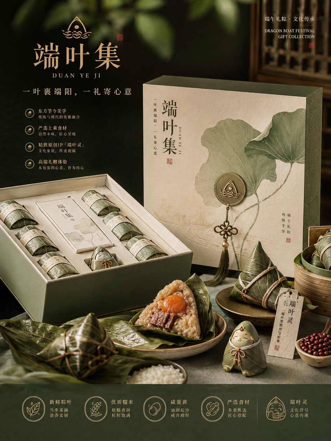
这类案例适合用在什么场景
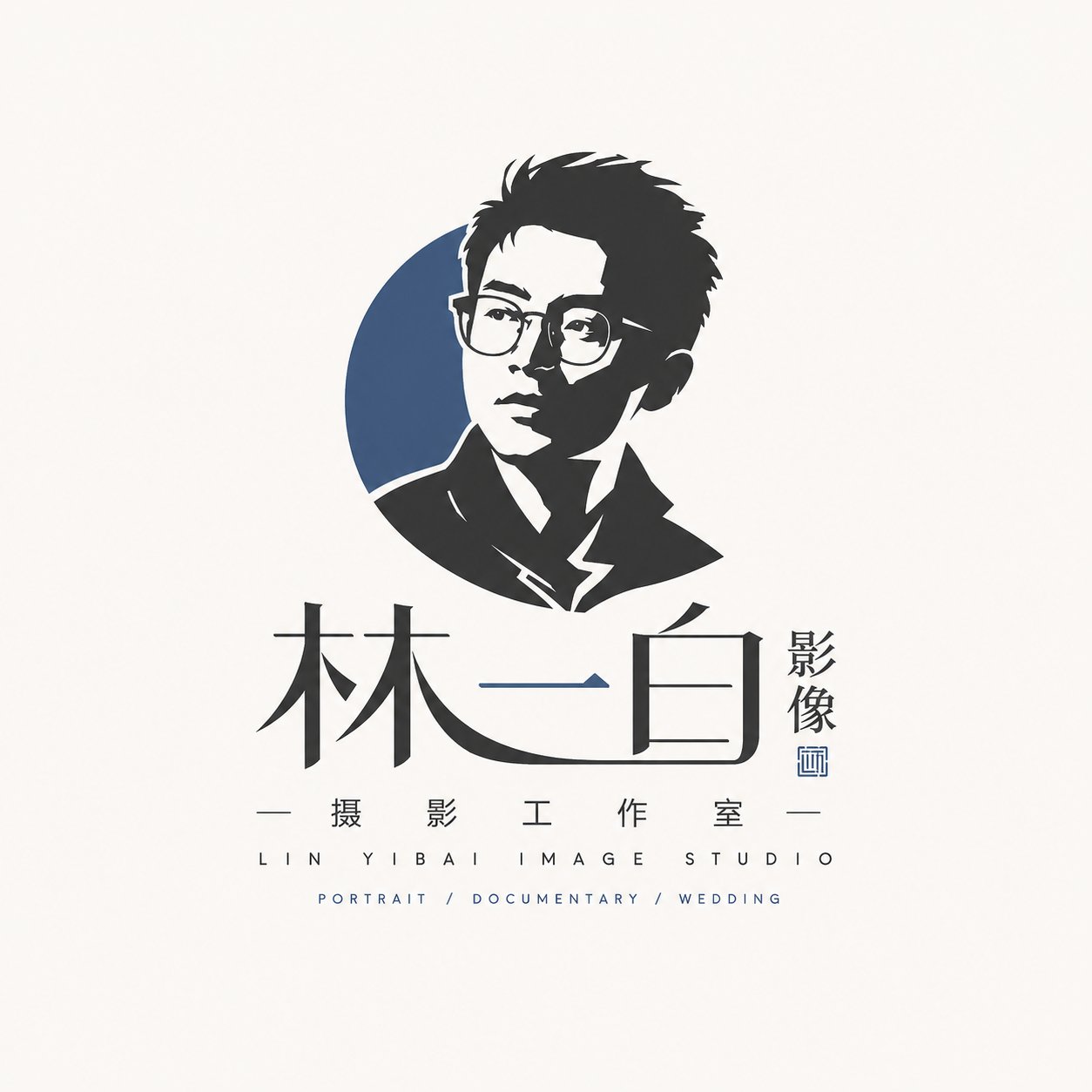
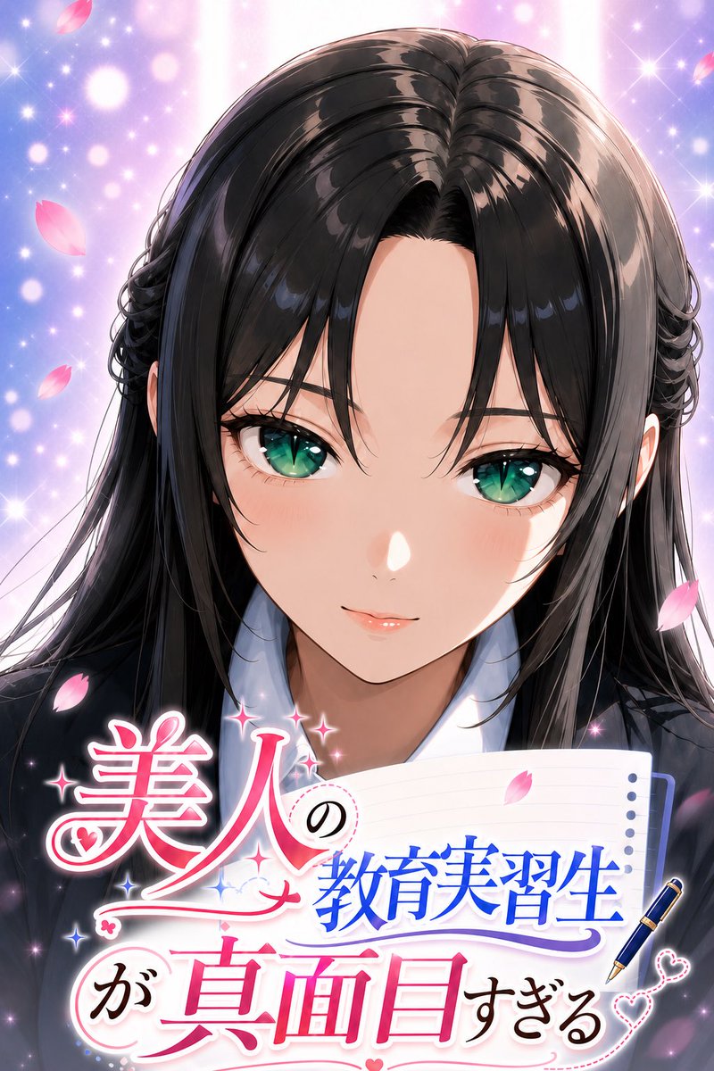
- 把它当作 角色设计 的基准案例最合适,先看成片方向,再决定自己的 Prompt 要往哪边改。
- 如果你的目标也落在 人像、海报、插画 这些方向,这条案例特别适合先看图判断风格,再回头微调描述。
- 做 Prompt 对比时,也很适合作为控制组,只改一个变量去看结果变化。
画面重点与风格信号
- 这条案例最明显的风格信号集中在 人像、海报、插画,所以第一次改写时最好先保留这些关键词。
- 重点可以先看轮廓、服饰语言、情绪气质,以及角色是否一眼就能立住。
- 当前保留了 2 份媒体输出,适合顺手观察同一方向在多张结果里的稳定性。
Prompt 结构可以怎么理解
- 这条 Prompt 整体属于一条比较长、约束条件很多的 Prompt,很适合拿来判断这类方向到底需要写到多细。
- 关键词簇主要围绕 人像、海报、插画 展开,所以复用时可以先保留这组风格词,再替换主体、镜头、环境或文案信息。
- 最稳的改写方式通常是先保留结果方向和最强风格信号,只替换主体设定与场景块。
如果你是带着问题来的,可以先看这些角度
- 如果保留 人像、海报、插画,只换主体题材,结果最先变化的会是哪一部分?
- 这条结果里,哪些特征更像是 角色设计 的结构特征,哪些又是标签风格本身带来的?
- 同分类的相关案例里,哪几条能给你更克制或更极致的相邻变体?
完整 Prompt
Please generate a set of high-completion, visually unified 'Original IP Commercialization Proposal / 4-Board Original IP Commercialization Proposal' based on the brand information provided by the user. Note: This is not a four-grid collage, nor a master image combining 4 contents into one screen, but a set of 4 independent images that must be 'generated sequentially'. You need to complete these 4 images continuously under the same brand visual system. The 4 images must obviously belong to the same brand, but each image has different responsibilities and cannot just be 4 repetitive variants. This is not a regular poster design, general e-commerce detail page, or a single packaging rendering, but a complete visual proposal possessing: branding, IP sense, product sense, packaging sense, scene sense, commercial realization sense, business proposal sense, exhibition sense, and portfolio quality. [User Input] Brand Name, English Auxiliary Name, Brand Type/Industry, One-sentence Brand Positioning, Core Keywords (3–8), Target Audience, Overall Style Direction, Brand Slogan, Main Product/Core Service, Product Line/SKU Info, Brand Story/Regional Characteristics/Cultural Background, Main Color Preference, Secondary Color Preference, Accent Color Preference, Cultural Elements/Graphic Elements to Incorporate, IP Image Requirement (Yes/No/Weakened IP), IP Direction Preference, Preferred Application Direction (Packaging/Gift Box/Store/E-commerce/Social Media/Merchandise/Cold Chain/Shelf/Other), Style to Avoid, Aspect Ratio (Default Portrait 3:4, customizable), Other Supplementary Explanations. [Overall Task] Please extract and unify the brand's visual DNA internally based on the above information, and then generate 4 independent images sequentially based on the same brand DNA. Before formally generating the 4 images, please unify the following content and keep it consistent in the subsequent 4 images: 1. Brand core temperament, 2. Brand visual keywords, 3. Main/Secondary/Accent colors, 4. Font tendency and glyph temperament, 5. Graphic language/Auxiliary pattern language, 6. Visual presentation of products or services, 7. IP image setting method, 8. Unified rules for packaging/application materials/merchandise/scenes, 9. Overall screen temperament: brand sense, proposal sense, commercial sense, exhibition sense, series sense, 10. 4 images with unified style but clear information division, not repetitive variants. [Special Requirements regarding IP] 1. This proposal cannot only have a Logo without IP sense. Even if the overall route is high-end, restrained, and realistic, it should possess an 'IP recognition role' or 'symbolic IP image'. 2. The IP does not necessarily have to be an exaggerated cartoon character, but can be a more high-end and restrained 'cultural symbol IP / brand totem IP / mascot IP / emblem IP / seal IP / charm IP / micro-sculpture IP'. 3. If the brand is suitable for a light IP route, please understand IP as 'brand recognition role', which can appear in emblems, seals, tags, pendants, charms, seals, packaging details, and social media symbols, not necessarily occupying the whole screen as a protagonist. 4. If the brand is more suitable for a strong IP route, the role can be clearer, but it must still be unified with the brand system and cannot appear cheap, childish, or like stock material. 5. If the user explicitly requests 'not too cartoonish', please treat the IP as: more high-end, more realistic, more designed, and more like a brand recognition symbol rather than a childish Q-version character. [Overall Uniformity Requirements] 1. The four images must obviously belong to the same brand system (Brand name, color system, font temperament, graphic language, brand symbol, IP image, product logic must be unified). 2. The four images are not 4 repetitive posters, but 4 brand commercialization proposal images with different duties. 3. All 4 images should have high completion, brand proposal sense, commercial sense, exhibition sense, and portfolio quality. 4. Layouts can differ, but the overall aesthetics, design language, and visual system must be highly unified. 5. Automatically match the most suitable content according to different brand types. 6. If text appears in the image, ensure the brand name, title, module name, slogan, and key product names are concise and clear, trying to be accurate without stacking long text. 7. Each image should be suitable for independent display, and when placed together, it should be obvious that they are a whole set of proposals. 8. Do not merge four images into one, do not make a four-grid, do not make a one-page overview collage. 9. Please generate in order: 1st -> 2nd -> 3rd -> 4th. 10. Generate only the current independent image each time, and automatically continue the brand system already established, until all 4 are completed. 11. If the user requests 'high-end realism', the screen must have a sense of real commercial photography, real material, real light and shadow, and real product texture, rather than illustration collage, low-quality material sense, or cheap e-commerce images. 12. If the user requests 'cultural elements', modernize, design, and brand the cultural elements. Do not simply stack traditional decorative symbols. 13. If the user requests 'not too cartoonish', handle it as light IP, heavy brand, and strong product sense. [Structure of the 4 Boards] 1. Brand Hero Board: Sets the tone, first visual memory point, shows brand name, English name, slogan, core temperament, visual elements, color system, core symbols. 2. Identity & IP System Board: Explains the 'visual system', shows wordmark, colors, font, auxiliary graphics, packaging pattern logic, IP image system (roles, charms, seals, tags, etc.), small application system. 3. Product & Packaging System Board: Shows how the brand lands on 'products/packaging/service carriers', demonstrates commercial implementation, relevant to brand type. 4. Campaign & Sales Scenario Board: Shows visual effects after entering real communication scenes, demonstrating brand recognition, communication power, and scenario extension capabilities. [Execution Method] 1. Understand and unify brand visual DNA. 2. Generate 1st image. 3. Generate 2nd image. 4. Generate 3rd image. 5. Generate 4th image. Do not merge, do not repeat, do not make grids. Generate only one at a time, remember the established system. [Image and Quality Requirements] Default aspect ratio 3:4, high definition, detailed, brand proposal/commercial sense, realistic, main Chinese text with English support, text clear and accurate. [Negative Constraints] No 'Logo only without IP', no poster collages, no low-quality e-commerce details, no cheap stock material, no traditional element stacking, no childishness unless requested, no repetitive variants, no grids, no fake-looking packaging, no copying existing brands.