Case Media
Case Notes
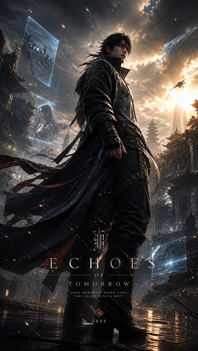
This page keeps the media, full prompt, and original source together so you can inspect the result first and decide whether the prompt is worth copying, saving, or comparing.
Case Insights
To make this page easier to search, cite, and reuse later, the case is also broken down into practical guidance about usage, visual cues, and prompt structure.
Best Fit Scenarios
- Use this as a ui & social screens benchmark when you need a fast style baseline before rewriting your own prompt.
- It is especially helpful if your target overlaps with Cinematic, Fashion, Poster and you want to judge the image result before tuning wording.
- Keep it as a control sample when you compare nearby prompt variants one variable at a time.
Visual Signals To Notice
- The clearest style signals here are Cinematic, Fashion, Poster, so those should usually stay in your first rewrite.
- The important layer is usually interface density, card hierarchy, and how the screen tells the story before you read small text.
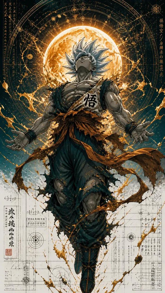
- This case keeps one primary output, so the first image should be treated as the main visual reference.
How The Prompt Is Structured
- The prompt reads as a long, highly specified prompt, which is useful when you want to judge how much specificity this direction needs.
- Its keyword cluster is centered on Cinematic, Fashion, Poster, so you can usually keep that cluster while swapping subject, camera, layout, or copy details.
- A practical rewrite path is: keep the outcome, keep the strongest style cues, then replace only the subject and environment blocks.
Good Follow-up Questions
- What changes first if you keep Cinematic, Fashion, Poster but switch the subject matter?
- Which part of the result comes from section-level structure (UI & Social Screens) versus tag-level style cues?
- Which related cases in the same section give you a cleaner or more extreme variation of the same direction?
Full Prompt
Design a high-end cinematic character poster in a layered depth composition (9:16 vertical) with a strong foreground–midground–background separation instead of silhouette framing. The {argument name="character" default="character"} stands slightly off-center in a dynamic, perspective-driven pose, interacting naturally with the {argument name="environment" default="environment (wind, light, particles, fabric movement)"}. The camera angle should feel intentional—low-angle for power or slight tilt for tension—creating a sense of motion and presence. The background should not be contained inside shapes. Instead, build a living world around the character: atmospheric environments (fog, city lights, ruins, nature, etc.) light rays, volumetric glow, drifting particles subtle storytelling elements placed naturally in space (not collage-based) Introduce floating fragments or layered planes (glass shards, light panels, memories, holographic slices, or torn paper edges) that orbit or intersect the scene, each containing faint symbolic visuals tied to the character’s story—keep them minimal and elegant, not cluttered. Lighting should be cinematic and directional: strong key light shaping the subject rim lighting to separate from background soft gradients and shadow falloff for depth Color palette should follow a {argument name="color palette" default="controlled dual-tone system (e.g., teal–orange, violet–gold, crimson–black)"} with smooth transitions and no oversaturation. Typography: place the title in a clean, modern cinematic layout integrate text subtly into the environment (ground plane, light projection, or floating UI style) avoid heavy or oversized typography Overall style: ultra-realistic + cinematic editorial, sharp detail on subject, soft atmospheric depth in background, minimal but intentional storytelling elements, premium movie-poster quality. Avoid: silhouette fill compositions, heavy collage density, watercolor textures, or ink-wash edges. Focus on spatial depth, realism, and cinematic immersion.