Case Media
Case Notes
This page keeps the media, full prompt, and original source together so you can inspect the result first and decide whether the prompt is worth copying, saving, or comparing.
Case Insights
To make this page easier to search, cite, and reuse later, the case is also broken down into practical guidance about usage, visual cues, and prompt structure.
Best Fit Scenarios
- Use this as a ui & social screens benchmark when you need a fast style baseline before rewriting your own prompt.
- It is especially helpful if your target overlaps with 35mm, Cinematic, Poster and you want to judge the image result before tuning wording.
- Keep it as a control sample when you compare nearby prompt variants one variable at a time.
Visual Signals To Notice
- The clearest style signals here are 35mm, Cinematic, Poster, so those should usually stay in your first rewrite.
- The important layer is usually interface density, card hierarchy, and how the screen tells the story before you read small text.
- This case keeps one primary output, so the first image should be treated as the main visual reference.
How The Prompt Is Structured
- The prompt reads as a long, highly specified prompt, which is useful when you want to judge how much specificity this direction needs.
- Its keyword cluster is centered on 35mm, Cinematic, Poster, so you can usually keep that cluster while swapping subject, camera, layout, or copy details.
- A practical rewrite path is: keep the outcome, keep the strongest style cues, then replace only the subject and environment blocks.
Good Follow-up Questions
- What changes first if you keep 35mm, Cinematic, Poster but switch the subject matter?
- Which part of the result comes from section-level structure (UI & Social Screens) versus tag-level style cues?
- Which related cases in the same section give you a cleaner or more extreme variation of the same direction?
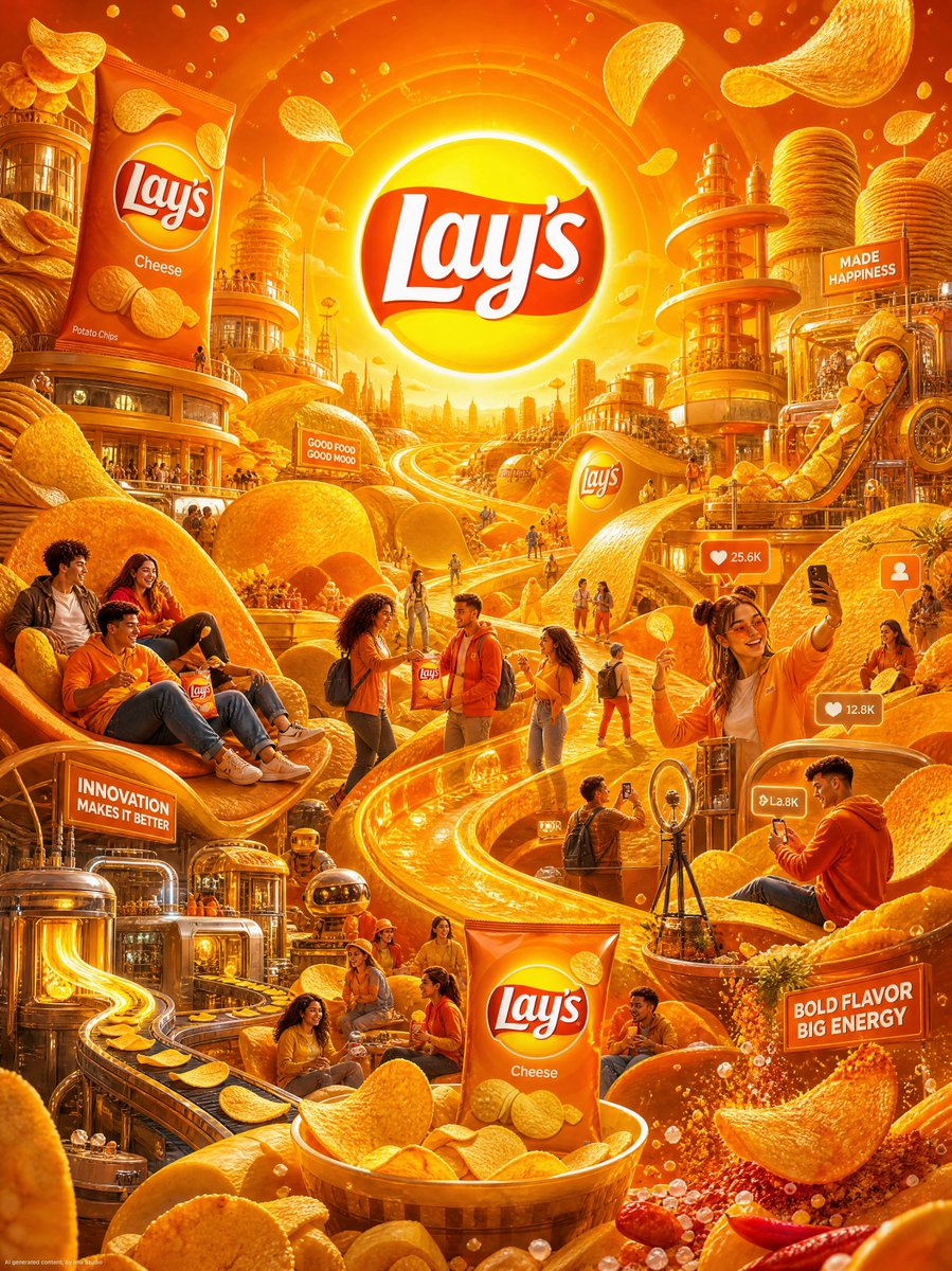
Full Prompt
CORE RULE: Everything must be derived from the Lay’s logo (orange variant): vibrant orange + yellow gradient tones circular sun-like logo shape soft curves, wave forms (chips) playful, energetic, snackable tone No generic fantasy worlds. MAIN CONCEPT: Lay’s becomes a crispy, golden WORLD — a vibrant snack universe where everything feels warm, crunchy, and irresistibly fun. architecture made of stacked chips glowing golden landscapes flowing cheese-like light trails (subtle, not messy) soft, airy atmosphere like a fresh-opened pack MAIN STRUCTURE: Vertical 4:5 poster Deep, layered cinematic composition CENTER (HERO SCENE): A massive golden-orange chip valley shaped like the Lay’s circular logo: giant curved potato chips forming hills and roads a glowing “sun” in the background inspired by the Lay’s logo warm orange light flooding the scene crispy texture details visible on surfaces flowing movement lines like heat + freshness This is the main world of Lay’s — lively, warm, addictive. ZONES (VERY IMPORTANT): Create 4–6 immersive zones inside this world: 1. PRODUCT WORLD giant floating Lay’s chips rotating in the air chips stacked like monuments packets integrated into environment (not floating randomly) 2. CUSTOMER LIFESTYLE young people relaxing on chip-shaped loungers laughing, sharing chips casual, fun, social vibe 3. BRAND VALUES (FUN & SHARING) groups passing chips across glowing paths visual metaphor of connection (chip trails linking people) 4. SOCIAL / POP CULTURE people taking photos, short-video style poses subtle UI-style overlays (likes, hearts, minimal and elegant) 5. INNOVATION / FUTURE futuristic chip-making structures conveyor-like flowing golden ribbons forming chips mid-air glowing tech-like snack production 6. FLAVOR ENERGY (OPTIONAL BONUS ZONE) bursts of spice particles, salt crystals sparkling dynamic energy around chips CHARACTERS: Include diverse, stylish people: wearing orange, yellow, and neutral tones inspired by Lay’s relaxed, expressive, joyful interacting with chips naturally (eating, sharing, playing) OBJECTS: Transform brand elements into the world: logo circle → sun / central sky element chips → buildings, roads, terrain packet colors → lighting gradients texture of chips → ground surfaces VISUAL DETAILS: crispy textures (very detailed) glowing warm highlights reflections on packaging salt crystals sparkling like tiny gems Add: floating chips in motion crumbs drifting in the air soft golden particles COLOR: Strictly from Lay’s palette: rich orange golden yellow warm highlights subtle neutral accents Use gradients and lighting for depth. STYLE: cinematic concept art hyper-detailed slightly stylized realism vibrant, energetic, commercial-grade DEPTH: 30–60 visual elements strong foreground (chips + characters) rich midground (zones) glowing background (logo-sun + horizon) IMPORTANT RULES: must feel immersive and delicious must feel intentional and brand-driven no empty areas no generic fantasy clichés everything must connect to Lay’s FINAL FEEL: Like: a snack universe film world a AAA game environment made of flavor a premium yet playful brand experience NOT: flat minimal random