Case Media
Case Notes
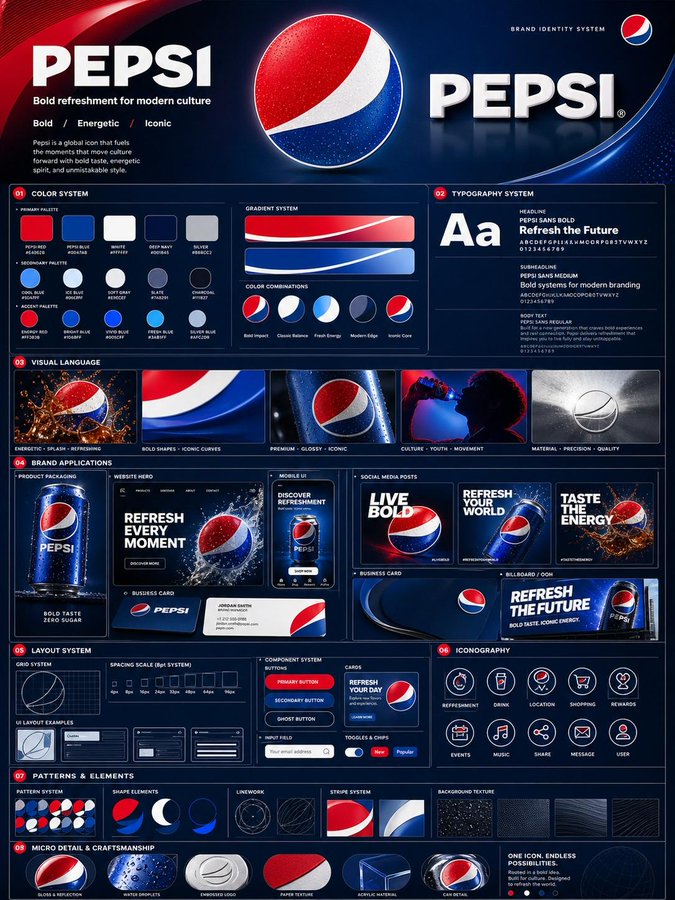
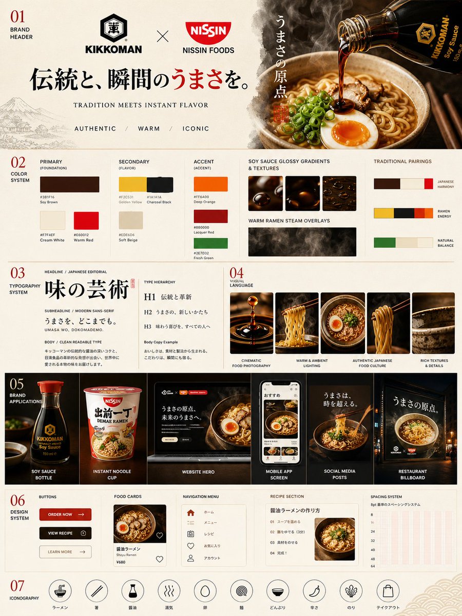
This page keeps the media, full prompt, and original source together so you can inspect the result first and decide whether the prompt is worth copying, saving, or comparing.
Case Insights
To make this page easier to search, cite, and reuse later, the case is also broken down into practical guidance about usage, visual cues, and prompt structure.
Best Fit Scenarios
- Use this as a ui & social screens benchmark when you need a fast style baseline before rewriting your own prompt.
- It is especially helpful if your target overlaps with Cinematic, Fashion, Poster and you want to judge the image result before tuning wording.
- Keep it as a control sample when you compare nearby prompt variants one variable at a time.
Visual Signals To Notice
- The clearest style signals here are Cinematic, Fashion, Poster, so those should usually stay in your first rewrite.
- The important layer is usually interface density, card hierarchy, and how the screen tells the story before you read small text.
- This case keeps one primary output, so the first image should be treated as the main visual reference.
How The Prompt Is Structured
- The prompt reads as a long, highly specified prompt, which is useful when you want to judge how much specificity this direction needs.
- Its keyword cluster is centered on Cinematic, Fashion, Poster, so you can usually keep that cluster while swapping subject, camera, layout, or copy details.
- A practical rewrite path is: keep the outcome, keep the strongest style cues, then replace only the subject and environment blocks.
Good Follow-up Questions
- What changes first if you keep Cinematic, Fashion, Poster but switch the subject matter?
- Which part of the result comes from section-level structure (UI & Social Screens) versus tag-level style cues?
- Which related cases in the same section give you a cleaner or more extreme variation of the same direction?
Full Prompt
Create a premium vertical 4:5 brand identity system poster for Kikkoman × Nissin Foods inspired by authentic Japanese food culture, featuring a clean modern Japanese editorial layout with elegant typography, warm cinematic restaurant lighting, soy sauce textures, ramen steam, ceramic bowls, noodles, and wooden chopsticks. Include the brand header with the tagline “Tradition Meets Instant Flavor” and the descriptors Authentic / Warm / Iconic, along with a sophisticated color palette of soy sauce brown, cream white, warm red, noodle yellow, charcoal black, deep orange, and garnish green displayed as modern swatches with HEX codes. Showcase bold Japanese-inspired typography, cinematic ramen photography, glossy gradients, and premium culinary mood-board visuals. Add realistic brand applications including a soy sauce bottle, instant noodle cup, website hero, mobile food app UI, social media posts, and a large restaurant billboard, plus a refined Japanese-style UI design system with buttons, food cards, navigation menus, recipe sections, spacing guides, and minimal rounded food-themed icons such as ramen bowls, chopsticks, steam, eggs, and noodle swirls, all presented in an ultra-realistic, warm, refined, globally recognizable editorial aesthetic.