Case Media
Case Notes
This page keeps the media, full prompt, and original source together so you can inspect the result first and decide whether the prompt is worth copying, saving, or comparing.
Case Insights
To make this page easier to search, cite, and reuse later, the case is also broken down into practical guidance about usage, visual cues, and prompt structure.
Best Fit Scenarios
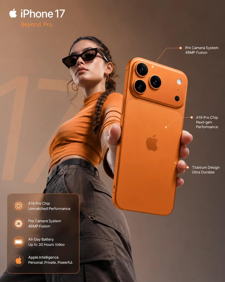
- Use this as a ui & social screens benchmark when you need a fast style baseline before rewriting your own prompt.
- It is especially helpful if your target overlaps with Cinematic, Illustration, UI and you want to judge the image result before tuning wording.
- Keep it as a control sample when you compare nearby prompt variants one variable at a time.
Visual Signals To Notice
- The clearest style signals here are Cinematic, Illustration, UI, so those should usually stay in your first rewrite.
- The important layer is usually interface density, card hierarchy, and how the screen tells the story before you read small text.
- This case keeps one primary output, so the first image should be treated as the main visual reference.
How The Prompt Is Structured
- The prompt reads as a long, highly specified prompt, which is useful when you want to judge how much specificity this direction needs.
- Its keyword cluster is centered on Cinematic, Illustration, UI, so you can usually keep that cluster while swapping subject, camera, layout, or copy details.
- A practical rewrite path is: keep the outcome, keep the strongest style cues, then replace only the subject and environment blocks.
Good Follow-up Questions
- What changes first if you keep Cinematic, Illustration, UI but switch the subject matter?
- Which part of the result comes from section-level structure (UI & Social Screens) versus tag-level style cues?
- Which related cases in the same section give you a cleaner or more extreme variation of the same direction?
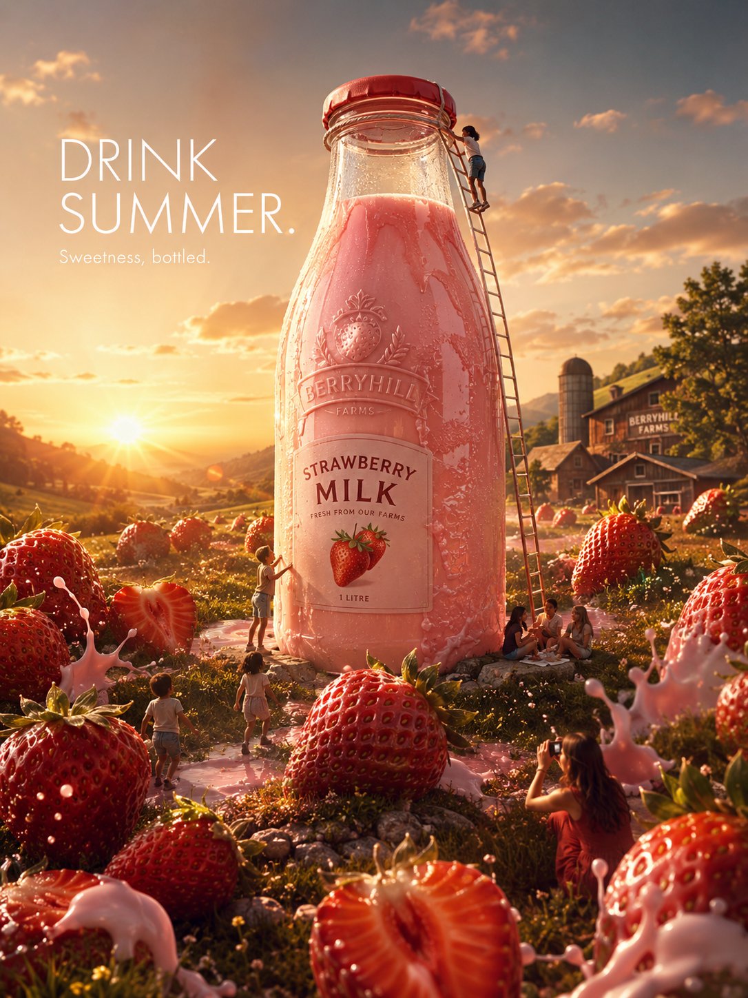
Full Prompt
Create a hyper-realistic luxury FMCG advertisement titled: “THE WORLD’S MOST BEAUTIFUL STRAWBERRY MILK.” The image should feel: bright, instantly understandable, premium, saveable and aggressively scroll-stopping. IMPORTANT: This should NOT feel like a normal product shot. It should feel like: a billion-dollar global campaign designed specifically to dominate social media feeds. SCENE: A gigantic transparent glass bottle of premium strawberry milk stands in the middle of a dreamy sunlit strawberry field during golden-hour sunset. The bottle should be enormous — larger than a small house — like a real-world landmark. Inside the glass bottle: perfect creamy pink strawberry milk swirls realistically with soft condensation and flowing liquid movement. The bottle itself should look: obsessively tactile and luxurious: - cold condensation droplets, - glossy glass reflections, - creamy liquid texture, - embossed logo, - realistic strawberry illustrations, - tiny imperfections in glass, - sunlight refracting through the liquid. AROUND THE BOTTLE: People naturally interact with it as though it has always existed there. Examples: - children running through giant strawberries, - friends sitting beneath the shadow of the bottle, - someone climbing a ladder attached to the bottle cap, - a girl photographing reflections in the glass, - strawberries rolling through grass in cinematic slow motion, - milk splashes forming organically around the environment. The atmosphere should feel: joyful, warm, dreamlike and visually addictive. IMPORTANT: The image should contain: MASSIVE oversized strawberries scattered across the landscape like natural objects. Some sliced open. Some reflecting sunlight. Some partially dipped in milk. The strawberries should feel: hyper-realistic, fresh, glossy and almost edible through the screen. TYPOGRAPHY: Minimal clean luxury typography floating softly in the sky: “DRINK SUMMER.” Small subtext beneath: “Sweetness, bottled.” Typography should feel: Apple-level minimal and globally iconic. LIGHTING: Warm golden-hour sunset lighting with: - glowing milk reflections, - cinematic lens flare, - soft atmospheric haze, - warm grass highlights, - dreamy backlighting, - realistic shadow falloff, - reflective liquid highlights. CAMERA STYLE: Blend: - luxury beverage commercials, - FMCG photography, - dreamlike environmental realism, - and tactile food cinematography. Use: - medium-format realism, - cinematic depth of field, - realistic skin texture, - subtle motion blur, - premium lens behavior, - aerial drone composition, - and practical reflections. COLOR PALETTE: creamy pink, warm strawberry red, golden sunlight, fresh green grass, soft white highlights and sunset orange tones. The final image should feel: so visually satisfying and commercially polished that people immediately stop scrolling and think: “how is this not a real campaign?”