Case Media
Case Notes
This page keeps the media, full prompt, and original source together so you can inspect the result first and decide whether the prompt is worth copying, saving, or comparing.
Case Insights
To make this page easier to search, cite, and reuse later, the case is also broken down into practical guidance about usage, visual cues, and prompt structure.
Best Fit Scenarios
- Use this as a ui & social screens benchmark when you need a fast style baseline before rewriting your own prompt.
- It is especially helpful if your target overlaps with Illustration, UI, Screenshot and you want to judge the image result before tuning wording.
- Keep it as a control sample when you compare nearby prompt variants one variable at a time.
Visual Signals To Notice
- The clearest style signals here are Illustration, UI, Screenshot, so those should usually stay in your first rewrite.
- The important layer is usually interface density, card hierarchy, and how the screen tells the story before you read small text.
- This case keeps one primary output, so the first image should be treated as the main visual reference.
How The Prompt Is Structured
- The prompt reads as a long, highly specified prompt, which is useful when you want to judge how much specificity this direction needs.
- Its keyword cluster is centered on Illustration, UI, Screenshot, so you can usually keep that cluster while swapping subject, camera, layout, or copy details.
- A practical rewrite path is: keep the outcome, keep the strongest style cues, then replace only the subject and environment blocks.
Good Follow-up Questions
- What changes first if you keep Illustration, UI, Screenshot but switch the subject matter?
- Which part of the result comes from section-level structure (UI & Social Screens) versus tag-level style cues?
- Which related cases in the same section give you a cleaner or more extreme variation of the same direction?
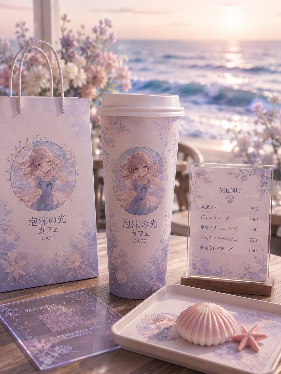
Full Prompt
Goal: Create a dreamy seaside anime-themed cafe brand mockup for {argument name="cafe name" default="泡沫の光 カフェ"}, using a soft pastel lavender and pink palette, elegant floral borders, seashell motifs, and a gentle ocean-sunset atmosphere. Canvas: Vertical 3:4 composition, photorealistic product display with anime illustration printed on objects, shallow depth of field, warm backlit sunset glow, soft bokeh, high-detail textures. Setting: A wooden outdoor cafe table on a beach terrace at sunset. The ocean fills the background with sparkling waves and a low sun near the horizon. Add blurred pastel flowers behind the display, mainly white, blush pink, and lavender, with a romantic coastal cafe mood. Main branded elements: Show exactly 5 visible cafe merchandise/display pieces arranged on the table: 1 tall pastel paper shopping bag on the left with rope handles, 1 large takeaway coffee cup in the center with a white plastic lid, 1 upright acrylic menu sign on a small wooden base on the right, 1 transparent acrylic QR-code card lying flat in the front-left foreground, and 1 rectangular serving tray in the front-right foreground. Each item should share the same delicate lavender floral pattern and ocean-inspired branding. Character illustration: On the paper bag, cup, and tray, print a circular anime illustration of {argument name="character description" default="a soft blonde anime girl in a pale blue summer dress, sitting by the sea, with wavy hair, gentle eyes, and a shy hand-near-face pose"}. The illustration should look watercolor-like, airy, and pastel, framed by tiny flowers and sea motifs. Text content: Use Japanese branding text on the bag and cup: 「泡沫の光 カフェ」 with “- CAFÉ -” below it. The upright menu sign should have the heading “MENU” and a small shell icon, with exactly 5 menu items and prices: 「潮風ラテ」650, 「桜シェルソーダ」680, 「星屑クリームソーダ」700, 「乙女のベリーパフェ」720, 「夢見るレアチーズ」660. The flat acrylic card should contain a QR-code area and small decorative Japanese cafe text, but it may be partially unreadable due to perspective and reflections. Foreground props: Add exactly 2 small seaside props on the tray: 1 pale pink ridged shell-shaped dessert or shell ornament, and 1 small pink starfish beside it. Keep them neatly placed on the branded tray. Visual style: Soft romantic product photography, pastel anime cafe aesthetic, pearlescent highlights, translucent acrylic reflections, creamy lighting, elegant floral line art, delicate shells, starfish, and ocean foam motifs. Use realistic shadows on the wooden table and a softly blurred background. Constraints: Keep the composition clean and premium, avoid extra people, avoid modern corporate logos, avoid clutter, preserve the exact count of 5 branded display pieces, 5 menu items, and 2 foreground seaside props.