Case Media
Case Notes
This page keeps the media, full prompt, and original source together so you can inspect the result first and decide whether the prompt is worth copying, saving, or comparing.
Case Insights
To make this page easier to search, cite, and reuse later, the case is also broken down into practical guidance about usage, visual cues, and prompt structure.
Best Fit Scenarios
- Use this as a ui & social screens benchmark when you need a fast style baseline before rewriting your own prompt.
- It is especially helpful if your target overlaps with Poster, UI, Screenshot and you want to judge the image result before tuning wording.
- Keep it as a control sample when you compare nearby prompt variants one variable at a time.
Visual Signals To Notice
- The clearest style signals here are Poster, UI, Screenshot, so those should usually stay in your first rewrite.
- The important layer is usually interface density, card hierarchy, and how the screen tells the story before you read small text.
- This case keeps 3 media outputs, which makes it easier to check whether the style remains stable across multiple results.
How The Prompt Is Structured
- The prompt reads as a long, highly specified prompt, which is useful when you want to judge how much specificity this direction needs.
- Its keyword cluster is centered on Poster, UI, Screenshot, so you can usually keep that cluster while swapping subject, camera, layout, or copy details.
- A practical rewrite path is: keep the outcome, keep the strongest style cues, then replace only the subject and environment blocks.
Good Follow-up Questions
- What changes first if you keep Poster, UI, Screenshot but switch the subject matter?
- Which part of the result comes from section-level structure (UI & Social Screens) versus tag-level style cues?
- Which related cases in the same section give you a cleaner or more extreme variation of the same direction?
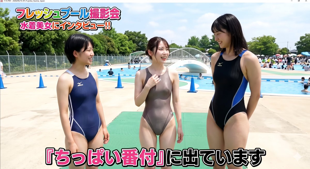
Full Prompt
Goal: Create a bright Japanese YouTube-style thumbnail for a public outdoor pool interview segment, featuring {argument name="number of women" default="three"} adult women in competitive one-piece swimsuits standing on a pool deck, with their faces anonymized by soft rectangular blur. The mood is sunny, casual, and documentary-like, as if captured during a summer pool event. Canvas: 16:9 horizontal image, high-resolution, realistic photo style, daylight, vivid colors, sharp focus, slight wide-angle perspective. Include a thin desktop window/title-bar strip at the very top with small text resembling a computer screenshot timestamp and location. Layout: Place the three women across the foreground, full body from head to upper thighs or knees. The left woman stands in a navy blue racing swimsuit with white side accents, short black hair, facing slightly toward the center. The center woman stands in a glossy taupe/gray racing swimsuit, tied-back brown hair, one hand raised near her chest as if being interviewed. The right woman is taller, wearing a black racing swimsuit with bright blue side panels, shoulder-length black hair, hands behind her back, facing slightly toward the center. Add rectangular blurred mosaics over all 3 faces. Background: A busy outdoor municipal pool on a sunny day with pale concrete decking, blue swimming pools, swimmers, families, umbrellas, trees, a chain-link fence, a white arched pedestrian bridge over the pool, and multiple blue safety cones. Include exactly 4 prominent blue cones in the midground: one near the left deck, one behind the center-left area, one near the center-right, and one farther right near the pool edge. Text content: Add a bold colorful Japanese headline at the top left in two lines: {argument name="top headline" default="フレッシュプール撮影会\n水着美女にインタビュー!!"}. Use thick rounded lettering with white fill, black outline, red/pink/yellow accents, and a playful variety-show style. Add a large bottom caption spanning nearly the full width: {argument name="bottom caption" default="『ちっぱい番付』に出ています"}. Make the bottom text white with black outline, with key pink emphasis on selected characters, matching Japanese variety TV subtitles. Visual style: Hyper-realistic summer pool photography mixed with Japanese TV-show thumbnail graphics, bright saturated blues and greens, strong sunlight, clean skin highlights, realistic swimsuit fabric shine, energetic composition. Constraints: All women must appear as adults, non-explicit, standing naturally, no nudity, no suggestive posing, no extra foreground people, keep the 3 blurred faces and exactly 3 main swimsuit interview subjects.